#
neo-pop
Copyright: Modern Artists: Artvee
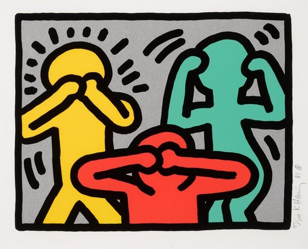
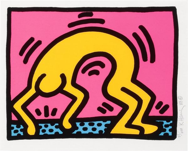
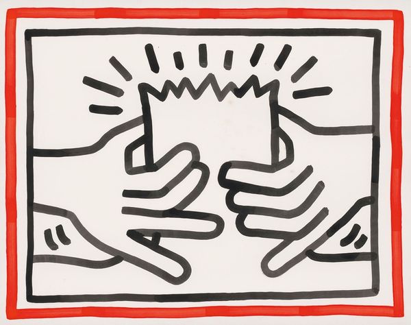
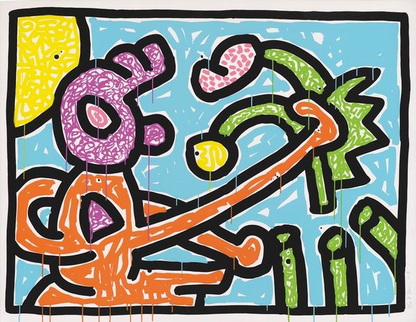
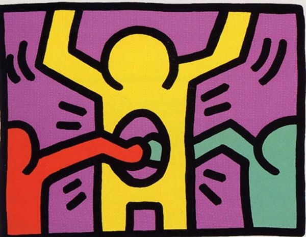
Editor: Here we have Keith Haring’s "Pop Shop V" from 1989, a vibrant print brimming with energy. The bright colors and playful figures create such a joyful feeling, almost like a celebration. What do you make of it? Curator: It zings, doesn’t it? Haring had this amazing knack for simplifying complex ideas into these wonderfully accessible visual nuggets. He used a visual language everyone could understand, from the subway riders to gallery goers. What I see is liberation – that winged figure feels like a shout of pure, unadulterated freedom rising above…well, hungry expectation? Maybe innocent wonder? Editor: Hungry expectation – that's interesting! The dolphins do seem a bit... intense. Curator: They're almost cartoonish in their yearning, aren’t they? Maybe they're us, reaching for something more, something just out of reach. Or maybe I'm reading way too much into pink dolphins! But, it is that playfulness with simple imagery, heavy line work and bold color that really speaks volumes in his works, doesn't it? How do those colours make you feel? Editor: The colours definitely grab my attention! That orange background makes the turquoise figure and the pink dolphins pop. Curator: It’s a feast for the eyes, isn’t it? A visual party. And it makes you think, what *is* Pop Art about if not instant communication and radical inclusion? Editor: I hadn’t really thought about the “inclusion” aspect. I’m so used to seeing the visual, the colours, but this is about sharing with everybody, no barriers, right? I hadn't put that together so explicitly. Curator: Precisely! Next time I see dolphins, though, I'll definitely remember to check their…expectations. Editor: Thanks for the food for thought.
Comments
No comments
Be the first to comment and join the conversation on the ultimate creative platform.
