Copyright: Richard Paul Lohse,Fair Use
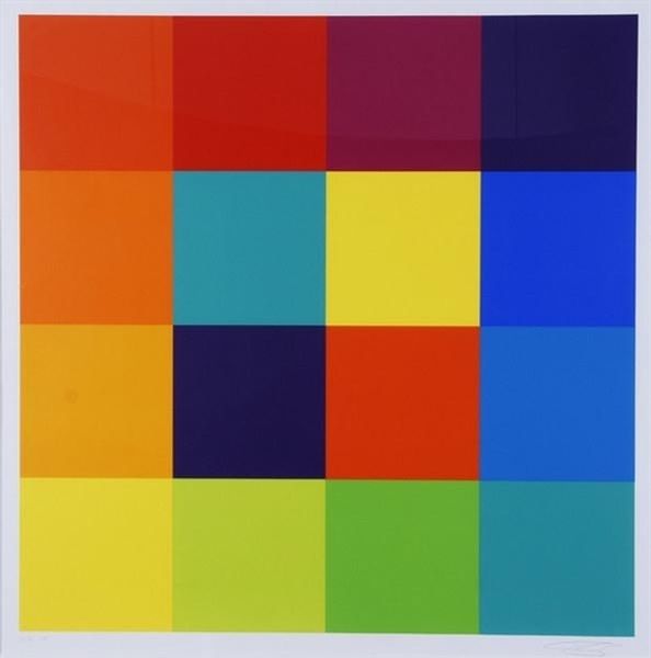
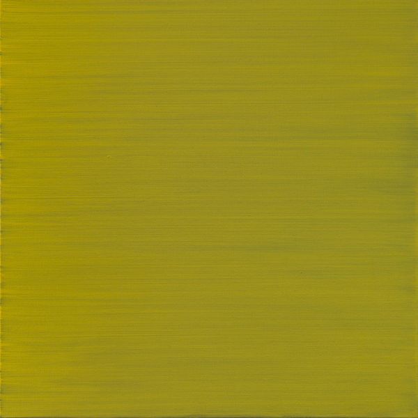
Richard Paul Lohse made this grid of squares in a range of sunny greens and yellows. It’s the kind of color combo that screams summer, but in a very ordered, rational way. The surface is really smooth; there’s no evidence of brushstrokes or texture. The colors shift subtly, almost like a gradient, from the top left to the bottom right. It’s so precise, you almost don’t notice that there are slight variations in the tones. Take the bottom right square: that sort of dark ochre shade feels warmer and more grounded than the cooler greens up top. Lohse's squares remind me a bit of Josef Albers' Homage to the Square. But while Albers was interested in the way colors interact, Lohse seems more focused on the system itself. Both show us that art is not always about expression, but about how we see and think about the world. It's like a conversation, a back-and-forth, across time and between artists.
Comments
No comments
Be the first to comment and join the conversation on the ultimate creative platform.
More like this