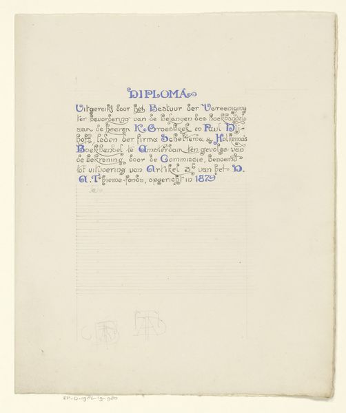
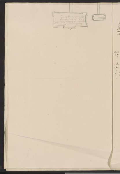
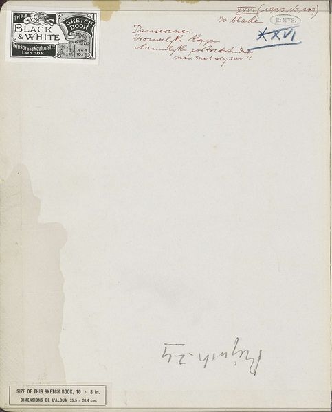
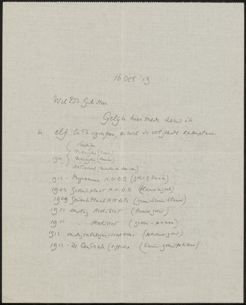
Ontwerp voor een diploma van de Vereniging ter Bevordering van de Belangen des Boekhandels 1909
0:00
0:00
drawing, graphic-art, paper, typography, ink
#
drawing
#
graphic-art
#
aged paper
#
art-nouveau
#
hand drawn type
#
paper
#
personal sketchbook
#
typography
#
ink
#
idea generation sketch
#
sketchwork
#
journal
#
fading type
#
sketchbook drawing
#
storyboard and sketchbook work
#
sketchbook art
#
calligraphy
Dimensions: height 250 mm, width 211 mm
Copyright: Rijks Museum: Open Domain
Curator: This ink drawing from 1909 is entitled "Ontwerp voor een diploma van de Vereniging ter Bevordering van de Belangen des Boekhandels," or "Design for a diploma of the Association for the Promotion of the Interests of Booksellers" by Reinier Willem Petrus de Vries. It's on paper, displaying an Art Nouveau style. What's your first take? Editor: Well, my initial feeling is one of…understated elegance. It's almost fragile in its simplicity, but that precise calligraphy suggests real authority and tradition. There’s something rather beautiful about the aged paper, too. Curator: Indeed, the very medium—paper—speaks volumes about history and knowledge transfer, not only the history of the book trade but more broadly of information dispersal in that period. The flourishes in the 'Diploma' heading create a feeling of honor, of distinction conferred by membership. What might that mean symbolically? Editor: Consider the visual language it employs. The flowing, almost serpentine lines in the lettering evoke that classic Art Nouveau celebration of nature. But they also feel intertwined, suggesting the interwoven nature of this booksellers' association – a community bound together. Even the choice of what appears to be a deep Prussian blue ink – that symbolizes trust and authority. Curator: Note too how the linear elements both construct and deconstruct the document as a cohesive unit. Those very neat, horizontal guidelines suggest order and control, preparing the document for information to be neatly recorded in a systemized fashion. Editor: Precisely! And looking at the names calligraphied onto the diploma design, what’s their cultural weight in 1909? How much did these individual signatures impact this trade community or the visual document, what stories do these specific figures and that symbolic association invoke? The Art Nouveau elements aren't merely decorative. Curator: Absolutely. We're glimpsing the visual signifiers of authority meeting the rise of commercial associations at the turn of the century. This convergence reveals how the graphic arts become tools of civic function. Editor: Exactly. For me, exploring this sketch is akin to peering into a bygone era of craft and trade. The very creation of this certificate holds multiple narrative and visual cues – more than just the functional delivery of a diploma; more as an echo chamber that still resounds to this day. Curator: I'd agree. By looking beyond its basic utility, and attending to its form, this design for a diploma holds more conceptual value than meets the casual eye.
Comments
No comments
Be the first to comment and join the conversation on the ultimate creative platform.
More like this