drawing, paper, ink
#
portrait
#
photo of handprinted image
#
drawing
#
aged paper
#
toned paper
#
ink paper printed
#
old engraving style
#
hand drawn type
#
paper
#
personal sketchbook
#
ink
#
hand-drawn typeface
#
ink drawing experimentation
#
sketchbook drawing
#
calligraphy
Copyright: Rijks Museum: Open Domain
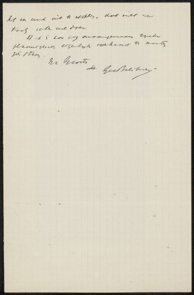
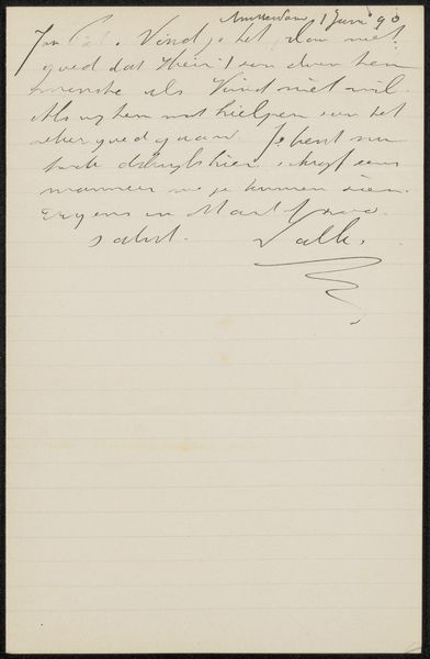
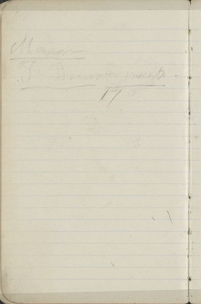
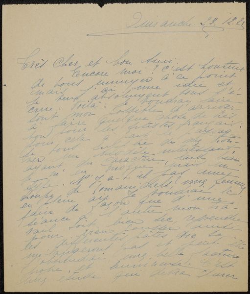
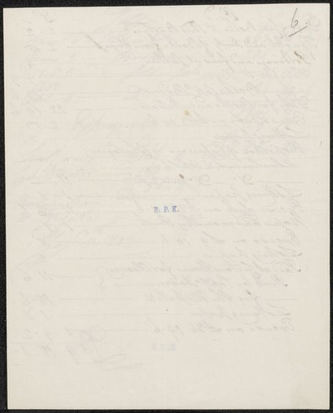
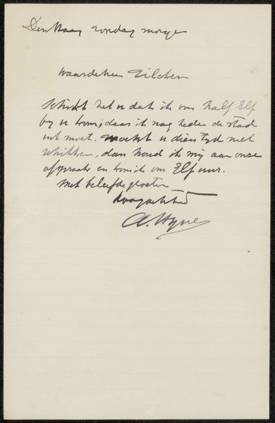
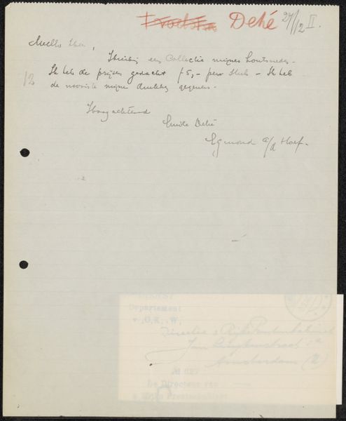
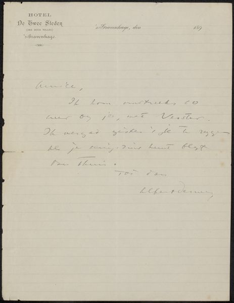
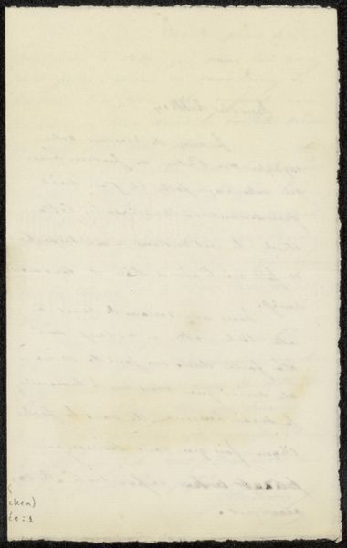
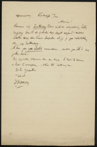
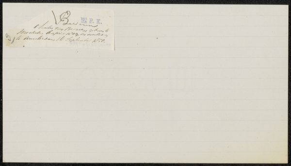
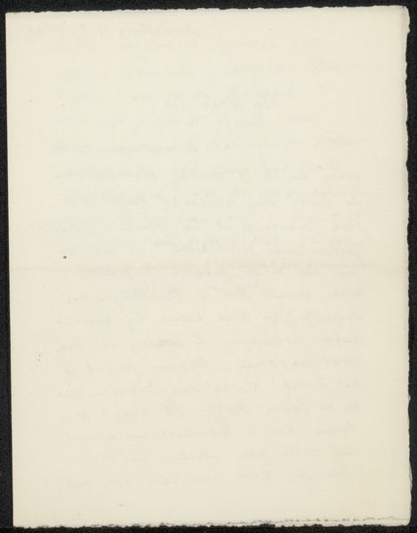
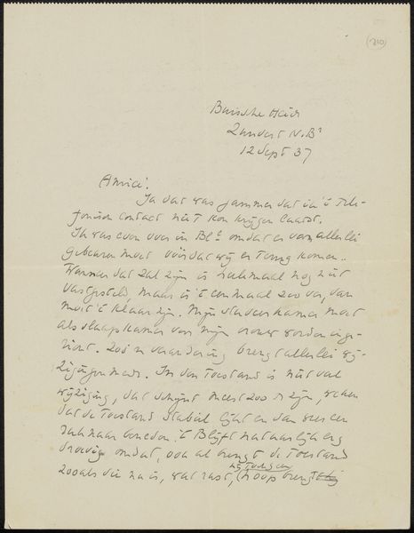
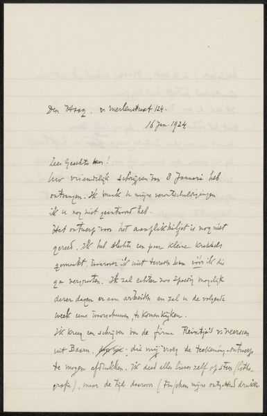
Curator: At first glance, the composition appears quite sparse—mostly unadorned paper, its lines meticulously ruled. The date, inscribed delicately near the top, hints at something more. Editor: It has a melancholic feel. The faded paper, the handwritten script, the almost ghostly quality of the ink—it feels like holding a piece of time itself. Tell me more about this work. Curator: Certainly. What we're looking at is entitled "Transcripties van brieven aan Philip Zilcken" or "Transcriptions of letters to Philip Zilcken". It's attributed to Pieter Haverkorn van Rijsewijk, and while undated, the inscription on the page seems to read January 29, 1892, likely the earliest this would have been executed, though this date seems later applied, thus, “after 29”. The piece consists of ink on paper. Editor: It seems incredibly personal, the lines hinting at correspondence. How did someone like Zilcken affect Rijsewijk’s work? What context do these letters provide about Rijsewijk as a political figure, if any? Curator: That’s the crux of it, isn't it? This isn't a finished piece, but rather a leaf from what appears to be a personal sketchbook, likely, preliminary studies or experiments in typography. Editor: I wonder how the act of transcription shaped the understanding between Rijsewijk and Zilcken’s world? Each copied line—almost a meditative act that forges a social bond beyond words. What did each one gain from that partnership? Curator: One can only speculate what the artist discovered from Zilcken's correspondence. Focusing on the structure of this page and this exchange: Rijsewijk's exploration of script transcends pure representation. See how the variations in pressure affect the line weight; observe the intentional flourishes within individual letterforms. It is not just an exercise in duplicating text, but an interrogation into visual rhythm, form, and calligraphic mark-making. Editor: I concur. To see just one letter opens the audience to consider just one element that fostered so much creativity! Curator: Absolutely, it shows how we find inspiration through many sources, no matter how great or small. Editor: What a great sentiment to leave with; I know I have a few new ideas!
Comments
No comments
Be the first to comment and join the conversation on the ultimate creative platform.
More like this