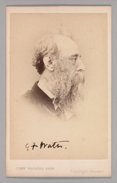
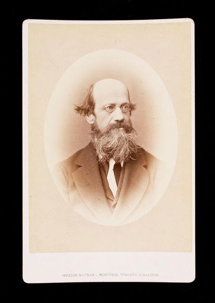
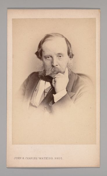
![[Charles West Cope] by John and Charles Watkins](/_next/image?url=https%3A%2F%2Fd2w8kbdekdi1gv.cloudfront.net%2FeyJidWNrZXQiOiAiYXJ0ZXJhLWltYWdlcy1idWNrZXQiLCAia2V5IjogImFydHdvcmtzL2ViZmVhZjczLTk5Y2QtNDM4Zi05OGVlLTYwMTAzYWQ5YzZlZS9lYmZlYWY3My05OWNkLTQzOGYtOThlZS02MDEwM2FkOWM2ZWVfZnVsbC5qcGciLCAiZWRpdHMiOiB7InJlc2l6ZSI6IHsid2lkdGgiOiAxOTIwLCAiaGVpZ2h0IjogMTkyMCwgImZpdCI6ICJpbnNpZGUifX19&w=3840&q=75)
photography, gelatin-silver-print
#
portrait
#
photography
#
gelatin-silver-print
#
men
#
publication mockup
Dimensions: Approx. 10.2 x 6.3 cm (4 x 2 1/2 in.)
Copyright: Public Domain
Editor: We’re looking at a gelatin silver print portrait of Charles West Cope, taken in the 1860s by John and Charles Watkins. The texture looks incredibly smooth, and the tones range from almost white to deep sepia. It has a very…contemplative mood, don't you think? How do you interpret this work? Curator: Indeed. If we bracket its subject momentarily, notice the photographers' exquisite control of tonal gradations. The diffused light sculpts Cope’s form, guiding our eye across the planes of his face, down to his hand and the delicate gesture where finger meets beard. Consider how that same delicate tonal contrast separates him subtly from the background, avoiding any harsh division or line that might interrupt the meditative unity. What effect is created? Editor: Well, the lack of a harsh line really does keep me focused on him, and on that hand-to-beard gesture, but the light is pretty simple overall. Is that by design? Curator: Precisely. The even illumination serves not to flatten the image but, paradoxically, to foreground the gradations. It allows for meticulous modulation within a tight register of values. A formal economy, would you agree, elevates what could have been a prosaic depiction to an exploration of photographic values themselves. And further: is there, in this highly specific balance of tonal control and composition, any sense of what photography could accomplish? Editor: I guess the success in modulating tones does emphasize what makes it photographic, like a pure study in the medium. I’ll be paying more attention to gradations now. Curator: As will I. Looking at this image, I see that a fresh focus on those simple choices is the foundation for so much more.
Comments
No comments
Be the first to comment and join the conversation on the ultimate creative platform.
More like this