#
bird
Dimensions: height 503 mm, width 711 mm
Copyright: Rijks Museum: Open Domain
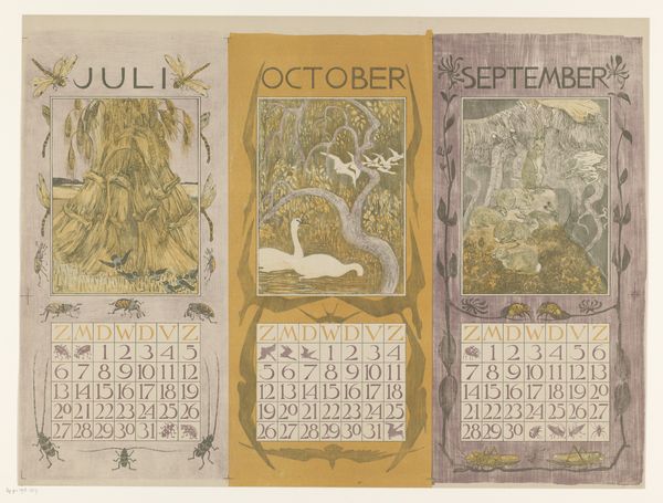
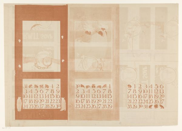
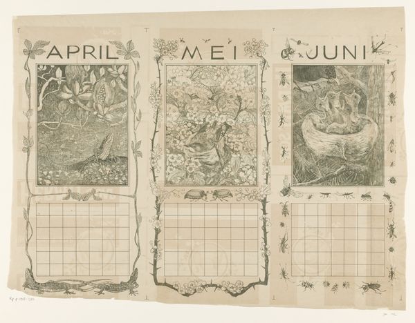
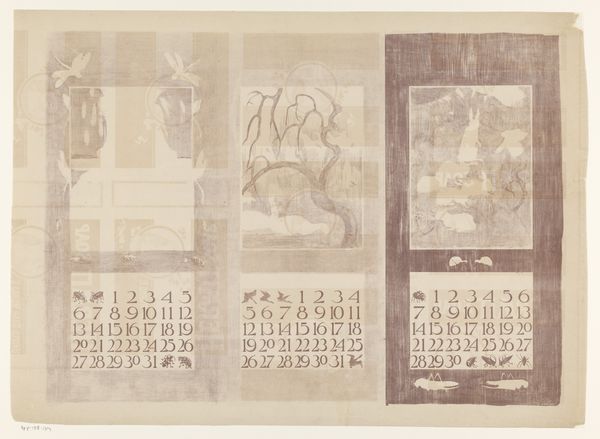
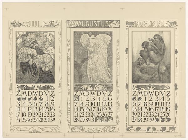
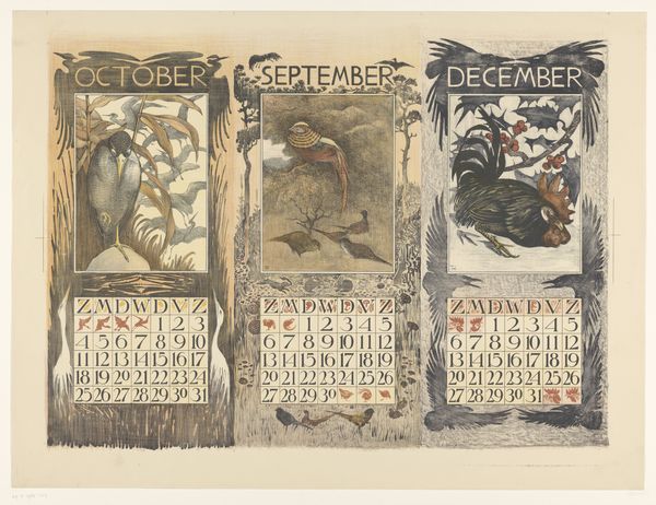
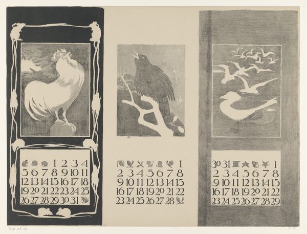
Editor: Here we have Theo van Hoytema's calendar print from 1901, showcasing July, October, and September. What I find striking is how meticulously Hoytema uses monochromatic tones, focusing on texture and line. It feels almost scientific, like a natural history illustration. What catches your eye about this print? Curator: Indeed. Hoytema's command of lithography allows for exquisite tonal gradations. Consider the structure of the composition, with each month employing similar elements: an illustration framed by botanical or entomological motifs, hovering over a grid. These create frames within frames. What's your impression of the role of framing here? Editor: I see. The inner illustration almost becomes a vignette, separated from the outer decoration. It's not merely decorative, then, but uses this layering to create visual distance and encourage deeper engagement. What of his emphasis on detail? Curator: Absolutely. Notice how each month presents different textures and compositional styles. In July we see the heavy thatch work against wispy blades of grass; for October, the water with swan stands in stark contrast to the wild foliage, with detailed patterns; and for September, the craggy rocks create visual roughness and three-dimensionality. All are bound by thin, graceful framing lines that add layers. Do you observe how these different textures interact with each other? Editor: It’s fascinating to see how a single print can contain such variation! It seems to emphasize each month’s unique qualities not through colour, but form. I did wonder why this work doesn’t rely on color or dramatic composition, as many works do. Curator: This lack is, itself, important. By restricting himself to blacks, grays, and whites, the artist challenges us to consider how light and shadow, lines, forms, composition can deliver aesthetic sensation, and meaning, beyond the obvious effects of the color spectrum. Each vignette stands apart because it does not mimic the previous panel’s formal properties. And this choice of media encourages the beholder to move with time itself. Editor: So by emphasizing the intricacies of form, texture, and the cyclical passage of months, Hoytema has invited us to examine not only these three months in a calendar, but the nature of seasons and art.
Comments
No comments
Be the first to comment and join the conversation on the ultimate creative platform.
More like this