lithograph, print
#
art-nouveau
#
lithograph
# print
#
bird
#
geometric
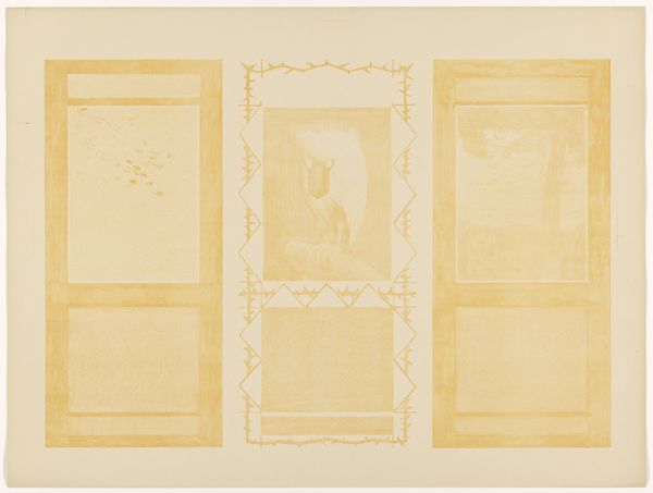
Dimensions: height 490 mm, width 722 mm
Copyright: Rijks Museum: Open Domain
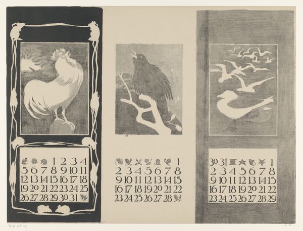
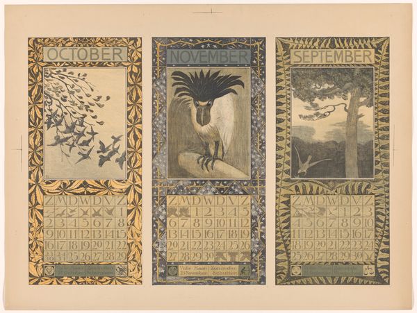
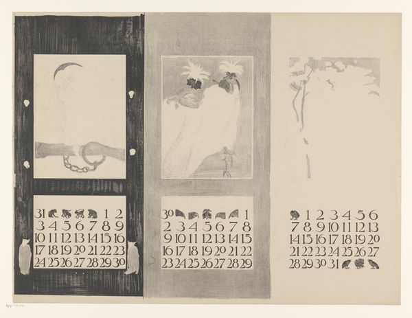
Theo van Hoytema made this calendar print of January, February and March at the turn of the century, using lithography. Look at the ghostly quality of the image, it's almost like a memory fading into the paper. The way the colors are laid down is so subtle, thin layers that let the paper breathe. It's not about showing off a skill, but more about capturing a feeling, a mood. It really speaks to an understanding of artmaking as a process of layering and revealing. Notice the rooster in the January panel, how it's not quite solid, but more like a suggestion. Or the bare branches of the tree that holds the crow of February. It’s so understated, almost like a whisper. It reminds me a little of Whistler, in the way that it approaches a certain poetic ambiguity, embracing the subtle and suggestive rather than the bold statement. It’s a quiet revolution, this work, favoring nuance over noise.
Comments
No comments
Be the first to comment and join the conversation on the ultimate creative platform.
More like this