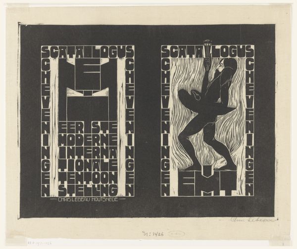
drawing, print, woodcut
#
photo of handprinted image
#
drawing
#
aged paper
#
toned paper
#
organic
#
art-nouveau
#
homemade paper
#
ink paper printed
# print
#
old engraving style
#
hand drawn type
#
bird
#
figuration
#
personal sketchbook
#
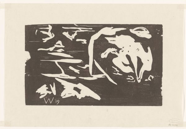
woodcut
#
line
#
symbolism
#
sketchbook drawing
#
decorative-art
#
sketchbook art
Dimensions: height 480 mm, width 639 mm
Copyright: Rijks Museum: Open Domain
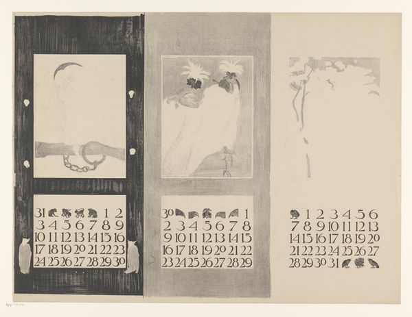
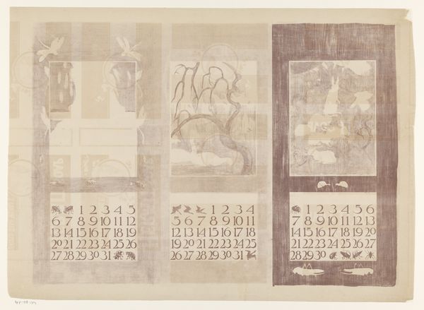
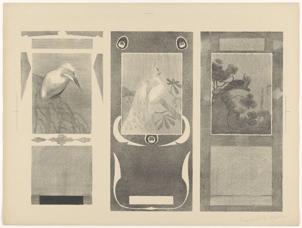
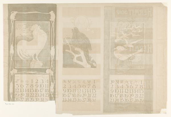
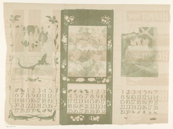
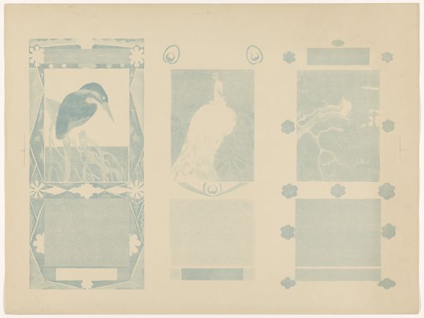
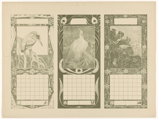
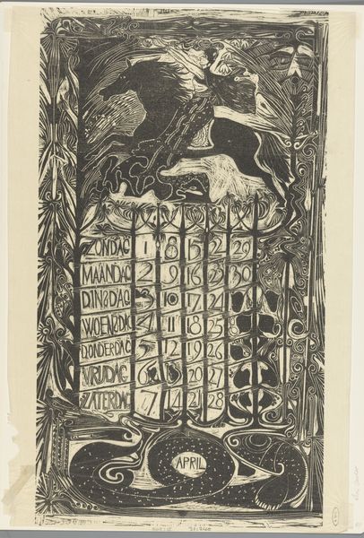
Curator: We're looking at Theo van Hoytema's "Kalenderbladen van januari, februari en maart, met vogels," created in 1901. It's held at the Rijksmuseum. Editor: Immediately, the stark contrast between the dark ink and toned paper gives it a somewhat austere but undeniably striking visual quality. It reminds me of turn-of-the-century book illustrations. Curator: It's a woodcut print. I think this piece speaks to the anxieties surrounding the commercialization of time and nature during the Industrial Revolution. Each month is headed by a bird—a rooster, a blackbird, seagulls. These choices become symbolic when we consider what those animals represent. The rooster and the start of the new day can stand for masculine authority and hard work. Seagulls stand for freedom of movement. This is about societal norms! Editor: Yes, and beyond any narrative, the interplay of light and shadow is quite captivating. Van Hoytema’s use of negative space directs the eye and allows for an aesthetic, rather than literal reading, creating these incredible textures. Look how that bold, almost geometric application of darkness lends the birds volume while setting them against spare, tonal grounds. Curator: And how about the font that almost feels hand-drawn? The small animals functioning like delimiters or bullet points between the dates... They make me wonder who this calendar was *for*. It feels homespun, as if intended for a worker looking for guidance in a period when society told them how to think about "productivity". This artist perhaps hopes that one might be reminded that productivity is aligned with our organic world. Editor: Right. It's walking a fine line between utility and art. Speaking purely technically, the texture variation—from the smoother bird images to the almost stippled effect in the monthly grids—really engages the viewer and gives a vitality you would not otherwise expect from such a basic implement. Curator: Ultimately, this work presents a subtle rebellion against industrial encroachment, reminding us of our bond to nature, and, I suspect, making a point about working for a purpose and the ability to make art to serve everyday folks. Editor: Yes, whether by intent or chance, these design choices lend it a compelling dynamism and depth that lift it far beyond its function, speaking, if you allow me, to art’s immanent, and intrinsic, properties.
Comments
No comments
Be the first to comment and join the conversation on the ultimate creative platform.
More like this