1925
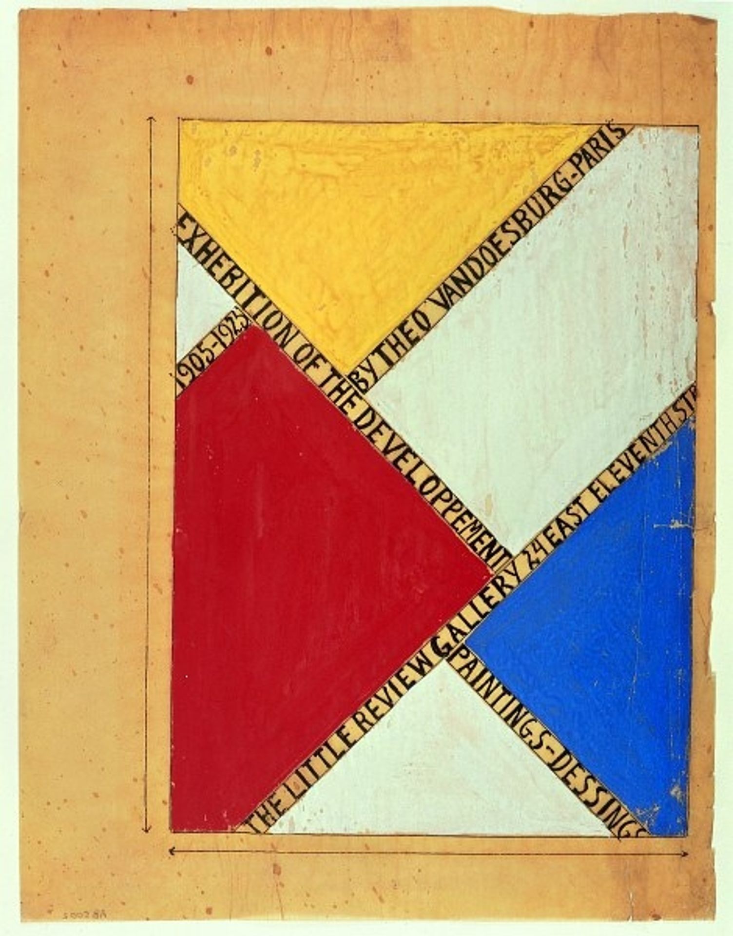
Design for a poster for an exhibition at The Little Review Gallery, New York
Listen to curator's interpretation
Curatorial notes
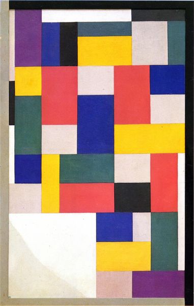
Theo van Doesburg made this design for a poster, announcing an exhibition at The Little Review Gallery in New York. It's a lovely concoction of primary colours, neatly arranged, yet kind of wonky, which I find very appealing. I think it’s cool to see how the different textures and colours play off one another. The paint application in the yellow area is quite loose and gestural. You can see the marks of the brush, whereas the red, blue, and white seem to have been applied in a much thinner and more even way. Then you have the text, carefully painted in black. I like the way the words are placed over the top of the coloured areas, creating a grid like structure. It’s not just a poster; it’s a painting in its own right. Looking at this makes me think of Mondrian, of course. But this feels much more spontaneous, less resolved. More human.
