stain
#
art-deco
#
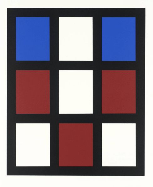
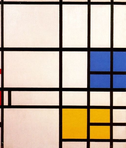
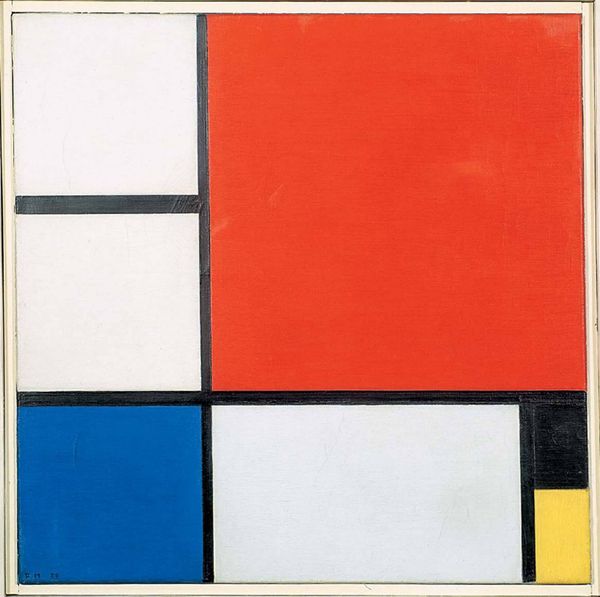
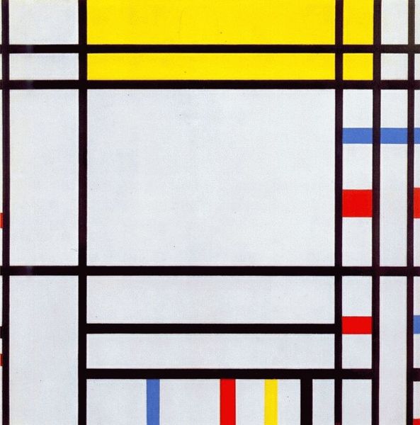
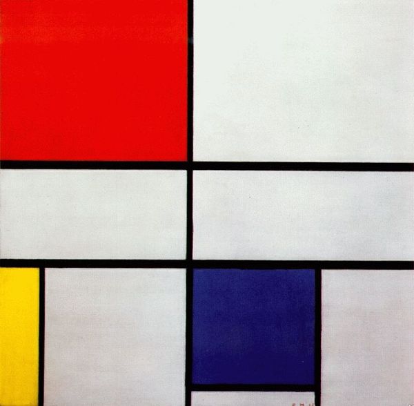
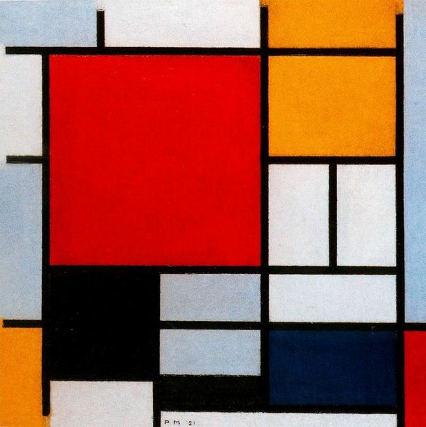
neo-plasticism
#
stain
#
pattern
#
form
#
geometric pattern
#
geometric
#
abstraction
#
line
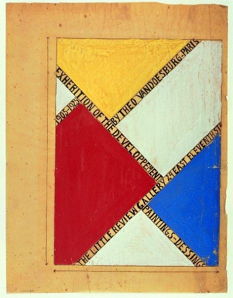
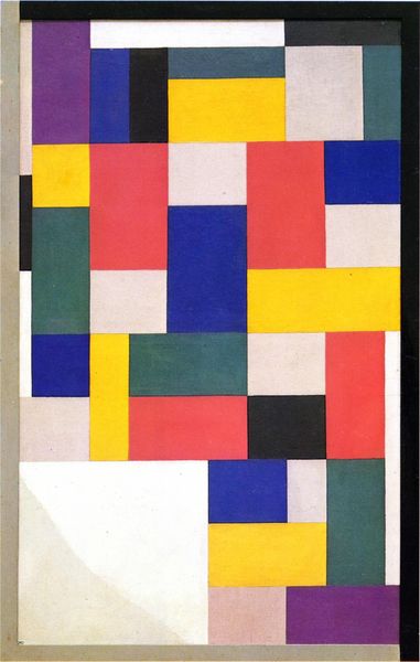
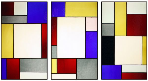
Dimensions: 99 x 32 cm
Copyright: Public domain
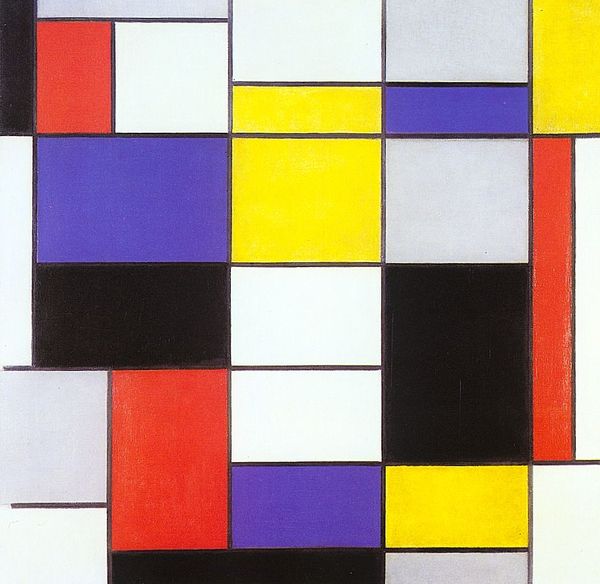
Curator: This striking work is Theo van Doesburg’s "Design for Stained Glass Composition XIII," created in 1924. Editor: Immediately, I’m struck by the harmony and visual austerity. It’s remarkably clean in its composition, these vibrant colors contained within what appear to be precisely measured boundaries. Curator: The design is rooted in the De Stijl movement, aiming for a universal visual language. I'm fascinated by the context of the Weimar era, where van Doesburg's De Stijl ideals encountered the practical realities of Bauhaus education and modernist architecture. Editor: I agree. The grid-like structure, composed of varied rectangles and primary hues, speaks to the core tenets of Neo-Plasticism. But notice how the rectangles don't quite align, a deviation that introduces a subtle tension and movement. It avoids the pitfalls of static balance. Curator: Absolutely. One could consider the socio-political influences. The move to pure abstraction, freeing itself from overt representation, provided refuge in an increasingly chaotic interwar era. There's a longing for an objective truth outside of ideological squabbles, perhaps? Editor: Perhaps. From my perspective, the stained glass, a medium traditionally linked to narrative depiction, is here radically reinvented. The interplay of color and light as it would have passed through these panes adds another layer of dynamism, a performative element that's often overlooked in design drawings. Curator: True. It mirrors the changing role of art within society. Rejecting traditional notions of craftsmanship, van Doesburg champions geometric forms to foster societal transformation. What was, then, the place for such artworks within everyday life, beyond the rarefied space of museums or private homes? Editor: Well, I look at the materiality. Van Doesburg utilizes this tension by composing non-symmetrical design of vertically divided rectangles and a reduced color scheme, highlighting form as essence. The black lines are used to further define the rectangles of various colours, and add to the balance. Curator: Considering it now, I wonder about the function of this design as a critique of power structures. This non-hierarchical organization resists singular interpretation; could it advocate the sharing of power within society, resisting elitist norms? Editor: These varied views provide us an entry point into understanding the complexity of seemingly simple forms. Curator: Yes, the confluence of philosophy, social reform, and formal purity makes this stained glass design an incredibly vibrant artifact.
Comments
No comments
Be the first to comment and join the conversation on the ultimate creative platform.
More like this