drawing, paper, ink, pen
#
portrait
#
script typeface
#
drawing
#
script typography
#
hand-lettering
#
old engraving style
#
hand drawn type
#
hand lettering
#
paper
#
ink
#
hand-drawn typeface
#
thick font
#
pen work
#
pen
#
handwritten font
Copyright: Rijks Museum: Open Domain
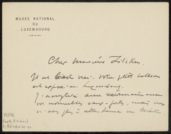
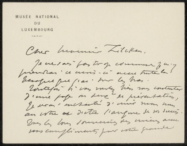
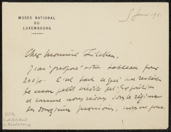
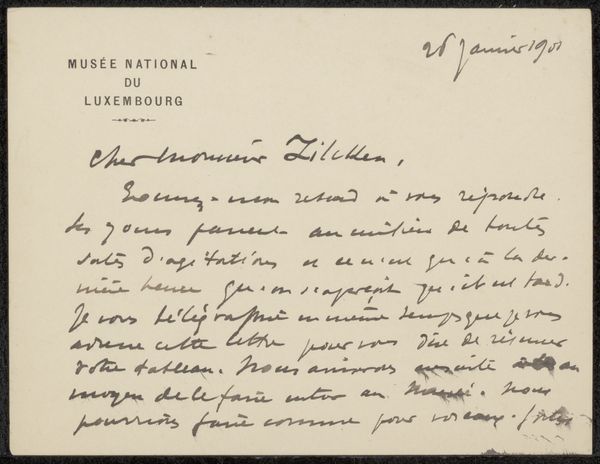
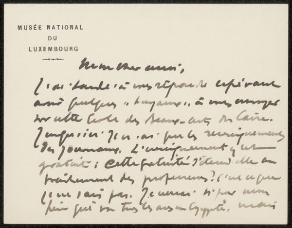
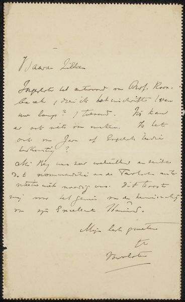
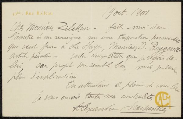
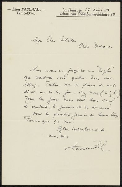
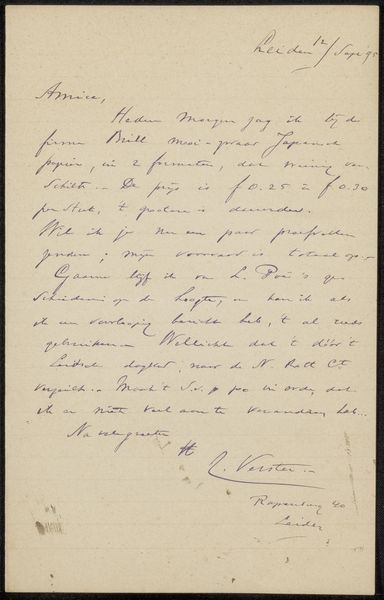
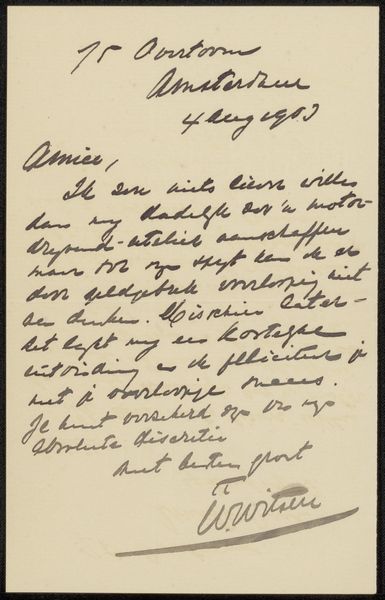
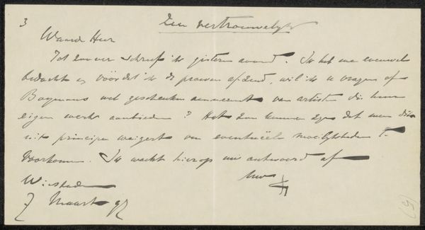
Curator: Today, we’re looking at Léonce Bénédite’s "Brief aan Philip Zilcken," likely penned around 1906, crafted with ink on paper. A seemingly simple handwritten letter. Editor: But it's far from simple! The elegant calligraphic flow creates such a pleasing visual rhythm, despite the apparent haste. Notice the varying pressure of the pen strokes. It dances. Curator: Indeed. The letter format, with its placement on "Musée National du Luxembourg" stationary tells a great deal about Bénédite himself, who served as curator at the Musée du Luxembourg around the time of this writing. His administrative role clearly intertwined with the artistic circles of his era, given the correspondence with Zilcken. Editor: I am drawn to the textures – the absorbent quality of the paper interacting with the ink. This textural depth creates a surprising intimacy for such a simple image. Curator: I agree; examining his correspondence reminds us that behind grand art movements lie complex webs of personal interactions and institutional networks. It gives us a keyhole glimpse into that turn-of-the-century Parisian world of art and artists, and their place in a broader public. Editor: The absence of flourish is also striking; it’s unadorned, direct. The practical function of the message supersedes the impulse to decorate the page—a characteristic perhaps more common than we’d assume from that time period, but something also possibly reserved for the communication with certain recipients more than others. Curator: And the context underscores its meaning. Think of the postal system in that era - handwritten notes carried enormous significance. This wasn’t a quickly typed email; it was a deliberate act of communication with physical presence, and thus, we feel the intimacy. Editor: Absolutely. Considering the texture and deliberate design allows us entry, a path, for discovering historical circumstances that influenced the letter's origin and importance. Curator: The history imbues the object itself with a vital part of the beauty you describe. Editor: Agreed; and I believe by appreciating both the form and the context we get a fuller and more compelling sense of the piece and the hand of its creator.
Comments
No comments
Be the first to comment and join the conversation on the ultimate creative platform.
More like this