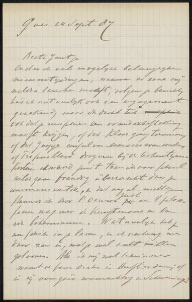
drawing, paper, ink
#
portrait
#
drawing
#
paper
#
ink
Dimensions: height 105 mm, width 150 mm
Copyright: Rijks Museum: Open Domain
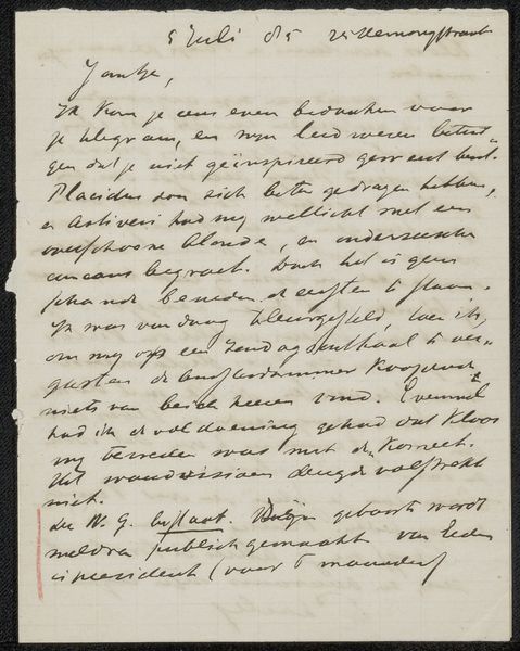
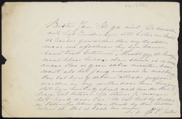
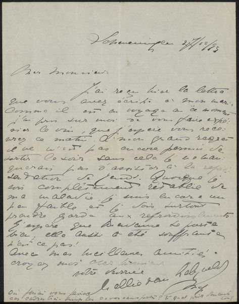
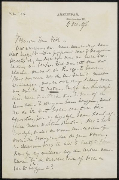
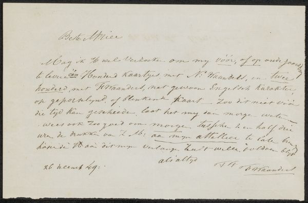
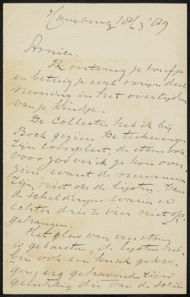
Curator: This is a postcard by Leo Gestel, titled "Briefkaart aan Harmina Catharina Ponstijn," likely from 1940. It is a drawing using ink on paper, and it’s held at the Rijksmuseum. What strikes you most about it? Editor: Well, the script is really tight and flowing, giving the postcard a sense of intimacy, like we're seeing something very private. It makes me wonder, what do you focus on when you look at a piece like this, which isn't exactly a traditional portrait, despite its listing? Curator: Intriguing question. As a formalist, I am drawn to the composition of the writing itself. Consider the elegant use of line. Note how the density of the ink varies, creating a rhythm and texture across the paper. Look at the upper right where it says "Blanicuum N.H. 20 Nov. ‘40" versus the denser text in the main part of the card. Does this layering not speak to the complex structure the writing occupies upon the surface? Editor: Yes, I see that contrast. It's interesting how the handwriting itself becomes a key part of the artwork. I guess I was thinking more about who Harmina was and what the message meant, but I can appreciate focusing on the visual structure. Curator: And in fact, deciphering the personal narrative becomes secondary to observing how the formal elements – line, texture, and composition – converge to create meaning. Gestel prompts a reflection on the fundamental aesthetics embedded in written communication. Would you agree with my position, given your assessment? Editor: Absolutely! Looking at the visual construction enhances my experience with the piece. I see what you mean by discovering formal aesthetics rather than deciphering the text. Curator: Excellent! The work encourages an expanded comprehension.
Comments
No comments
Be the first to comment and join the conversation on the ultimate creative platform.
More like this