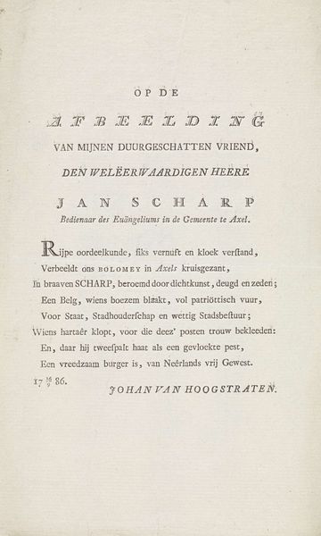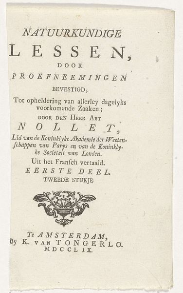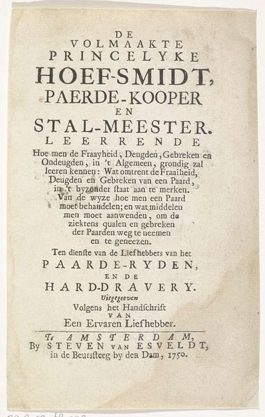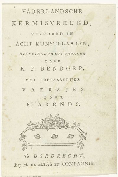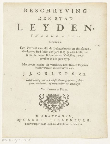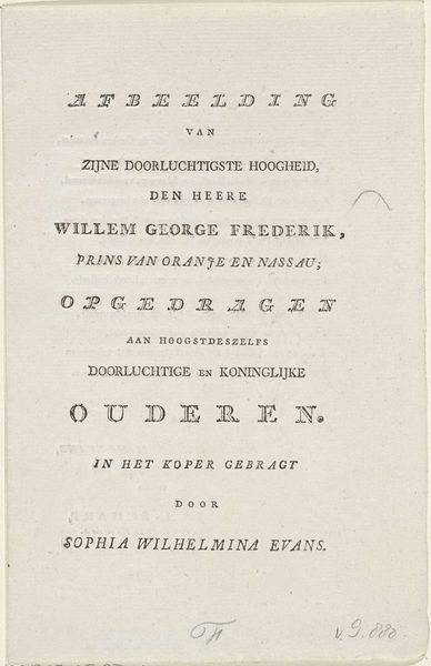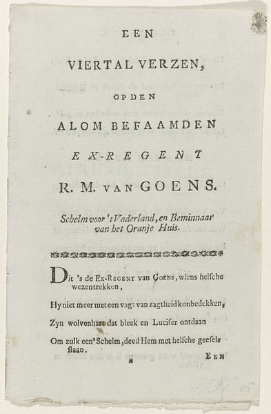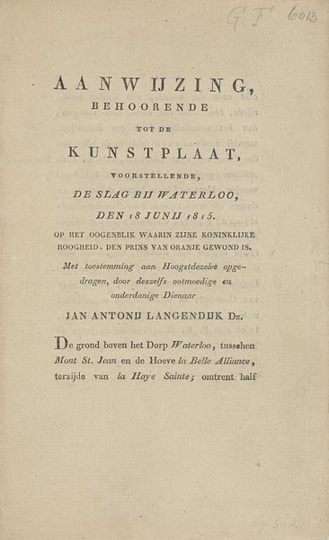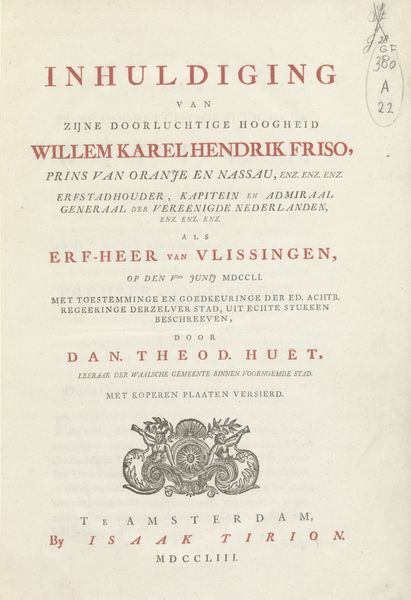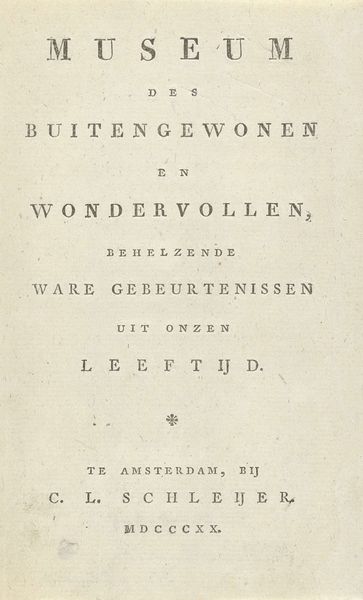
Titelpagina voor: Johannes Cornelisz. Hazeu, Agt kunstplaaten behoorende tot de Kinderpligt en zinnebeelden, Amsterdam 1789 1789
0:00
0:00
willemvanvliet
Rijksmuseum
#
aged paper
#
old engraving style
#
hand drawn type
#
personal sketchbook
#
hand-drawn typeface
#
fading type
#
thick font
#
handwritten font
#
historical font
#
columned text
Dimensions: height 179 mm, width 115 mm
Copyright: Rijks Museum: Open Domain
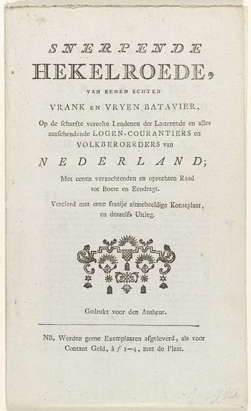
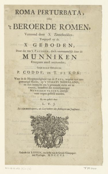
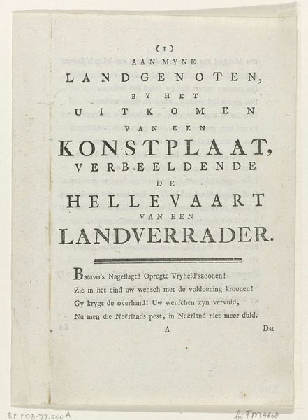
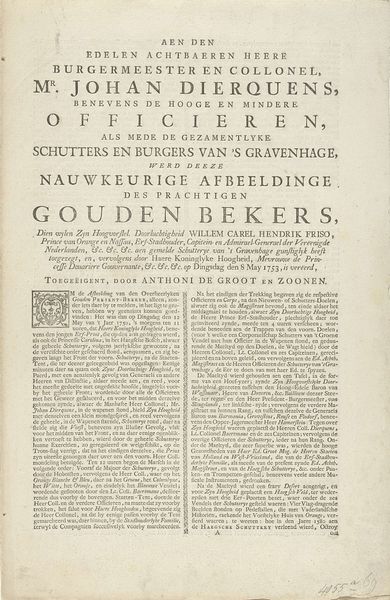
Editor: So, this is the title page for "Agt kunstplaaten behoorende tot de Kinderpligt en zinnebeelden," from 1789. It was made in Amsterdam. I notice it credits both a designer, P. de Bakker, and a publisher, J. Hazeu. The typography has a unique quality, making it seem both antique and carefully composed. What's your perspective on this kind of historical printed matter? Curator: Well, from a historical standpoint, it's fascinating to consider how this title page reflects the burgeoning print culture and the shaping of childhood in the late 18th century. "Kinder-Pligt," or "Children's Duty," and "Zinnebeelden," "Emblems", hint at a didactic purpose. Who was this aimed at? Editor: Probably wealthier families who could afford such illustrated moral lessons for their children? Curator: Exactly. The very existence of printed material aimed at children reveals an evolving understanding of childhood as a period of instruction and moral formation. Notice how the printer, W. van Vliet, proudly proclaims his location? This reveals a growing public sphere. The Roman numerals for the year, the explicit pricing at the bottom - it’s all contributing to a certain type of commodity culture around education. Editor: So, it’s not just the illustrations that are important, but also the entire infrastructure around the making and selling of it that helps us understand it? Curator: Precisely. And it points towards understanding that education for children becomes also a product, shaping certain type of culture and consumption. Are those "symbols" and font designs reflective of artistic trends of that time? Editor: I didn’t think of it that way before. It’s interesting how much social context is packed into a single title page. Curator: It really does open up a whole avenue for investigation beyond the artistic skill. It illustrates the development and social consumption.
Comments
No comments
Be the first to comment and join the conversation on the ultimate creative platform.
