graphic-art, print, textile, typography
#
graphic-art
# print
#
textile
#
typography
Dimensions: height 218 mm, width 140 mm
Copyright: Rijks Museum: Open Domain
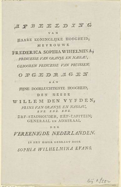
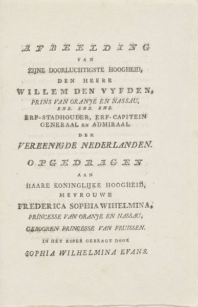
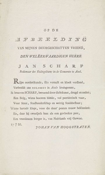
Curator: Well, at first glance, it seems quite simple. Just words, elegantly arranged. I wonder about the choice of typeface. Editor: Indeed. This is "Tekst bij het portret van Frederik, prins van Oranje-Nassau," made between 1790 and 1816 by Jan Scharp. It’s currently held in the Rijksmuseum collection. It’s fascinating when we think about this print as both graphic art and a textual artifact, especially in its engagement with royalty. Curator: Exactly! The material of print, the very process of its making, speaks volumes. Consider the labor involved in the typography; each letter meticulously placed, each word carefully chosen and arranged to dedicate itself to someone of nobility. Who was Sophia Wilhelmina Evans, who "brought it forth in copper"? Editor: Right, let's dive deeper into that. Jan Scharp made this graphic piece but credits Evans for realizing it. We see the artwork's political purpose in how it functions. Was this simply an act of courtly promotion for the Prince and his royal line? How was it circulated? Curator: Promotion, dedication, perhaps even aspiration? The fact that it's dedicated to his parents highlights the societal and hierarchical structures in place. And "in koper gebragt"-- bringing forth the image in copper implies craft production as being inherently intertwined with the status it intends to reflect back on its Royal Subject. The method of reproducing text becomes meaningful. Editor: Precisely. By thinking of this piece's origins in copper engraving and textiles, the materials suggest ideas around luxury but simultaneously evoke the social milieu in which it was created, including access to workshops and perhaps patronage. I agree, its effectiveness resides in making it a publicly consumable image that reinforces the Prince's image. Curator: Thinking about it this way reframes how we see what might have looked like some random official note-- it now reflects a world filled with socioeconomic concerns revolving around labour practices needed to fulfill that official need and ambition! Editor: I’m struck by how a seemingly simple piece of text unlocks so much insight into social dynamics of the late 18th century, highlighting the intersections of craft, power, and visibility.
Comments
No comments
Be the first to comment and join the conversation on the ultimate creative platform.
More like this