Copyright: Modern Artists: Artvee
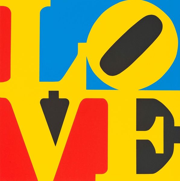
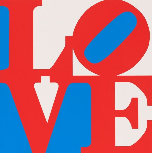
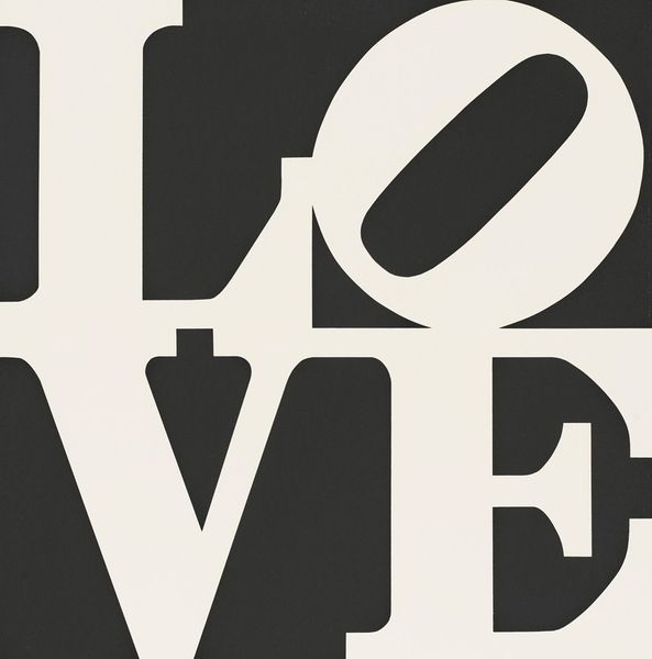
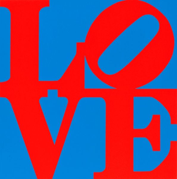
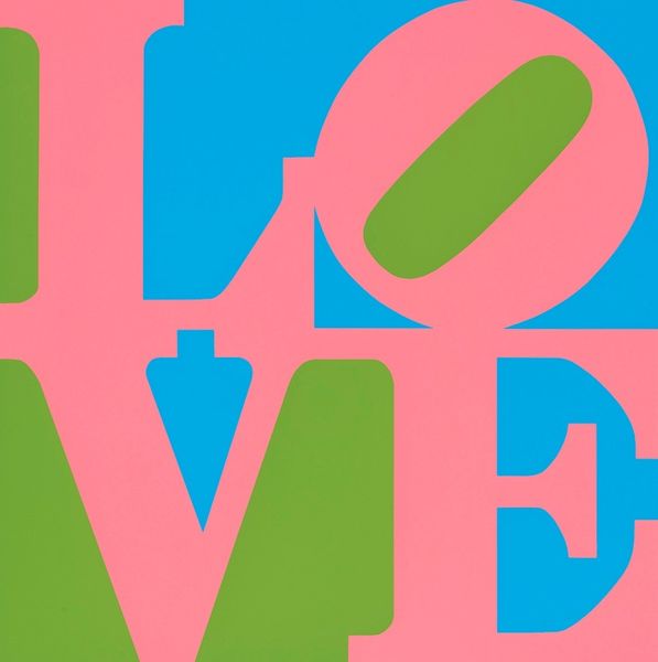
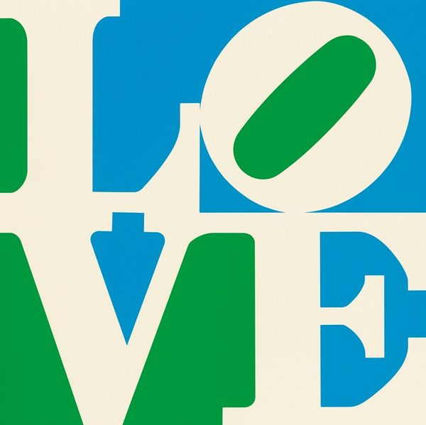
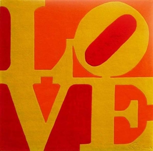
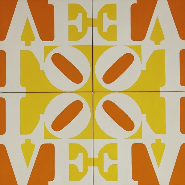
Robert Indiana made this Pop artwork called Book of Love #4. Look how Indiana simplifies everything! It’s like he's saying, "Let's cut to the chase." The colors are bold, unapologetic. The way he stacks the letters, tilting that 'O' to the side, it’s like a little visual hiccup. When I look at this 'LOVE,' I think about how we throw that word around. Love is such a loaded concept. How can you make it visual? I think back to Matisse and his cut-outs. There's something similarly direct and deceptively simple about this piece. Indiana isn't hiding anything. What you see is what you get, but it's the layering, the color choices, that give it depth. I think that is a conversation that has been going on in art for centuries, a conversation about how we can represent the human condition, in it’s most simple form.
Comments
No comments
Be the first to comment and join the conversation on the ultimate creative platform.
More like this