drawing, graphic-art, paper, typography, ink, poster
#
drawing
#
graphic-art
#
art-nouveau
#
paper
#
typography
#
ink
#
linocut print
#
geometric
#
line
#
decorative-art
#
poster
Dimensions: height 213 mm, width 345 mm
Copyright: Rijks Museum: Open Domain
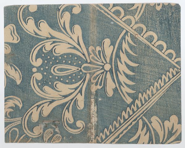
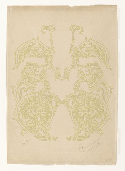
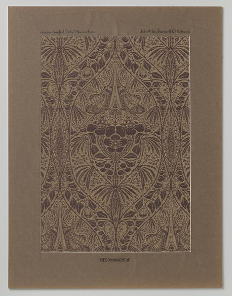
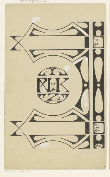
Curator: I am immediately struck by its overall sense of delicate balance. The pale blues dancing on the brown paper creates a strangely calming effect, even with the underlying geometry. Editor: This is the book cover design "Psyche," created in 1898 by Reinier Willem Petrus de Vries. It employs ink and typography on paper, exemplary of the Art Nouveau movement. Curator: The geometric forms appear inspired by plant life; consider how the triangles are formed into organic, curved edges and motifs. Editor: The prevalence of triangles pointing toward a central axis implies aspirations and movement, literally directing one’s view to the spine of the book—that narrow strip acting as the keystone between these bisymmetrical mirror images. We also recognize, psychologically speaking, triangles as strong, powerful shapes. It will sell well. Curator: Interesting… I can see how those triangular forms could direct attention toward the book's spine. However, what I find truly compelling is the interplay between those angular lines and the gentler, flowing tendrils that spring from them. This offers a contrast that engages the eye, doesn’t it? Editor: And notice the butterfly or possibly winged scarab-like forms surrounding the center text. To me, the images evoke not only Psyche of mythology but, also a spiritual idea of the book representing change, freedom, maybe even a little immortality. It offers to me a peek inside a soul or the chance to meet my true nature as Psyche did in her story. Curator: Absolutely. Those motifs provide layers of meaning. They’re strategically positioned at points where the triangular forms meet. Again, it underscores the importance of balance and central connection as the work seeks a harmony among competing lines. Editor: So, you find in those geometric features—their intersections and juxtapositions with organic forms—the primary message about formal relationships? I tend to view geometric lines with suspicion. Still, this one, I believe, might be inviting me in. Curator: In that respect, we actually concur. Editor: Excellent. Then the cover is working, because it seems we agree the cover communicates at the core.
Comments
No comments
Be the first to comment and join the conversation on the ultimate creative platform.
More like this