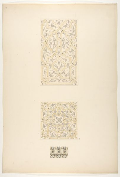
drawing, mixed-media, ink
#
drawing
#
mixed-media
#
reduced colour palette
#
muted colour palette
#
ink
#
geometric
#
decorative-art
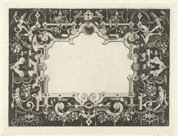
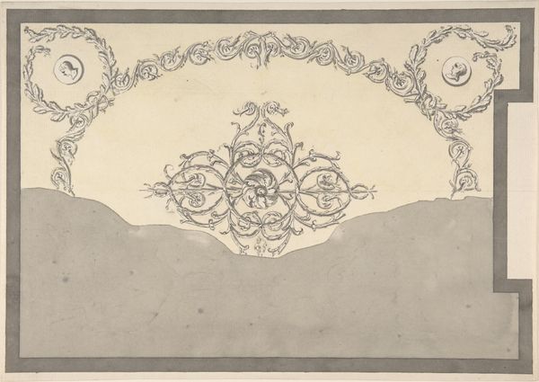
Dimensions: height 552 mm, width 363 mm
Copyright: Rijks Museum: Open Domain
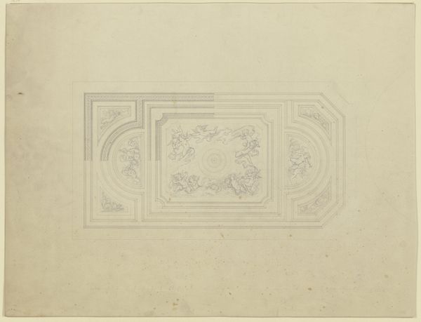
Editor: So, we're looking at "Gedamascineerd ijzeren kast voor een pendule", made around 1860-1880 by Plácido Zuloaga, using mixed media with ink. The stylized presentation, stark color choices, and use of geometry give it a distinctly decorative feel. What draws your eye when you look at it? Curator: Initially, the work compels one to analyze the balance inherent in its composition. Consider the interplay between the geometric rigidity of the frame and the flowing arabesques contained within. Does the tension resolve itself, or is there a deliberate discordance? Editor: I see what you mean, it’s almost like two opposing forces on one picture plane! How does the color contribute to this interplay? Curator: Observe how the reduced color palette focuses attention on the formal arrangement. The stark contrast between the black ground and the gold and white ornamentation accentuates the surface qualities. Note also the areas where the design appears incomplete, revealing the underlying structure. Editor: It's fascinating how those incomplete sections offer insights into the artist's process. Would you consider that revealing the underlayer as being structurally significant to understanding Zuloaga's overall composition? Curator: Precisely. These “unfinished” sections function as a visual deconstruction, exposing the framework upon which the final, decorative layers are built. In a sense, they lay bare the structural underpinnings of the artwork. Editor: This makes me wonder if Zuloaga was less interested in the aesthetic harmony and more in the mechanical, almost blueprint-like, features of the image itself. Curator: That is a valid assessment, which invites discourse. Consider, too, the implications of displaying what would typically remain concealed. The artist appears to value process and construction, placing them on equal footing with the finished product. Editor: That’s a completely different way of considering this piece than how I came into this. Thanks for that insight! Curator: And thank you for your astute observations! The dialogue between intention and perception is at the very heart of formal analysis.
Comments
No comments
Be the first to comment and join the conversation on the ultimate creative platform.
More like this