drawing, textile, paper, ink
#
drawing
#
contemporary
#
script typography
#
hand-lettering
#
lettering
#
playful lettering
#
hand drawn type
#
hand lettering
#
textile
#
paper
#
ink
#
hand-drawn typeface
#
typography style
#
handwritten font
#
calligraphy
#
small lettering
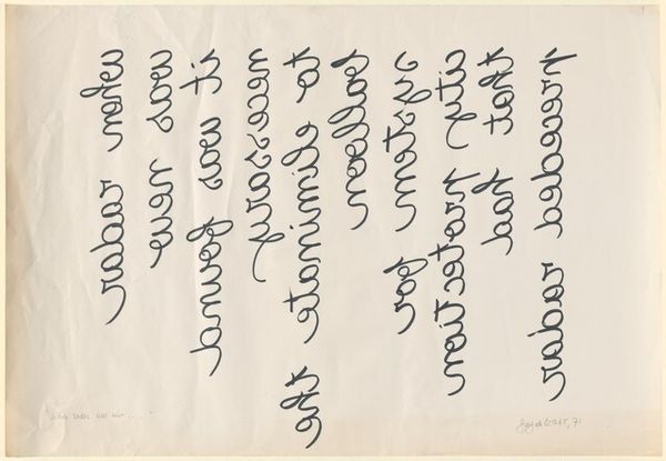
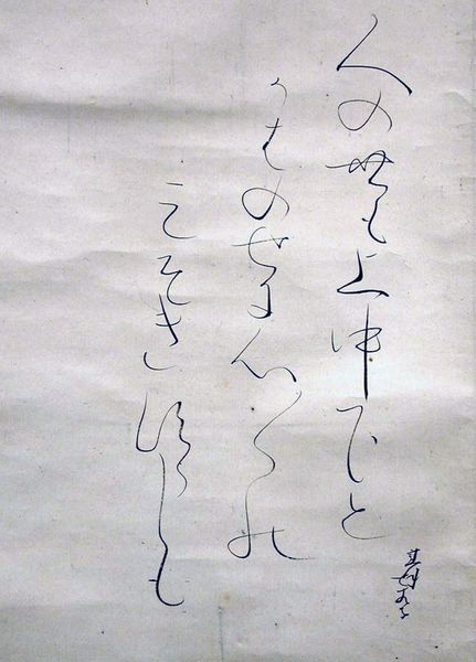
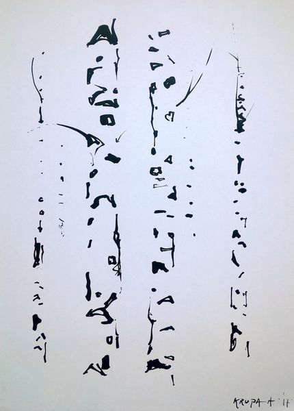
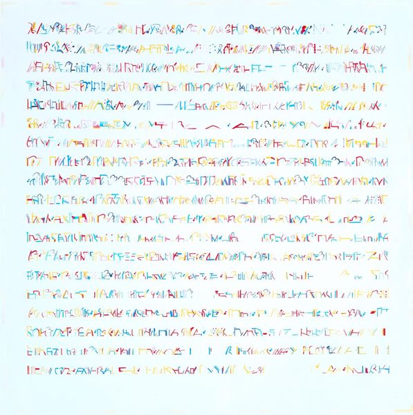
Copyright: Alevtyna Kakhidze,Fair Use
Editor: Here we have Alevtyna Kakhidze's "Untitled. Strawberry Andreevna," created in 2019 using ink on paper, or perhaps textile. The spidery handwriting gives it a very personal, almost diary-like quality. What strikes you when you look at this work? Curator: The initial point of entry lies in the relationship between the stark black lettering and the neutral ground, seemingly paper. Consider the composition – the words are arranged almost asymmetrically, guiding the eye downwards in a cascade of script. The strokes themselves are not uniform, betraying the hand's inherent tremor and idiosyncrasies. This introduces a human element that counters the inherent formality of text. Do you observe any tension arising from this contrast? Editor: Yes, I see that. It’s both deliberate and uncontrolled at the same time. The lack of embellishment almost forces you to consider the shapes and weight of each character. Is the focus on the visual form of the letters the intention, would you say? Curator: Indeed. Consider the negative space created between the lines and within each letter. This isn't merely a backdrop but an active element influencing how we perceive the graphic shapes. We might deconstruct the text using semiotics to reveal layers of meaning coded within. How does the lack of color influence your understanding? Editor: Without color, the pure contrast creates a real boldness, an undeniable clarity in what is being expressed typographically. Looking at this piece reminds me that even the most basic components of visual communication like typography can carry emotional weight. Curator: Precisely. Focusing on the inherent qualities such as line, form, and composition helps appreciate the power and depth found even in the most austere artwork.
Comments
No comments
Be the first to comment and join the conversation on the ultimate creative platform.
More like this