drawing, paper, ink, pen
#
drawing
#
pen sketch
#
paper
#
ink
#
ink drawing experimentation
#
pen work
#
pen
#
post-impressionism
Copyright: Rijks Museum: Open Domain
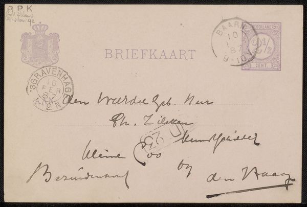
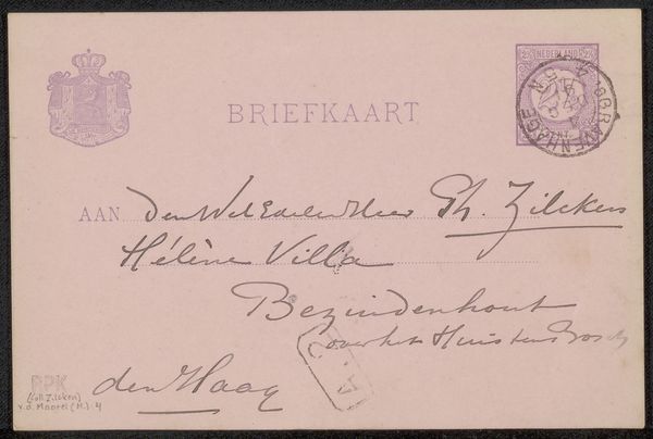
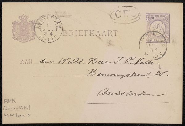
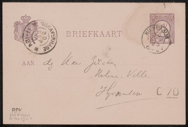
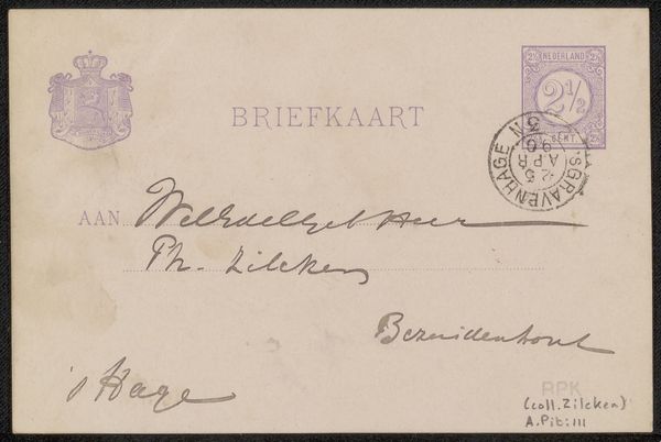
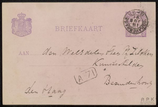
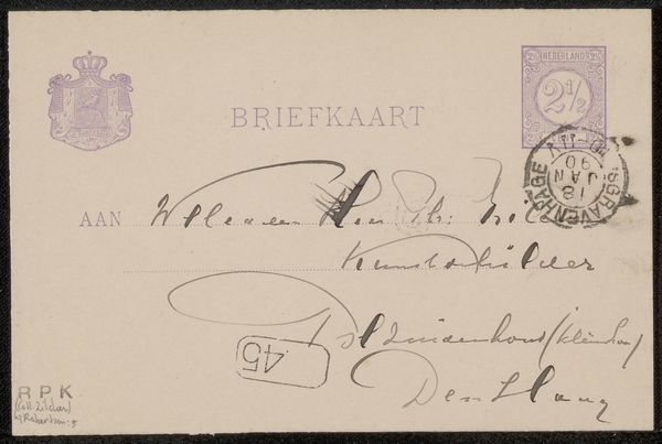
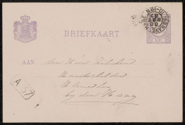
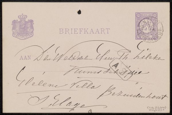
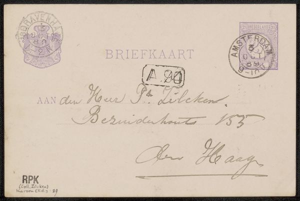
This is a postcard addressed to Philip Zilcken by Willem de Zwart, its surface a pale tableau filled with textual and symbolic forms. The layout adheres to a structured division, presenting the recipient's address balanced with official stamps and emblems, which creates a visual hierarchy reflecting the bureaucratic nature of postal communication. De Zwart employs calligraphy as a primary visual element. The handwritten script varies in pressure and rhythm, conveying a personal touch within the otherwise standardized format of the postcard. The contrast between the rigid, printed typeface of "BRIEFKAART" and the fluid, organic quality of the handwriting introduces a semiotic tension between the formal and the informal. Consider the use of colour, where the muted purple ink of the stamps and text against the off-white card evokes a sense of nostalgia. The postcard functions not merely as a means of delivering a message, but also as an artifact laden with cultural and temporal significance. Each element contributes to its complex reading.
Comments
No comments
Be the first to comment and join the conversation on the ultimate creative platform.
More like this