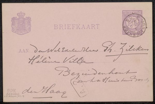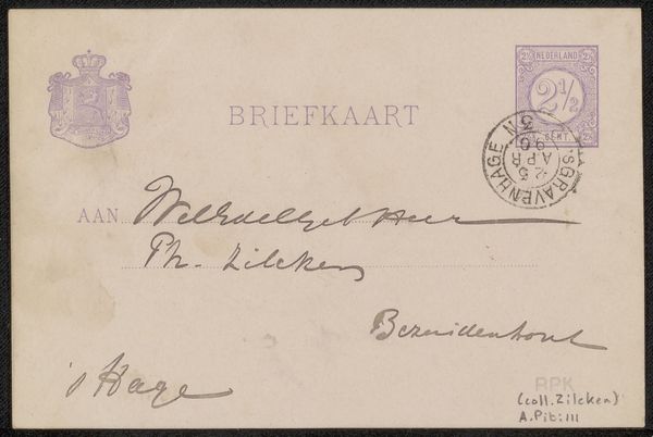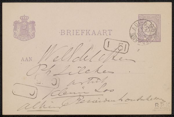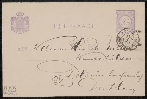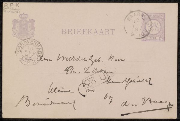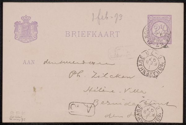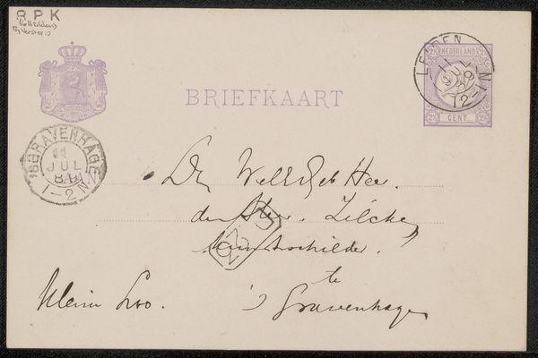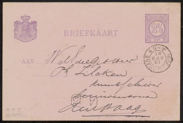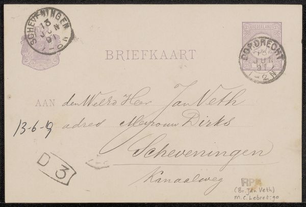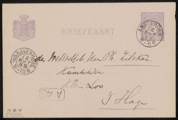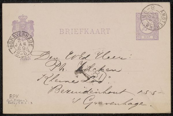
Possibly 1887
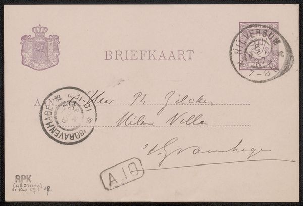
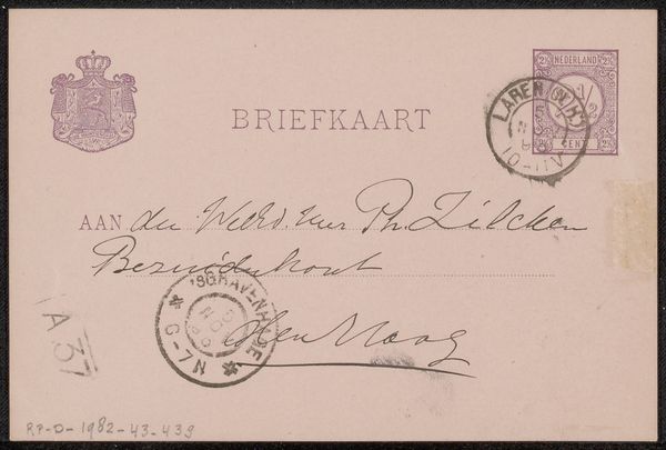
Briefkaart aan Philip Zilcken
Listen to curator's interpretation
Curatorial notes
Curator: Here we have Barbara Elisabeth van Houten's "Briefkaart aan Philip Zilcken," thought to be from around 1887. My first impression is that of quiet intimacy. Editor: The thinness of the paper, visible texture, suggests something precious, but everyday—an artifact handled so many times. What can you tell me about the postal system's materials and what sort of connection this represented? Curator: On the symbolic level, a correspondence of this kind suggests a vital need to be connected. Envelopes bear the marks of authority—the royal seal, postage—which lends the missive both importance and official approval. This suggests something of its significance at the time, both legal and emotional. Editor: Right, and let's not overlook how the postal system was one of the great facilitators of industrial capitalism. Looking at how van Houten addressed the envelope by hand – with carefully chosen ink – it reveals labor beyond simple artistic expression. Think about the time, care, and physical effort that went into creating the handwriting and sending it out to deliver the message. Curator: Precisely, and the very act of inscription bears its own significance, no? A sort of ritual imbued into language. You have the formal "Briefkaart" at the top, but the more personal, handwritten details that follow create a powerful tension between public declaration and private sentiment. Editor: I find that material connection utterly fascinating. What type of paper did she have available and what dictated her material choice in the first place? Curator: Indeed, the choice of materials tells a story too. Perhaps lighter stock allowed for efficient processing. Yet even its thinness suggests vulnerability and impermanence as opposed to a sturdier material like board stock which sends messages about permanence, wealth, or greater symbolic gravitas. The interplay is endless. Editor: In a way, that very fragility reminds us of our fleeting moments in history. Each mark contains not just her intent but also something of her culture, accessible and immediate. Curator: Precisely. It's remarkable how this piece offers up a time capsule of intertwined realities of materiality, emotional symbols and cultural echoes, making history touchable. Editor: A little bit of a past. Precisely so.