Copyright: CC0 1.0
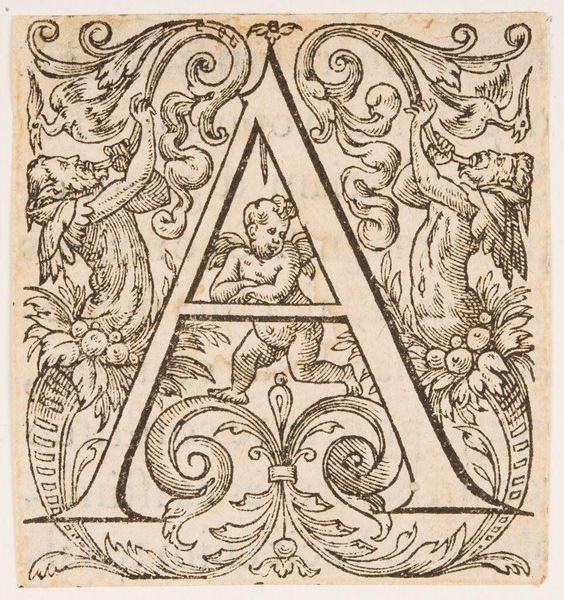
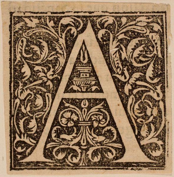
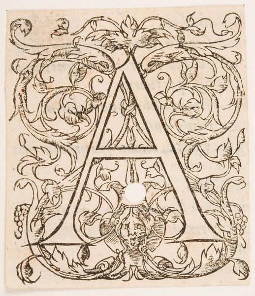
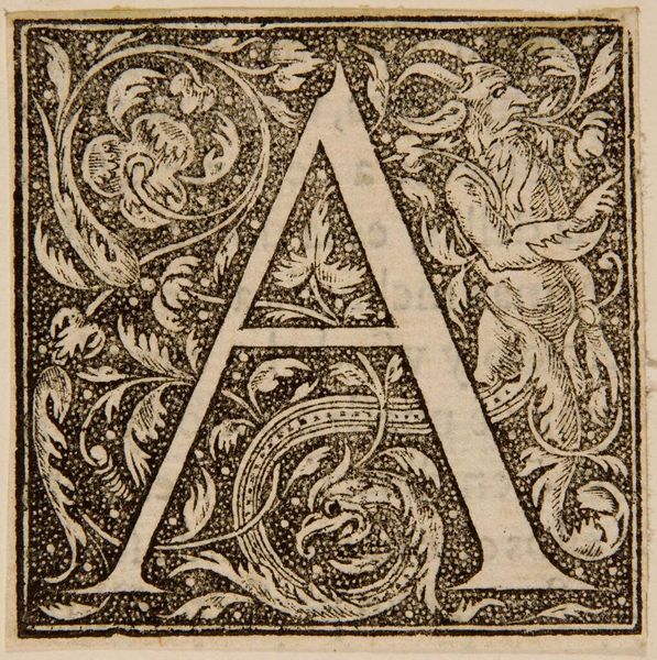
Editor: This is "Letter A," an anonymous piece from the Harvard Art Museums. I'm immediately struck by its elaborate design within such a small space. What formal elements stand out to you? Curator: Note how the rigid geometry of the letter 'A' is counterpointed by the organic, curvilinear forms that surround it. The tension created by this juxtaposition is further amplified by the stark contrast of black ink on the off-white paper. Do you perceive a deliberate visual hierarchy? Editor: Yes, the 'A' commands attention, but the eye also wanders to the cherubic figure nestled within the letter's apex and the stylized birds. I wonder about the artist's intention. Curator: Perhaps less about intention and more about the visual relationships at play. The balance of positive and negative space, the repetition of shapes—these formal considerations guide our reading of the artwork. Editor: That's insightful. Focusing on those relationships really does give a fresh perspective. Curator: Indeed. By bracketing out considerations of “meaning” and “intention,” we are better able to appreciate the intricate interplay of form and line.
Comments
No comments
Be the first to comment and join the conversation on the ultimate creative platform.
More like this