Copyright: CC0 1.0
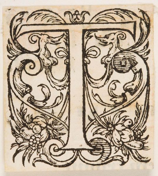
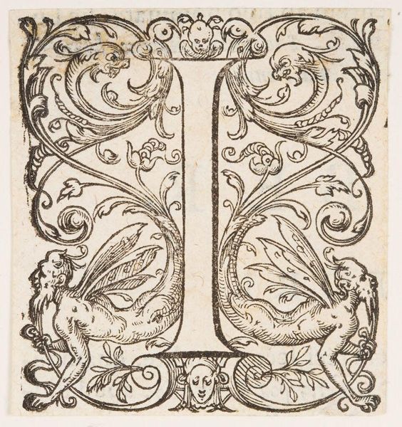
Editor: So, this is "Letter T" by an anonymous artist, currently held at the Harvard Art Museums. I’m struck by the intricate details of the figures interwoven with the letterform. What compositional elements stand out to you? Curator: Note the symmetry at play. The "T" acts as a central armature, around which mythical figures and foliage are mirrored. The artist uses line to create depth and texture, inviting a close reading of its graphic qualities. How does this structured design affect your perception? Editor: The symmetry creates a sense of balance and harmony, I think. What do you take away from the artist's use of symbolism? Curator: Indeed. Formally, the decorative elements enhance the legibility of the letter, but also contribute to a visually engaging surface. The lack of color directs our attention to the intricacies of the line work itself. Editor: I hadn't thought about that, thanks! Curator: It's a pleasure. The structural elegance of this piece is quite captivating, isn't it?
Comments
No comments
Be the first to comment and join the conversation on the ultimate creative platform.