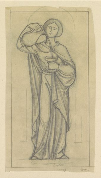
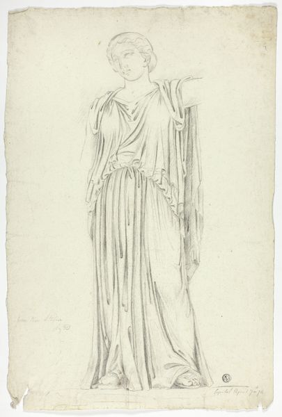
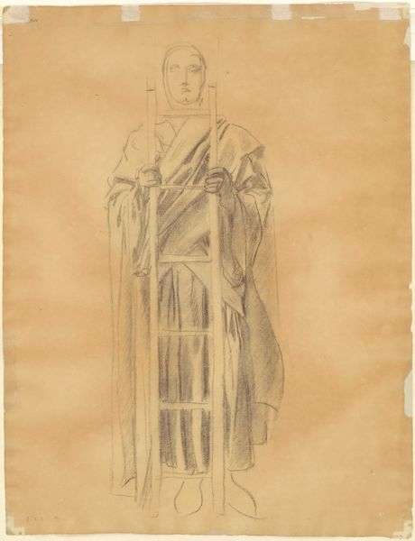
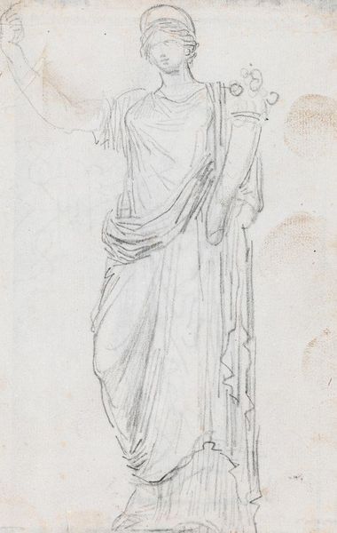
Ontwerp voor wandschildering in de Beurs van Berlage: De Kracht 1869 - 1925
0:00
0:00
drawing, pencil
#
portrait
#
drawing
#
pencil sketch
#
figuration
#
pencil
#
academic-art
Dimensions: height 229 mm, width 100 mm
Copyright: Rijks Museum: Open Domain
Curator: The almost ethereal quality to this drawing really grabs me; it’s a pencil sketch called "Ontwerp voor wandschildering in de Beurs van Berlage: De Kracht", or "Design for a mural in the Beurs van Berlage: The Power", sketched by Antoon Derkinderen, sometime between 1869 and 1925. Editor: Power... and yet, what a quiet kind of strength is evoked here. I’m immediately struck by the figure's placid expression. She isn't flexing muscles, but something more enduring seems implied by her stance. The muted tones enhance a sense of contemplative might. Curator: Indeed, the column itself becomes a compelling symbol here, a support of sorts, of course suggesting the bedrock upon which power rests. Consider also, though, the flowing garments, reminiscent of classical antiquity; there’s a deliberate echo of idealized forms, which carried immense weight in the collective consciousness. Editor: And that echoes into the design itself; one thinks of the context. The Beurs van Berlage was conceived as a space that would consolidate national identity through commerce and culture, so deploying such visual cues in a public work such as this resonates far beyond the simple image itself. Curator: Right. So, why root strength, or power, specifically to a classical symbol, with all that carries about order, stability, enduring values, and civic responsibility? And why this very pose—slightly withdrawn, gentle, almost demure? Editor: It definitely encourages discussion! Given the period, there’s a strong argument to be made here about the intended projection of Dutch society. It speaks to ideas of Dutch authority during times of great global shift and change; that search for identity through architectural and artistic symbols speaks loudly, even now. Curator: What resonates for me, beyond historical factors, is this deliberate marrying of seeming opposites – power communicated through restraint, permanence suggested with fluidity. There is tremendous sophistication here, on that emotional level. Editor: A sentiment, perhaps, we can each bring back with us. Seeing history expressed through its proposed public art offers such intimate glimpses into a society’s aspirations, then and even still now.
Comments
No comments
Be the first to comment and join the conversation on the ultimate creative platform.
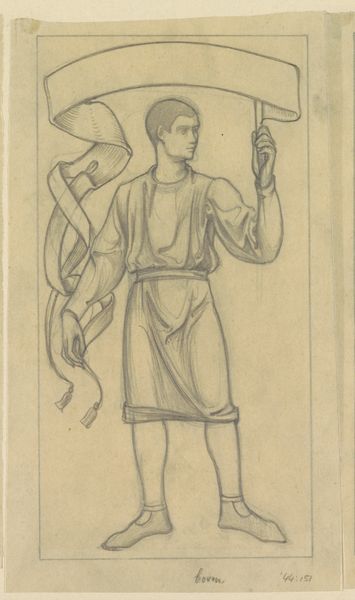
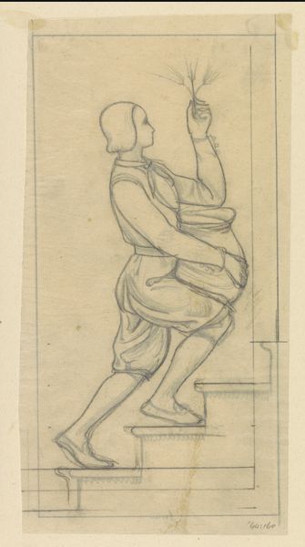
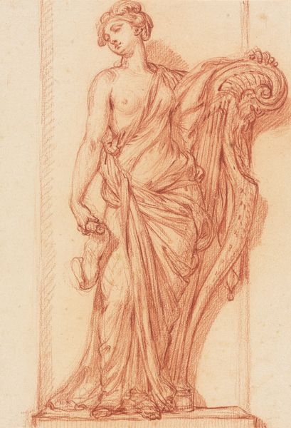
More like this