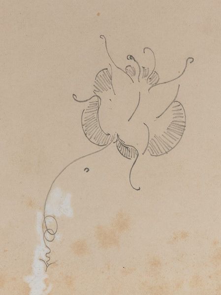
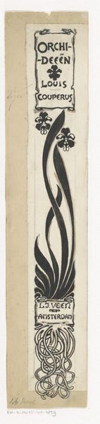
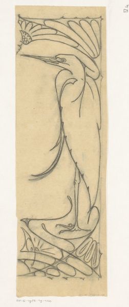
Ontwerp voor een boekrug voor: Johanna van Woude, De zeven schoonheden, 1897 before 1897
0:00
0:00
anonymous
Rijksmuseum
drawing, graphic-art, typography, poster
#
drawing
#
graphic-art
#
art-nouveau
#
hand drawn type
#
typography
#
geometric
#
line
#
decorative-art
#
poster
Dimensions: height 190 mm, width 24 mm
Copyright: Rijks Museum: Open Domain
Curator: Looking at this piece, my first thought is that it’s wonderfully delicate and precise. There's an incredible symmetry here, the way the hand-drawn typography and botanical motifs interact is captivating. Editor: Precisely! This is a design for a book spine from around 1897, titled "Ontwerp voor een boekrug voor: Johanna van Woude, De zeven schoonheden". We see the embrace of Art Nouveau in typography. Van Woude was writing at a time of rapid social change for women, so the ‘seven beauties’ is very interesting to examine through the context of Dutch societal expectations of femininity at the fin de siècle. Curator: Absolutely, the typography here, especially, is clearly a result of painstaking work. Consider the medium. This isn't mass-produced print, each letter carefully drawn and considered; what we could explore is whether this craft echoes broader ideas about the labor, perhaps of women within artistic movements like the Arts and Crafts movement which emphasized handwork and rejected industrial production. The title, even down to the printer’s location— Amst L J Veen is right there—is front and centre of the artist's vision. Editor: True. The choice of floral imagery could be read through several lenses: we could question if these flowers reinforce or subvert the representation of women at that period. The symbolism around it too cannot be overlooked. Does it act to simply adorn the author's work, or does the design hint at more about themes within Johanna van Woude's writing? What did 'beauty' signify in relation to this author and these historical conventions? Curator: And how was such a book spine achieved through specific production? There is that interesting emphasis of symmetry. Also, observe the actual materials involved, we only know it's a drawing – but thinking about the types of paper or ink informs the original reception. It reminds us that design is the sum of artistic ideas as much as industrial or handicraft execution. Editor: It’s interesting how this piece creates this intersection between aesthetics and the socio-political atmosphere back then. It speaks about challenging gender dynamics, but at the same time also provides some information about its period’s ideas. I like how examining an everyday artifact allows you to view society in that historical timeframe. Curator: It is fascinating to consider how such objects from our archives represent values associated with labour, even production! Editor: It truly opens up fascinating questions about the complex interplay between design, culture, and female representation during this pivotal historical juncture.
Comments
No comments
Be the first to comment and join the conversation on the ultimate creative platform.
More like this