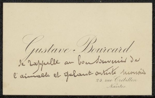
typography
#
typography
#
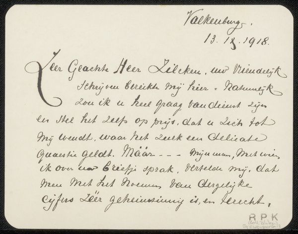
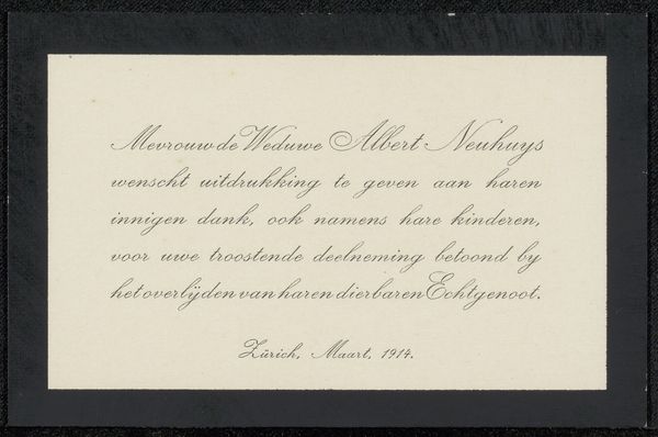
calligraphy
Copyright: Rijks Museum: Open Domain
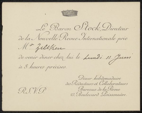
This thank you card was created in Amsterdam in June 1901, and though we don't know who made it, it was for Philip Zilcken. Look at the texture of the paper, that aged quality, and then think about the labor of love that went into making this. It's not just about the message, but the delicate, almost dance-like quality of the script. Each letter seems carefully considered, a small performance in ink. I'm particularly drawn to the flourish on the 'J' in 'Juni', it has a kind of joyful exuberance that really elevates the whole piece. Thinking about the kind of patience and control required to produce this type of writing, it reminds me of calligraphy, but there’s also something of the freehand, gestural quality you might find in Cy Twombly’s work, just in miniature! It's about the touch, the feel, the rhythm of the hand. Like all art, it reminds us of the human connection embedded in the simplest of gestures.
Comments
No comments
Be the first to comment and join the conversation on the ultimate creative platform.
More like this