Copyright: Modern Artists: Artvee
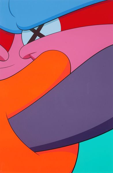
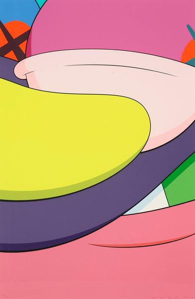
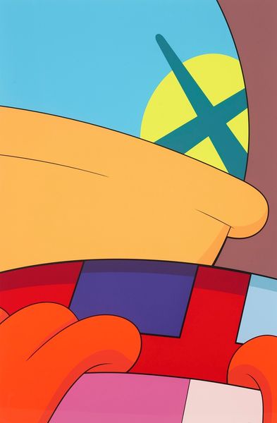
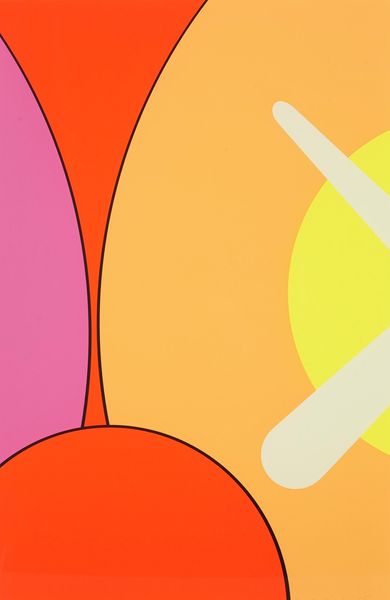
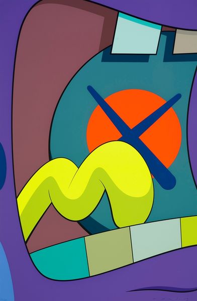
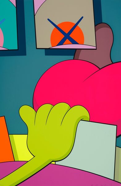
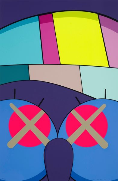
This is KAWS' "No Reply #10," and what strikes me first is the flatness of the color. These bright, bold shapes feel as if they were born digitally and then carefully translated into paint. Look at the edge of the orange form, how it presses up against the white. The thick black outlines create a graphic punch, flattening the space and making it almost impossible to tell what's in front of what. This hard-edged precision is kind of mesmerizing. KAWS often uses cartoonish imagery and I think here the tradition of Pop Art and artists like Warhol are a clear reference. But while Warhol used repetition and mass production to question originality, KAWS' work often plays with appropriation, inviting us to think about how images circulate and how their meanings shift when they are taken out of context. Ultimately, the artwork becomes a place of dialogue and exchange, not a place of definitive answers.
Comments
No comments
Be the first to comment and join the conversation on the ultimate creative platform.
More like this