Copyright: Modern Artists: Artvee
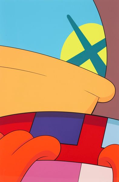
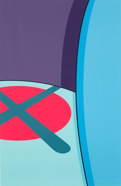
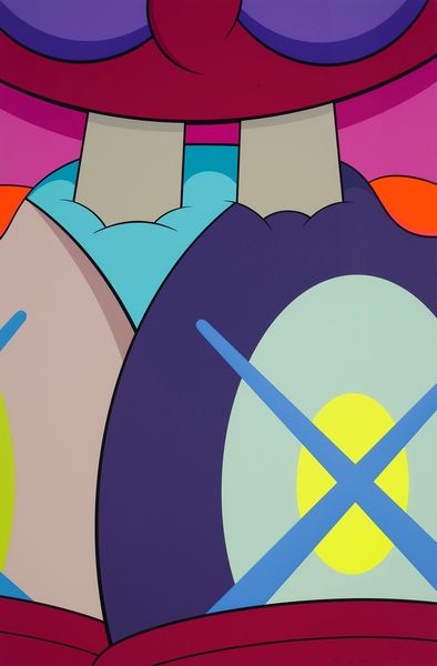
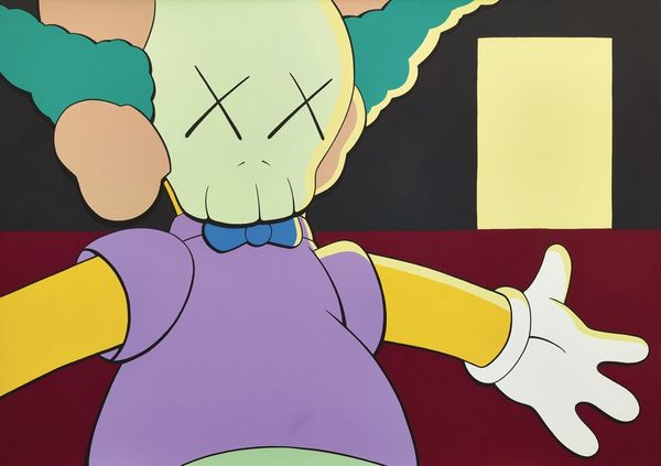
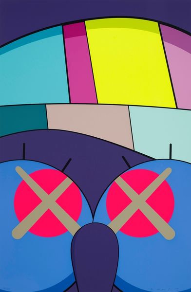
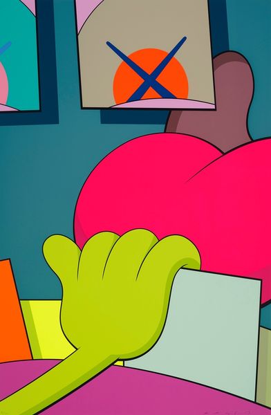
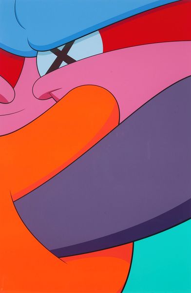
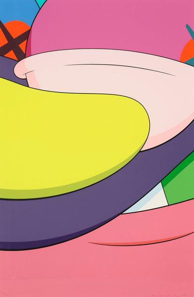
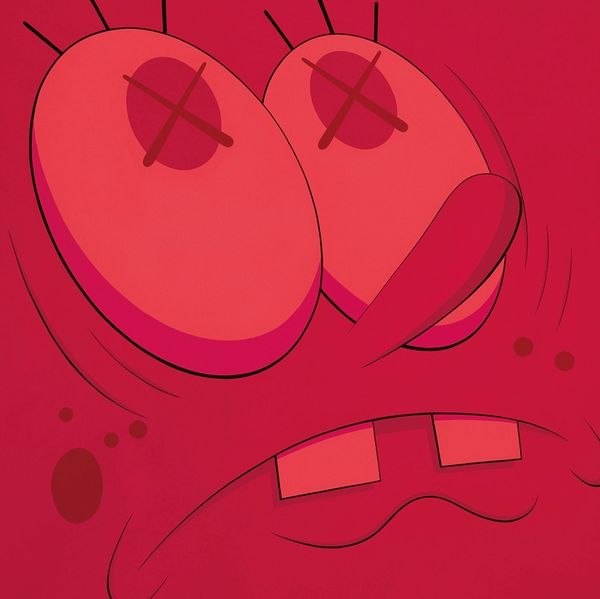
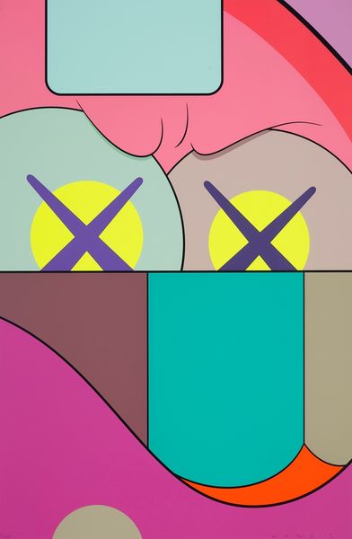
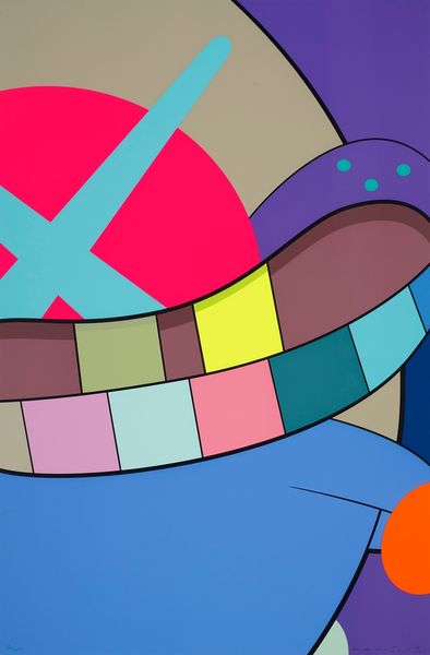
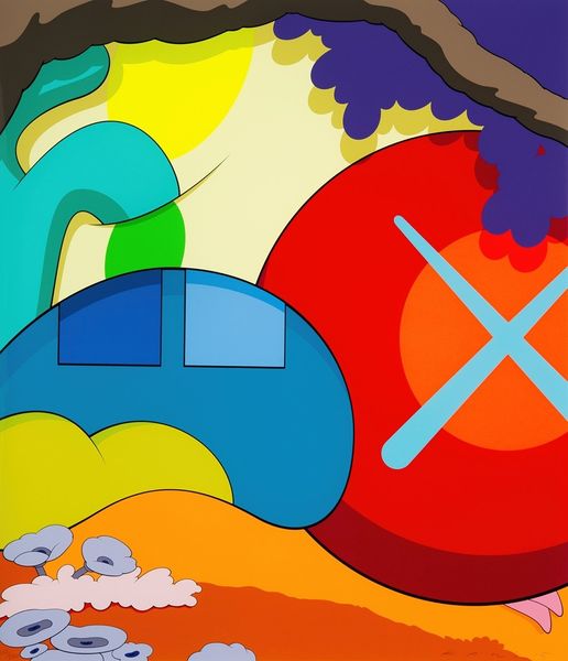
Kaws, who was born in 1974, made this screenprint called Ups And Downs #2, and it’s not dated. It's like he’s playing with our senses using flat, bold color blocks and crisp lines to create something both familiar and totally strange. This feels like an exploration of process, stripping things down to their bare bones and building them back up in a way that makes you question what you're seeing. You get a real sense of the flatness of the surface; the colors are so opaque, so deliberately placed, that it feels more like looking at a billboard than a painting. But then you notice the way the colors butt up against each other, no blending, just pure, unadulterated color. Take that X, those intersecting lines hovering over the orange circle – it’s so graphic, so decisive, it feels like a brand, a statement. It reminds me a little of Peter Saul, but where Saul's work is chaotic, Kaws is more controlled. It's all about pushing and pulling, questioning what art can be. It's a conversation, and we're all invited to join in.
Comments
No comments
Be the first to comment and join the conversation on the ultimate creative platform.
More like this