Copyright: Modern Artists: Artvee
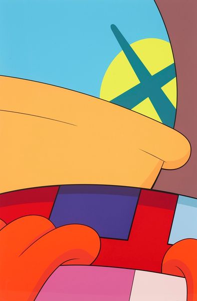
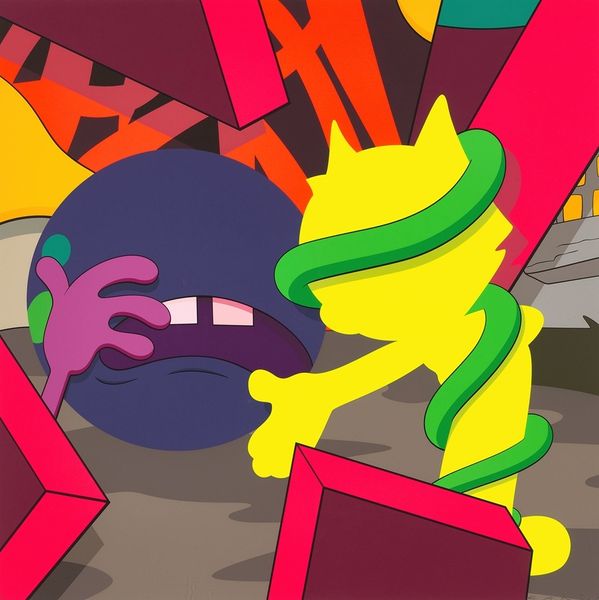
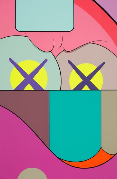
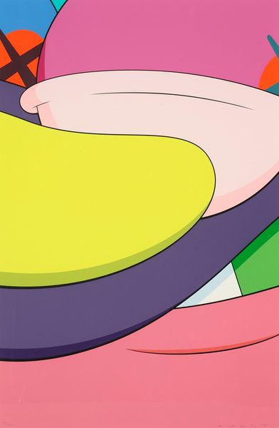
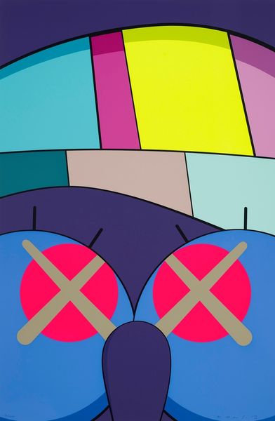
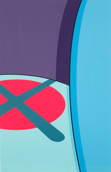
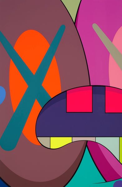
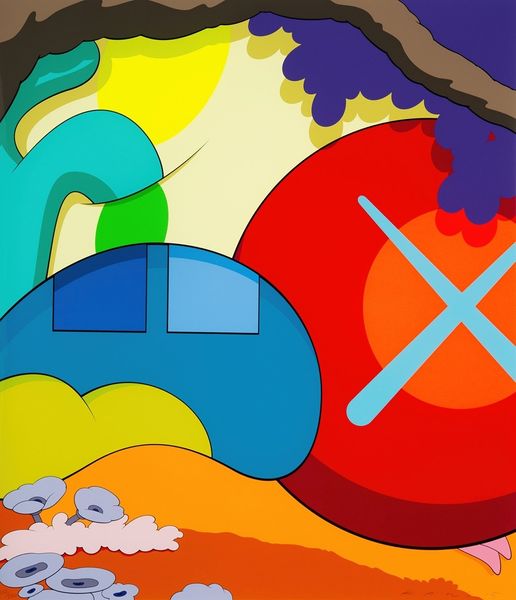
Kaws made "Ups and Downs #7," sometime around now, I guess. The bold, flat colors remind me of screen printing. There's something so immediate and graphic about them. I love how the areas of color abut each other without blending. Look at that acid green hand against the cool grey card it holds, and the hot pink form behind. It's like a masterclass in how colors can vibrate and create a feeling of depth without shading or detail. The edges are so sharp, like paper cut-outs, but those bright, clashing colors give it this wild energy. It makes me think of early Pop Art, like something by, say, Tom Wesselmann, but with Kaws’ very particular, melancholic sensibility. There's something about the simplicity of the shapes, combined with the emotional punch of the colors, that makes it stick in your mind. It's like a visual haiku - so much said with so little.
Comments
No comments
Be the first to comment and join the conversation on the ultimate creative platform.
More like this