drawing, print, paper, ink, engraving, architecture
#
drawing
# print
#
paper
#
11_renaissance
#
ink
#
italian-renaissance
#
engraving
#
architecture
Dimensions: height 278 mm, width 180 mm
Copyright: Rijks Museum: Open Domain
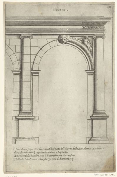
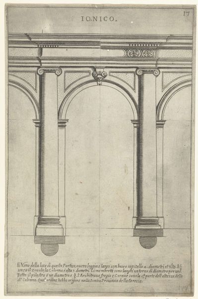
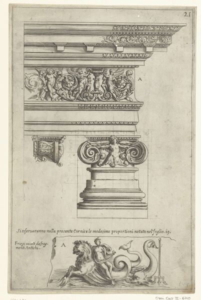
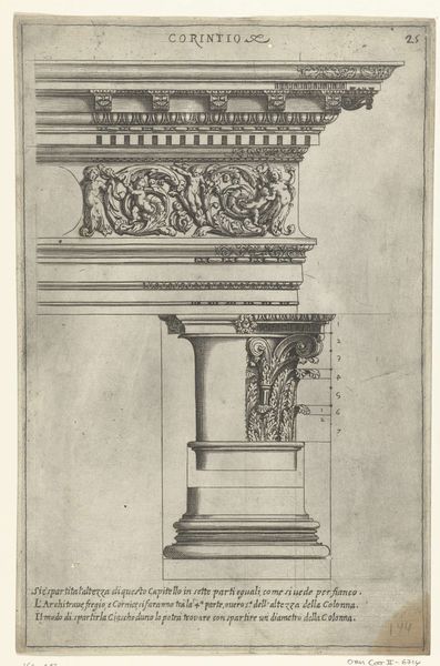
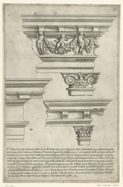
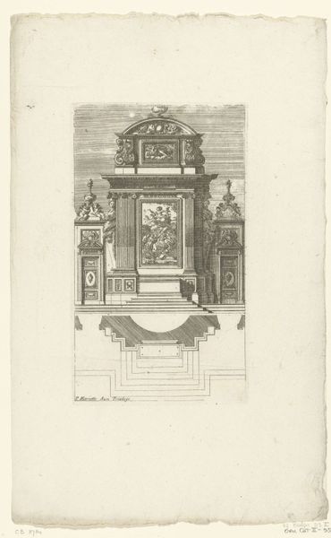
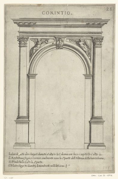
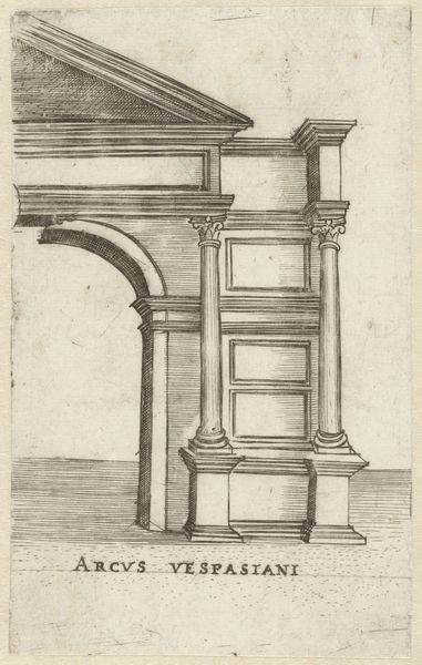
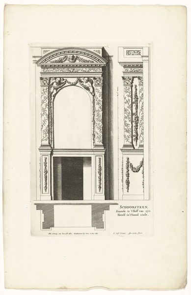
Curator: This meticulous engraving, titled "Toscaans portiek en twee details van hoofdgestel," dates back to 1636. Though the artist remains anonymous, the work is housed here at the Rijksmuseum. Its detailed lines, rendered in ink on paper, present a fascinating study of architectural form. Editor: The precision feels…clinical. It's architectural, certainly, but lacks warmth. Almost sterile in its lines. There is an intention for coldness, that I find a little concerning. Curator: Perhaps “objective” is a better descriptor? The artist isn't trying to evoke emotion, but to demonstrate structure. The meticulous detailing of the Tuscan portico, along with the two capital details, becomes a visual exploration of architectural elements and principles. Notice the rendering of light and shadow; its use constructs depth with careful application to forms. Editor: And what cultural forces might be at play here? It feels deliberately removed from social context. Renaissance ideals often manifested in civic architecture aimed at promoting harmony and the greater good. The writing on the etching suggests more than a simple artistic or architectural treatise. The columns and calculated symmetry are rendered here as part of a deliberate effort of knowledge transfer about civic virtue through public buildings, even in print form. Curator: It does operate as something of a manual. See how each component – the column, the capital, the arch – is dissected and presented almost as isolated units. Editor: Almost as if to dissect the Renaissance preoccupation with balanced harmony to expose its underlying machinery of authority? This could be critiquing power and control embedded in idealized forms, especially considering where this was printed and produced in the 17th century. The austere, technical rendering subverts traditional grandeur, inviting us to question the purpose of design within these societal structures. Curator: A provocative reading! I've always appreciated the clarity with which this artist isolates elements of the Tuscan order, and provides us with what reads to me as a blueprint for classical understanding. Editor: But perhaps we also must think what is it about a society in the 17th century which is so determined to promote its design to such an extreme that the form lacks the life of spontaneity and becomes authoritarian. It's a balance that even a seemingly detached work such as this one hints at the power latent in design, both architecturally and societally.
Comments
No comments
Be the first to comment and join the conversation on the ultimate creative platform.
More like this