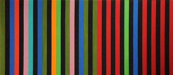
acrylic-paint
abstract-expressionism
colour-field-painting
acrylic-paint
geometric
line
modernism
Copyright: Gene Davis,Fair Use
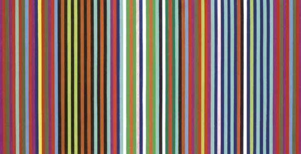
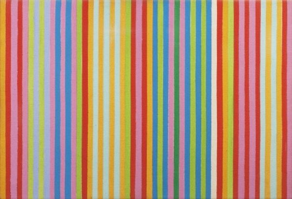
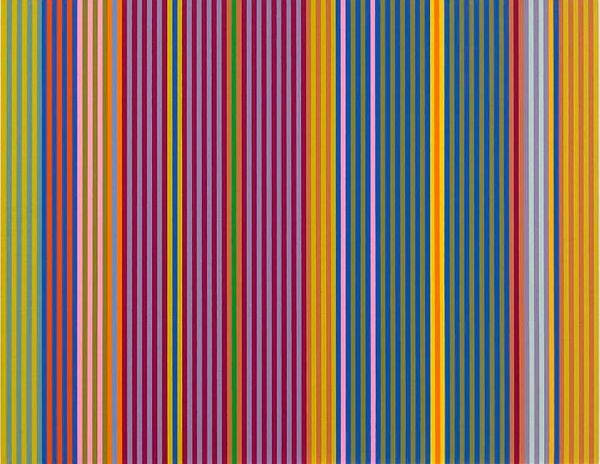
Curator: Gene Davis' "Orange Twitter," painted in 1966, presents a mesmerizing field of vibrant vertical stripes rendered in acrylic paint. The bands vary in width and color, creating a rhythmic, almost musical composition. What are your first impressions? Editor: The immediate feeling is of organized chaos, actually. It's bright, lively, but with a certain insistent quality that hints at something slightly off-kilter. The verticality and variations remind me a bit of a musical score or a series of radio frequencies, all slightly interfering with one another. Curator: The "all over" compositional method, common in Color Field Painting, certainly reinforces this sense of unified energy, doesn't it? Let's consider the production process: Davis meticulously applied these acrylic bands, demanding incredible control and an acute awareness of the paint's material properties and the support beneath. He wanted to highlight pure color and rhythm to stimulate the senses of the viewer. Editor: Yes, and these individual colors certainly contribute to the feeling I described. The orange, in the titular stripe and in others, certainly seems to grab my attention most, bringing connotations of change, energy, activity... even something more synthetic, related to production. They appear as the highlights within the mostly-cool range of the blues. Then, other spots of hot hues intermingle, breaking that harmony to communicate an industrial aesthetic. Does the name, "Orange Twitter" relate to the act of broadcasting through color? Curator: It's an interesting conjecture, as he developed this composition technique a few years after media really bloomed. Certainly, we know he wasn't adverse to such plays. What’s important for us is the physical presence of this thing: its smooth surface and flat composition serve as the support and end to itself, removing layers of painterly illusion. How do these physical decisions inform our encounter with it? Editor: Ultimately, it is what sets this apart as modernist artwork, an artwork with no hidden subtext. Still, those verticals are so direct and unambiguous. To me, the image almost feels architectural, like the painted glass façade of a skyscraper in the mid-twentieth century—optimistic, geometric, a bit utopian perhaps, if a little cold and imposing at the same time. I think Davis does not strip all the potential symbolic layers here. Curator: It's amazing how Davis takes something as basic as a vertical stripe, and through color and composition, creates this dynamic experience. To understand its place in post-war American Abstraction helps contextualize it into the American consumption boom after WWII. Editor: It gives us much to consider, and many avenues to understanding this important era. Thank you.
Comments
No comments
Be the first to comment and join the conversation on the ultimate creative platform.