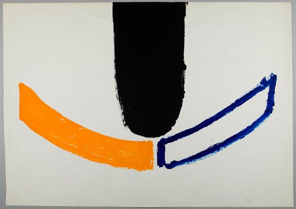
Variation II on Mauve Corner 1969
0:00
0:00
helenfrankenthaler
Albrecht-Kemper Museum of Art, Saint Joseph, MO, US
stain, acrylic-paint
#
abstract-expressionism
#
stain
#
colour-field-painting
#
acrylic-paint
#
acrylic on canvas
#
abstraction
#
modernism
Copyright: Helen Frankenthaler,Fair Use
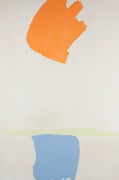
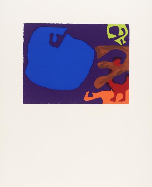
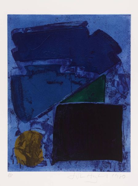
Helen Frankenthaler made this print, Variation II on Mauve Corner, using lithography, and you can really see how she treats the medium like paint. The way she blots and stains the paper makes it feel immediate, like an action. Look at that big blue shape; it dominates, but it's not aggressive. The color soaks into the paper, and you can almost feel the fibers drinking it up. Then there are the smaller marks, like the little green smudge near the bottom. It’s like a tiny counterpoint to the big blue, a little spark of life. And that orange? It’s so subtle, just a whisper. Frankenthaler’s work reminds me a lot of Joan Mitchell. They both had this incredible sense of color and gesture. I think both of them are really trying to push the boundaries of what painting can be, embracing the mess and the ambiguity. It’s like they’re saying, "Here’s a feeling, a moment, a question," and leaving it open for you to complete.
Comments
No comments
Be the first to comment and join the conversation on the ultimate creative platform.
More like this