Copyright: John Hoyland,Fair Use
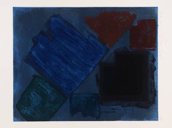
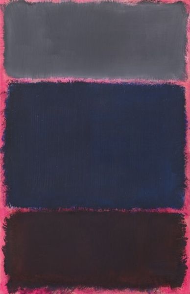
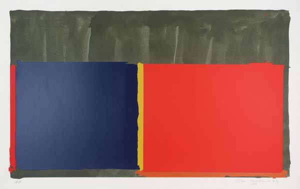
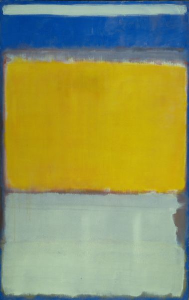
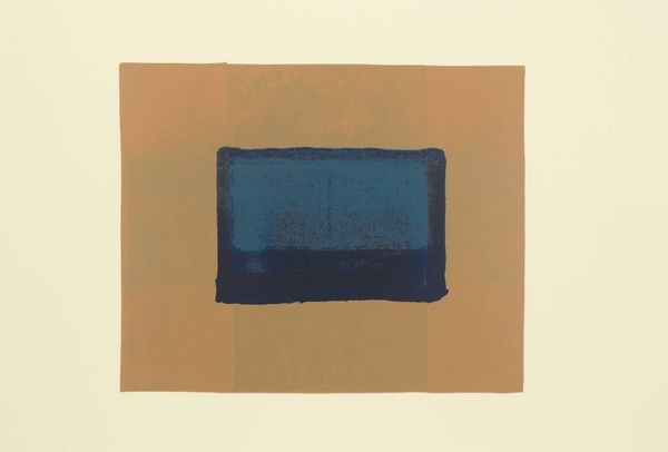
John Hoyland made 'Vigil' as a print in 1980, and it’s a piece that really gets under my skin with its deep blues and blacks. It’s all about process, you can almost feel him pushing the ink around. I mean, look at the texture around the edges of those blocks of colour! The blues and purples seem to bleed into one another, creating a sense of depth. The surfaces aren’t uniform, and you get the feeling that Hoyland wasn’t trying to hide the marks of his process. My eye keeps getting drawn to the lower left corner, where that rusty red square sits—it’s so different from the cool tones everywhere else. The red anchors the piece, and the linear marks seem to vibrate against the blue. Hoyland’s use of colour reminds me a bit of Rothko, but with a more hands-on, gritty feel. He embraced the messiness of art-making, and I think that’s why his work feels so alive, even now.
Comments
No comments
Be the first to comment and join the conversation on the ultimate creative platform.
More like this