print, paper, typography, engraving
#
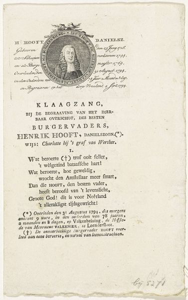
portrait
#
aged paper
#
baroque
# print
#
typeface
#
book
#
hand drawn type
#
paper
#
typography
#
fading type
#
stylized text
#
thick font
#
handwritten font
#
golden font
#
engraving
#
historical font
#
columned text
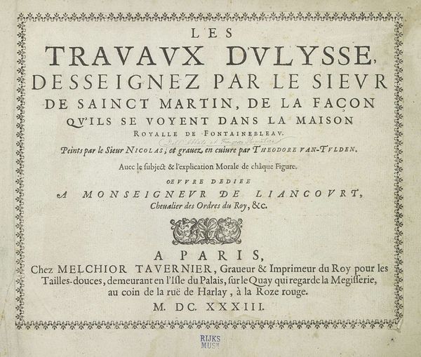
Dimensions: height 204 mm, width 261 mm
Copyright: Rijks Museum: Open Domain
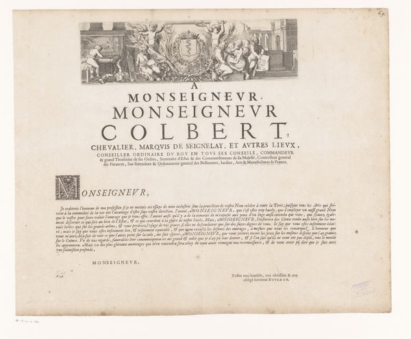
This dedication to the Duke of Liancourt, crafted by Melchior Tavernier, showcases a world of symbolic communication through typography. The elaborate letter 'M' at the beginning, framed by foliage, echoes the classical acanthus leaf, symbolizing immortality and regeneration. This motif harkens back to ancient Greek and Roman art, where it adorned temples and monuments, signifying enduring legacy and is here to underline the significance of the Duke's name. Across time, this symbol has recurred in various forms, from medieval manuscripts to Renaissance architecture, each time adapting to the cultural context while retaining its core essence of growth and continuity. The border comprised of repeated floral elements can be associated with prosperity and blessing. Such recurring motifs are not mere aesthetic choices, but rather echoes of a shared cultural memory, surfacing from the depths of our collective consciousness. They remind us that images possess a life of their own, traversing eras and cultures, carrying emotional and psychological weight that engages viewers on a subconscious level. This dedication is not just a piece of paper, but a vessel carrying symbols through time.
Comments
No comments
Be the first to comment and join the conversation on the ultimate creative platform.
More like this