drawing, paper, ink
#
portrait
#
drawing
#
dutch-golden-age
#
paper
#
ink
#
pen work
Copyright: Rijks Museum: Open Domain
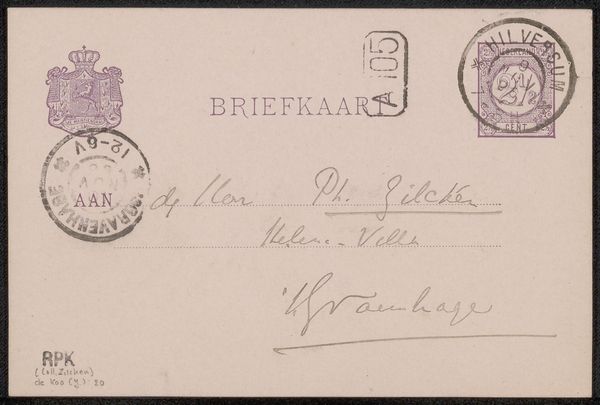
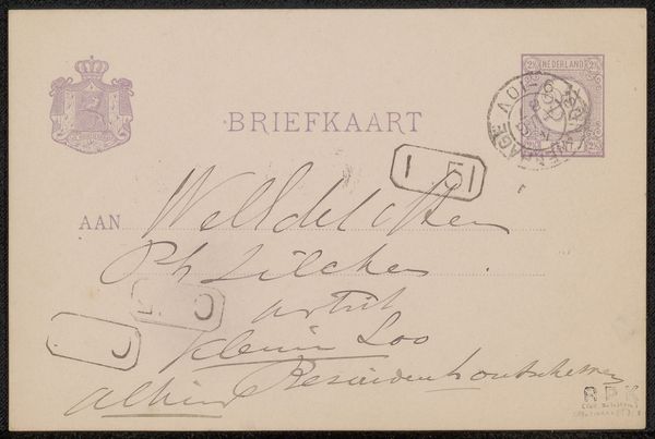
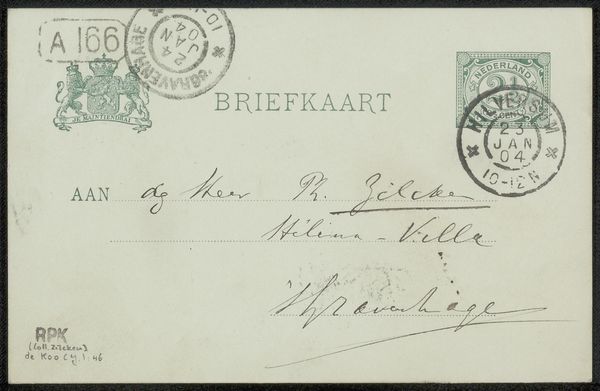
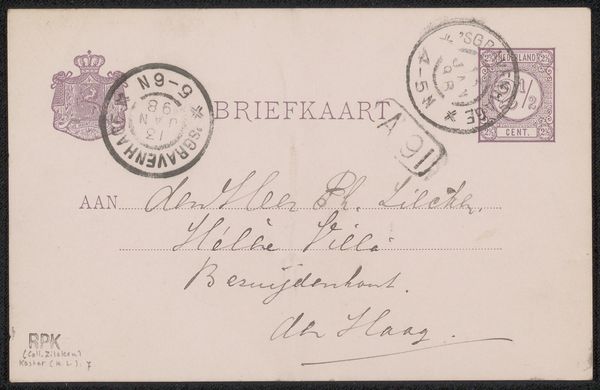
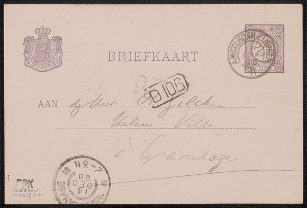
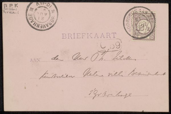
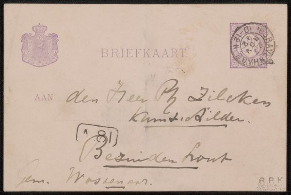
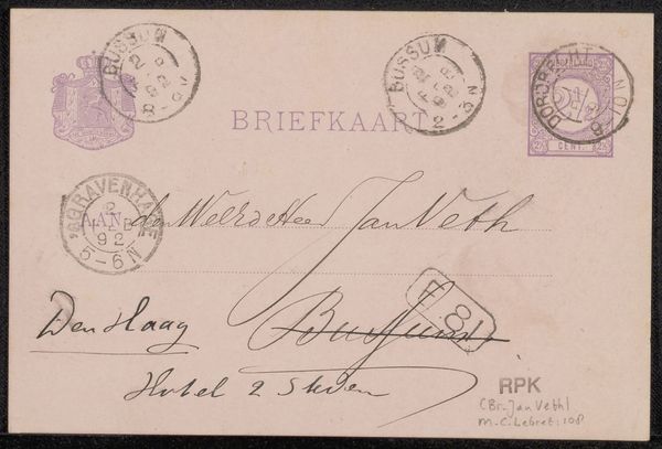
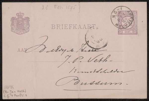
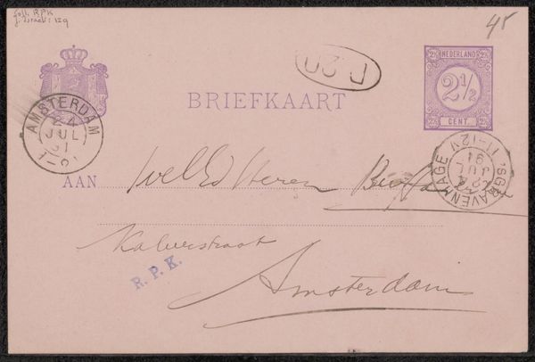
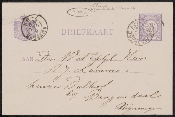
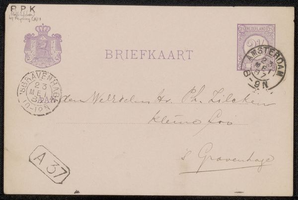
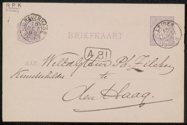
Curator: Ah, here we have something utterly charming: "Briefkaart aan Philip Zilcken," or "Postcard to Philip Zilcken." Attributed to Johannes de Koo, somewhere between 1851 and 1909. A simple ink drawing on paper. What do you make of its visual presence? Editor: Faded grandeur! It’s got that melancholic feel, you know, of things whispered across time. All these delicate stamps and scribbles, layered like echoes. I can almost smell the old paper. Curator: Precisely. Note the deliberate layout—a formal address juxtaposed with a postal system of seals, which transform the entire paper into a miniature composition. Semiotics are dancing here! It uses visual space and language in a tight dialogue. Editor: A tight dialogue indeed, although the signature is wonderfully sprawling. It feels almost subversive, like the sender is trying to escape the formality of the "BRIEFKAART" label above. It's breaking the grid. The imperfection creates space. Curator: Yes! The flourish embodies an unspoken energy. And that violet ink, particularly in the stamps, gives such an austere refinement, elevating an everyday form into… well, almost something royal. Editor: Royal and fragile at the same time. And it really evokes this pre-digital, analogue beauty... which might make me sound like an old romantic. Curator: Never! It reminds us of what gets lost, of course, as much as what has been sent. Ephemerality cast in ink... lovely. Thank you! Editor: And thank you! Seeing the mundane elevated into the sublime? It’s postcards like these that really keep us searching for something deeper in the simple things.
Comments
No comments
Be the first to comment and join the conversation on the ultimate creative platform.
More like this