drawing, paper, ink, pen
#
drawing
#
hand-lettering
#
hand drawn type
#
hand lettering
#
paper
#
personal sketchbook
#
ink
#
hand-drawn typeface
#
ink drawing experimentation
#
pen-ink sketch
#
pen work
#
sketchbook drawing
#
pen
#
sketchbook art
Copyright: Rijks Museum: Open Domain
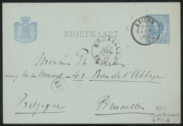
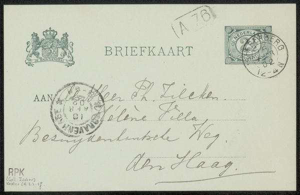
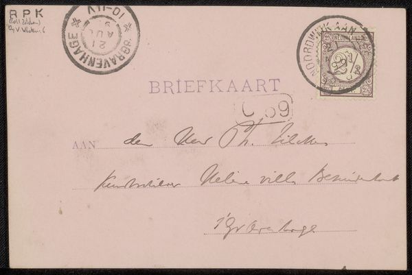
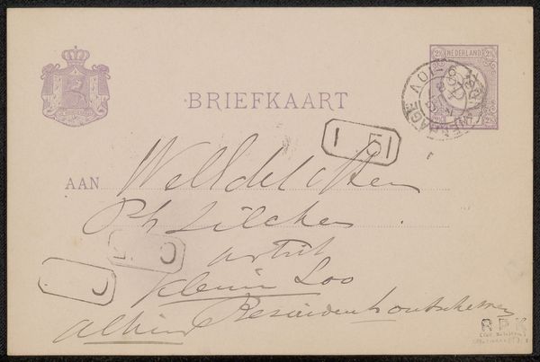
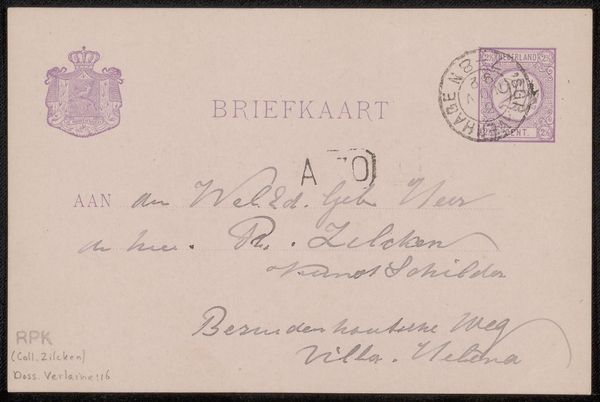
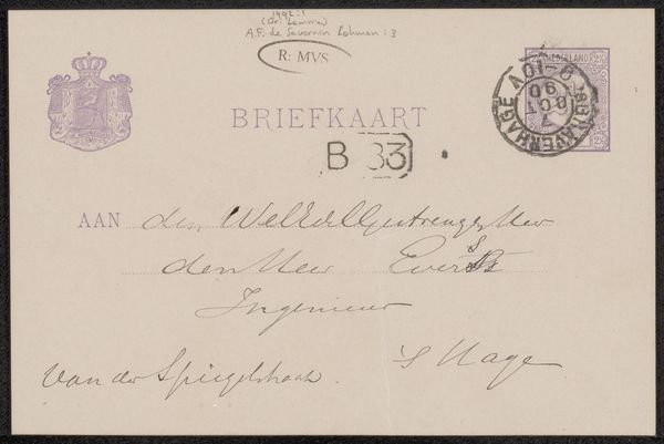
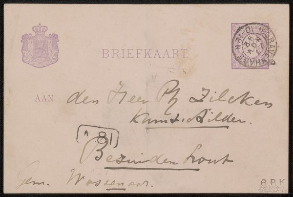
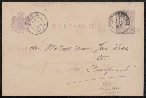
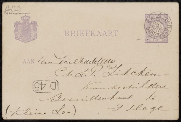
Curator: Welcome. Today, we'll be examining "Briefkaart aan Philip Zilcken" by Johannes de Koo, potentially from 1904. It’s crafted with pen and ink on paper, presenting an interesting glimpse into personal correspondence of the period. Editor: My first impression? There is something really visually arresting about the graphic composition, specifically the stark juxtaposition between the mechanical precision of the stamps and printed text, and the raw, freehand script of the personal note. It projects a sense of restrained formality, perhaps hinting at the societal conventions surrounding communication. Curator: Exactly. Observe how the printed elements – the postage stamp, the postal marks – establish a grid-like structure, a plane that anchors the gestural freedom of de Koo's handwriting. This creates a subtle but palpable tension, where control and expressiveness meet. It speaks to the deliberate arrangement of the various elements of a standardized format of personal exchange at the turn of the century. Editor: Yes, and if we unpack that, we see these printed elements not as neutral, but as state-sanctioned technologies that were rapidly changing patterns of intimacy, of accessibility, of civic duty at this moment. To then render personal script atop of it adds an undeniably human, and often rebellious element of imperfection. How did people navigate these expectations of what a letter *should* be? This provides an important insight into class and personal relationship. Curator: Quite so. De Koo’s careful placement of the written address relative to the pre-printed "BRIEFKAART" shows, perhaps unconsciously, how individuals engage with these prescribed forms. The graphic hierarchy in terms of letter weight establishes clear relationships. It is legible. It adheres to societal demands for order. The entire artifact can be appreciated as a delicate semiotic ecosystem. Editor: Moreover, beyond this composition is de Koo’s decision to *use* the technology of mass-printed postage at all, placing him in a social web of power, access and global communication. Who were de Koo and Philip Zilcken in relation to one another, and what does this choice say about that status dynamic? The very fact that the work survives today indicates the privileged circles they both likely moved in, as it allowed the conservation of ephemeral objects that others of their time could not have accomplished. Curator: Precisely, all these relationships point back to form. It’s the materiality and arrangement which prompt our investigation into the social narratives you’ve laid out. By recognizing the structured organization, we begin to decode its broader cultural implications. Editor: Well, both approaches have illuminated how historical forms shaped individual expression and continue to influence social exchanges. I’ll certainly be thinking about how each seemingly banal message is wrapped up in identity and politics. Curator: Indeed, by focusing on how the artist shaped and designed his card, we are brought into a richer comprehension of his artistic choices.
Comments
No comments
Be the first to comment and join the conversation on the ultimate creative platform.
More like this