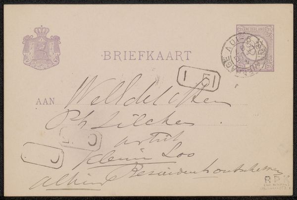
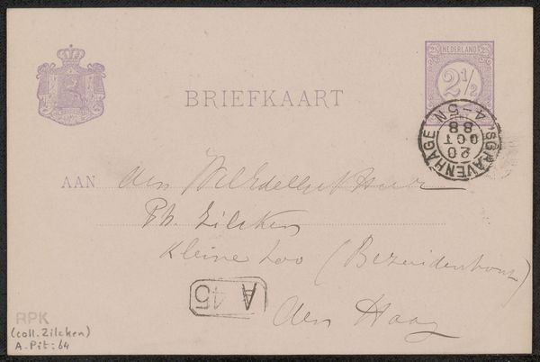
drawing, paper, ink, pen
#
drawing
#
script typography
#
hand-lettering
#
hand drawn type
#
hand lettering
#
paper
#
personal sketchbook
#
ink
#
hand-drawn typeface
#
pen-ink sketch
#
pen work
#
sketchbook drawing
#
pen
#
post-impressionism
#
sketchbook art
Copyright: Rijks Museum: Open Domain
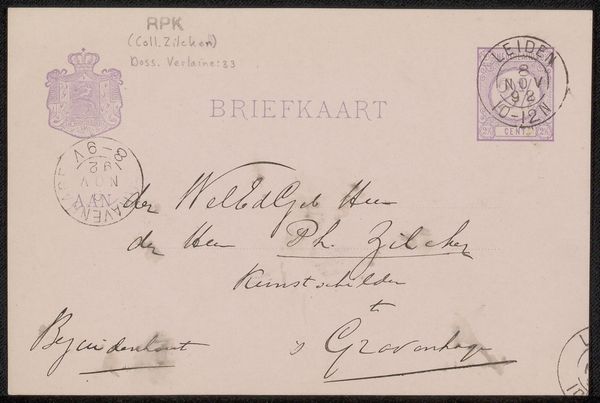
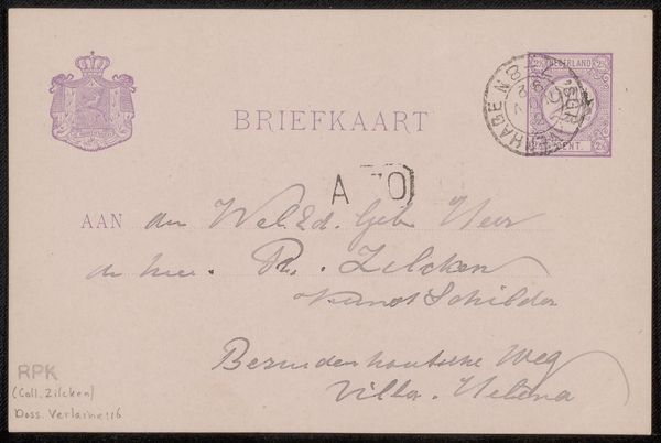
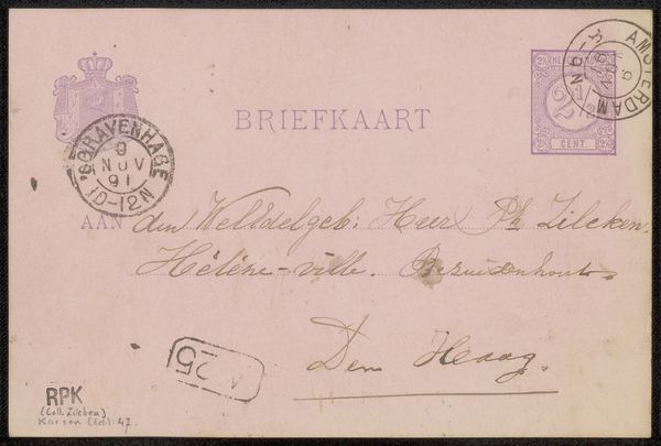
Curator: This is "Briefkaart aan Philip Zilcken," a drawing potentially from 1888 by Floris Verster, rendered in ink on paper. What strikes you initially? Editor: The calligraphy is captivating. The letterforms dance across the paper with incredible fluidity. The variations in line weight—thin hairlines versus bold curves—create a visually stimulating rhythm. Curator: Verster was part of a circle of artists, critics and collectors. This postcard format was a way of participating in the public discourse of the art world, particularly at the end of the 19th century. Note the postal stamps—they become almost an integral part of the overall composition, don't they? Editor: Absolutely. The circular stamp adds another layer of texture and shape, breaking up the otherwise rigid rectangular format. It’s also a reminder that even everyday objects possess intrinsic visual interest. Curator: There's something inherently intimate about handwritten correspondence, particularly from this era. It provides insight into the personal relationships and social networks that shaped artistic production. The choice of addressee and tone certainly suggest an existing professional rapport, maybe friendship. Editor: Indeed. And structurally, the contrast between the elegant cursive address and the stenciled "BRIEFKAART" creates an interesting juxtaposition. It is both personal message and commodity. Curator: Post-Impressionist artists really started challenging our understanding of the world, blurring the boundaries between what’s deemed a traditional artwork and day-to-day material culture. Editor: Yes, and the beauty of these marks, even in something as commonplace as a postcard, highlights the formal aspects that elevate it. Curator: Exactly. I think looking at art as a reflection of social exchange really allows one to engage with its purpose. Editor: I’m more moved by the artistry itself. In Verster's deliberate handling of ink, in the relationships of positive and negative space, he makes something worth cherishing. Curator: A lovely reminder that both social history and formal qualities of art bring vital understanding. Editor: Agreed. There is meaning, and there is beauty, and they often support one another.
Comments
No comments
Be the first to comment and join the conversation on the ultimate creative platform.
More like this