Titelpagina voor: G.A. Bredero, Boertigh, amoreus, en aendachtigh groot lied-boeck, 1622 1622
0:00
0:00
graphic-art, print, typography
#
graphic-art
#
dutch-golden-age
# print
#
typography
Dimensions: height 145 mm, width 183 mm
Copyright: Rijks Museum: Open Domain
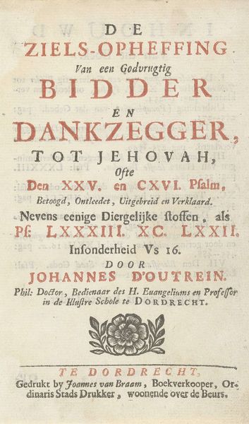
This title page for G.A. Bredero’s songbook, made in 1622 by Cornelis Lodewijcksz. van der Plasse, presents a stark interplay of form and function, typical of early modern book design. The composition is dominated by the hierarchical arrangement of text, using varied typefaces and sizes to draw the eye. Notice how the bold, larger font emphasizes Bredero's name, anchoring the design, while smaller texts provide supplementary details. This isn't merely informational; it's a deliberate construction of visual space, where each line break and font choice structures our reading experience. The page operates as a semiotic system. The use of blackletter font evokes a sense of tradition, while the overall layout suggests a rational, ordered worldview characteristic of the emerging print culture. However, the slightly uneven printing and worn texture hint at the material realities of production, reminding us of the human effort involved. The title page functions both as an advertisement and an aesthetic object. Its formal qualities signal not only the content of the book but also the values and cultural context in which it was created and consumed.
Comments
No comments
Be the first to comment and join the conversation on the ultimate creative platform.
More like this