Dimensions: 35.4 x 49 cm
Copyright: Public domain
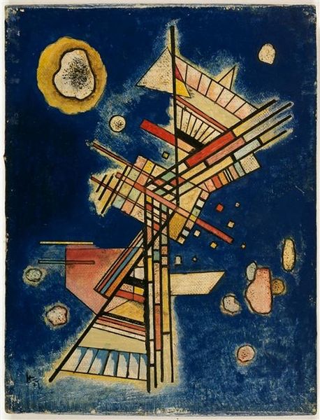
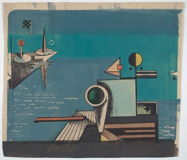
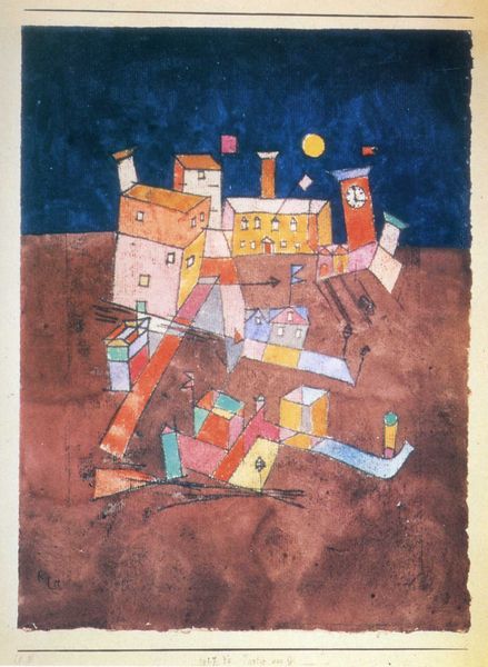
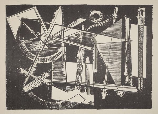
Editor: So, this is "Fragile" by Wassily Kandinsky, created in 1931 using mixed media. The cool blue background immediately gives me a sense of calm, almost like a night sky. The geometric shapes, mostly in white and silver, create a fascinating contrast. What do you see in this piece from a formalist perspective? Curator: Focusing on the intrinsic qualities of "Fragile," the composition presents a careful arrangement of geometric forms against that striking, deeply saturated blue ground. Note the precise linear elements – the stark white lines – and how they intersect with various shapes. Consider, too, how these shapes interact: circles, triangles, rectangles, positioned dynamically across the picture plane. How does this interplay of form, color, and line evoke any specific feeling, apart from the sense of calm you mentioned? Editor: Well, the overlapping and fragmented forms, especially the precarious-looking tower, suggest a sense of instability, despite the initial calming effect of the color. The title, "Fragile," definitely reinforces that feeling. Is it just the arrangement of shapes or are there other techniques at play here? Curator: Indeed, the strategic distribution of visual weight contributes significantly. Notice the density of forms concentrated around the implied horizon line, contrasted with the relative sparseness elsewhere. Examine the surface texture itself – the layering of media creates subtle variations that activate the eye. Could we analyze this visual "fragility" through a semiotic lens? What systems of signs and symbols do we see deployed in this painting's visual structure? Editor: Hmm, I guess the fragility is expressed through a sort of visual tension… like a delicate balance about to be disrupted. The shapes could almost be read as architectural elements, but they don't quite form a coherent structure. Curator: Precisely. The painting destabilizes any clear representational reading, prompting us to engage with the formal relationships and material qualities directly. It’s through these intrinsic elements that the artist communicates, bypassing the need for external narratives. It highlights a focus away from the real world and emphasizes relationships in this painting alone. Editor: That’s a great insight. Looking at it now, the forms feel much more dynamic and intentionally precarious. I've never looked at an abstract work this way before. Thank you. Curator: A close viewing makes the difference, wouldn't you agree?
Comments
No comments
Be the first to comment and join the conversation on the ultimate creative platform.
