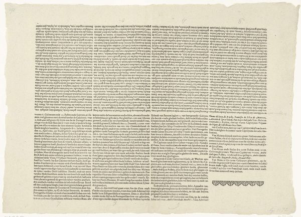
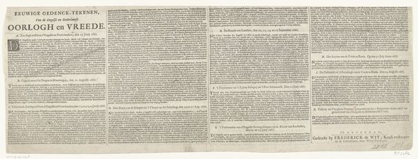
Duits tekstblad bij de voorstelling van de slag bij Nieuwpoort gecombineerd met portretten van Albrecht en Isabella met Mendoza en Maurits en Frederik Hendrik te paard voor het slagveld, 1600 1600 - 1601
0:00
0:00
lambertcornelisz
Rijksmuseum
#
script typography
#
hand drawn type
#
hand lettering
#
hand-drawn typeface
#
fading type
#
stylized text
#
thick font
#
handwritten font
#
classical type
#
small lettering
Dimensions: height 150 mm, width 955 mm
Copyright: Rijks Museum: Open Domain
Editor: This intricate German text sheet from around 1600, attributed to Lambert Cornelisz, details the Battle of Nieuwpoort alongside portraits. Its sheer density of text, like an ocean of tiny waves, feels overwhelming at first glance. What layers do you see beneath this textual battlefield? Curator: Ah, that’s precisely the feeling, isn’t it? A deluge. It reminds me of trying to decipher my grandmother’s letters – beautiful penmanship guarding secrets just out of reach. This piece, beyond being a historical record, feels almost like a coded message. What does it *mean* to painstakingly render every word in this way? Is it about the power of information, the weight of history, or perhaps even a yearning to control the narrative? Editor: The "coded message" idea resonates. It’s almost as if the sheer volume of text is meant to intimidate, to assert a kind of authority. I wonder how someone from that era would have actually interacted with this piece. Curator: Exactly! I suspect it’s less about reading every single word – though some certainly did! – and more about being *in the presence* of such knowledge. Think of it like standing before a grand library, sensing the wisdom contained within without actually needing to read every book. Do you notice the portraits juxtaposed with the battlefield scene? Editor: Yes, the contrast is striking! The controlled, almost regal portraits versus the implied chaos of battle. Curator: Precisely. It suggests a desire to impose order on chaos, to frame history within a clear, presentable narrative. Yet, the overwhelming text hints at the impossibility of truly containing it. We see it; it’s just like the battle between having perfect vision and battling to achieve perfection in the battle’s depiction. What’s captured and what’s simply alluded to? Editor: That tension between control and chaos makes it much more compelling. I initially saw it as just a historical document, but now it seems more like a meditation on the nature of history itself. Curator: Precisely! It becomes an active engagement with history rather than passively looking from the outside in.
Comments
No comments
Be the first to comment and join the conversation on the ultimate creative platform.
More like this