print, engraving
#
hand-lettering
#
dutch-golden-age
# print
#
old engraving style
#
hand lettering
#
text
#
hand-drawn typeface
#
history-painting
#
engraving
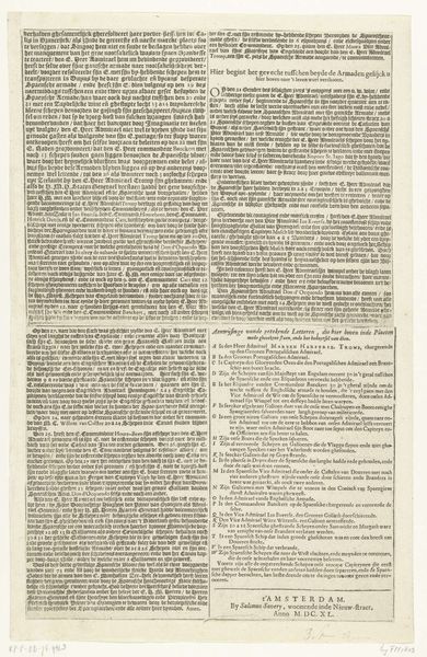
Dimensions: height 363 mm, width 210 mm
Copyright: Rijks Museum: Open Domain
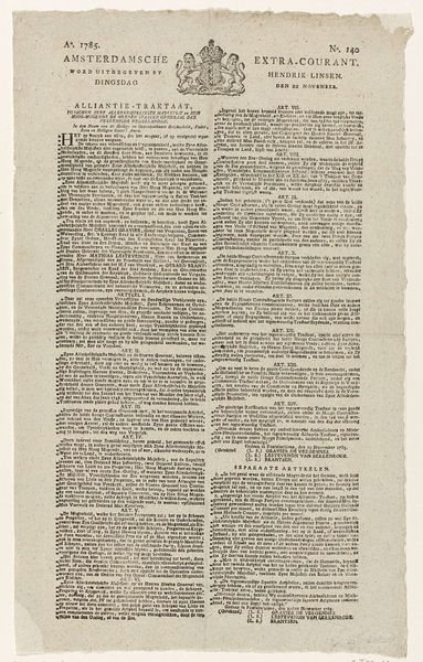
Editor: This is the “Treaty of Münster, second sheet” from 1648, created by Rombout van den Hoeye. It's an engraving, and what strikes me is just how much text is packed onto one page! How would you even begin to interpret something like this? Curator: Indeed. Before meaning, there is form. Let's examine the structure itself. Note how the dense, unbroken columns of text create a visual rhythm. Do you see how the hand-lettering itself contributes to a sense of formality, yet simultaneously reveals the individuality of the engraver's hand? The lines are crisp, precise, betraying none of the imperfections associated with gestural expression or abstract qualities. Editor: Yes, the evenness and straightness almost turn it into a pattern, even though it's writing. Is that intentional? Curator: Consider the inherent tension. The primary function is communicative, to convey the Treaty of Münster's terms. But look at it solely as a configuration of lines, shapes, and textures. The interplay between the black ink and the white paper creates visual interest, and, dare I suggest, evokes authority by its uniformity? The content, after all, cannot be separated entirely from its mode of representation. Now consider how a contemporary font might achieve similar communicative aims but to dramatically different visual affect. What might this tell you? Editor: So, the choice of engraving and hand-lettering isn’t just about the information, but also how that information is presented and received. I’ve never thought about historical documents as art before, only as historical records. Thank you. Curator: Precisely. Form illuminates function, even across centuries. Consider it not merely historical record, but artifact with deliberate compositional choices.
Comments
No comments
Be the first to comment and join the conversation on the ultimate creative platform.
More like this