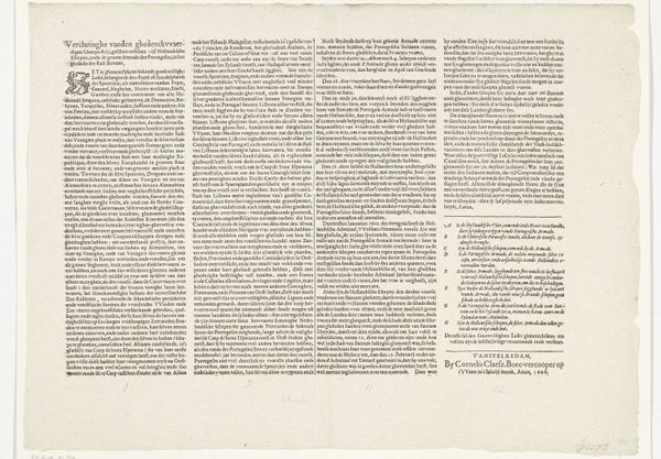
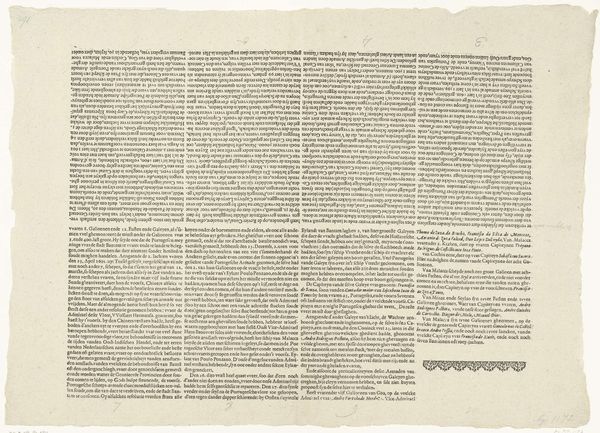
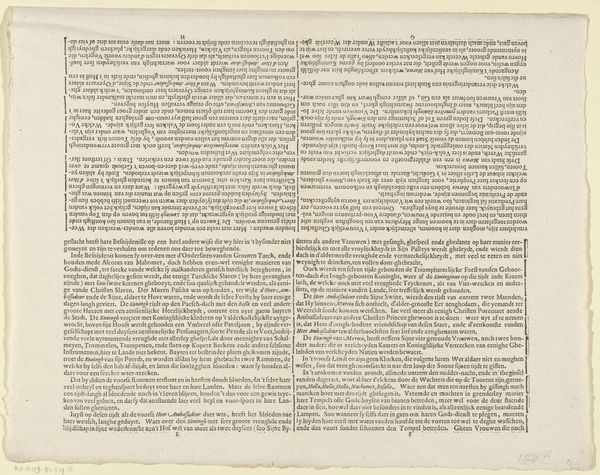
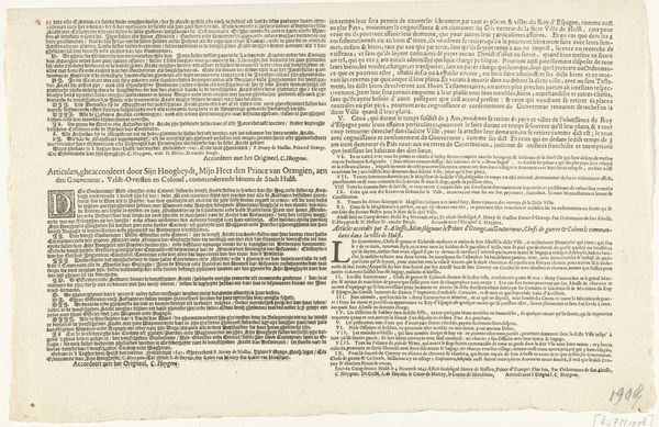
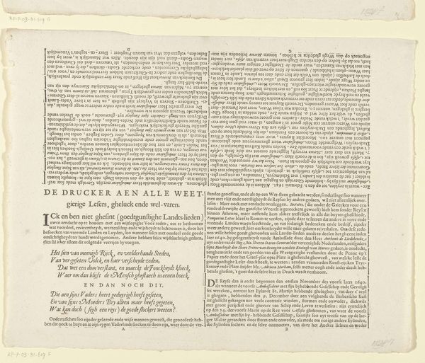
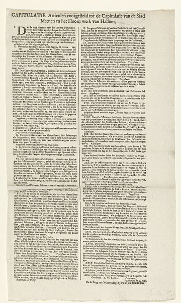
Blad met de gedrukte getuigenissen van Ruben en Jacob van der Helling inzake de slangbrandspuiten, 1697 1697
0:00
0:00
janvanderheyden
Rijksmuseum
print, paper, typography, engraving
#
portrait
#
dutch-golden-age
# print
#
paper
#
text
#
typography
#
newspaper layout
#
genre-painting
#
engraving
Dimensions: height 306 mm, width 508 mm
Copyright: Rijks Museum: Open Domain
Curator: What we're looking at here is a print from 1697 by Jan van der Heyden, currently held at the Rijksmuseum. It's entitled "Blad met de gedrukte getuigenissen van Ruben en Jacob van der Helling inzake de slangbrandspuiten," which translates to "Sheet with the printed testimonies of Ruben and Jacob van der Helling regarding hose fire extinguishers." Quite a mouthful, isn’t it? Editor: My first impression? It feels like I've stumbled upon a seventeenth-century blog post! The density of text, the straightforward presentation—it’s oddly familiar and strangely charming. The tone is informational and practical but the format feels monumental. Curator: Indeed. The text itself, engraved on paper, functions almost like a broadside, aimed at disseminating information about new technology. Specifically, these hose fire extinguishers, and their efficacy. This connects directly to van der Heyden's work not just as an artist, but as an inventor. Editor: So it’s about celebrating civic innovation through print. Is it effective in the promotion of an amazing, life-saving invention if it's also pretty ugly? What emotional impact do we assume this paper object must have had for a potential client for van der Heyden’s pumps? Is it more moving to the readership, if it's also easier on the eye? Curator: What is interesting to me is how typography plays such an important and practical role in creating both this artwork’s beauty and its functionality, considering both form and content—making art almost purely based in commerce. Editor: Right! The way those dense blocks of text are arranged creates a visual rhythm, but at the end of the day, this arrangement may feel like a practical one in order to fit the most information. I love the fact that the artist wasn't even thinking of artistic considerations. The efficiency is lovely, maybe in the absence of some other aesthetic sensibility. Curator: It underscores how art during the Dutch Golden Age was deeply entwined with commerce and civic life. What is more exciting is recognizing the labor involved and appreciating its intention more than the aesthetics. Editor: So, in a way, looking at this "sheet of testimonies" pulls us into the world of 17th-century Amsterdam: fires, innovations, and the very human need for security. And I can't think of another kind of artwork to achieve this in a similar fashion.
Comments
No comments
Be the first to comment and join the conversation on the ultimate creative platform.
More like this