Verenigde Amsterdamse Compagnie, zilveren munt ter vervanging van de Spaanse 2 realen 1601
0:00
0:00
print, metal, relief, embossing, sculpture
#
dutch-golden-age
# print
#
metal
#
sculpture
#
relief
#
embossing
#
sculpture
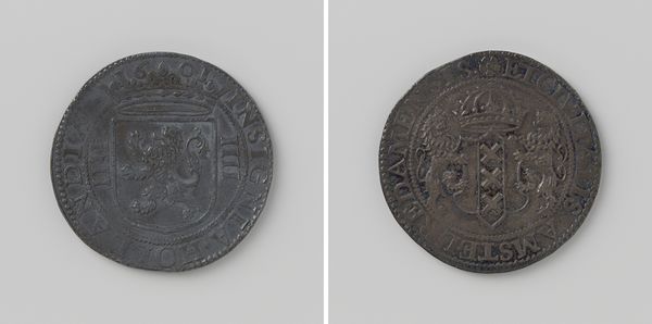
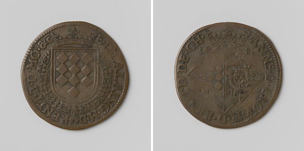
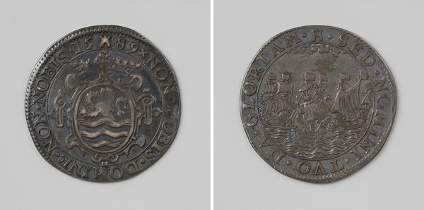
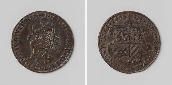
Dimensions: diameter 3 cm, weight 6.76 gr
Copyright: Rijks Museum: Open Domain
Curator: Immediately I’m struck by the sense of history; it feels like holding a piece of the past in my hand, something that’s journeyed through centuries. There’s a tangible weight to its history, don’t you think? Editor: Indeed. This piece before us is a silver coin minted in 1601 by Jacob de Jonge, commissioned by the Verenigde Amsterdamse Compagnie to supplant the then-dominant Spanish currency. Observe the circular form; its perfection is, ironically, marred by its aging, yet this adds a distinct character. Curator: That marring you mention, yes! The tarnished silver and subtle abrasions lend such authenticity; like whispers of forgotten transactions or tucked away treasures of an explorer! I see that the material itself communicates volumes before one even considers design or iconography. Editor: Precisely. The deliberate arrangement of symbolic devices operates as a formal articulation of the Dutch Republic’s economic power, using semiotic codes readily recognizable at the time. Look closely, you'll note, on one face, the heraldic lion beneath a crown, emblem of sovereignty and authority. The other, more explicitly signifies Amsterdam. Curator: It’s like a double helix—symbols woven in the structure—the lion projecting power, and Amsterdam anchoring the mercantile muscle. What stories these unassuming surfaces tell! I cannot help wonder who clutched these coins. What did they purchase, or save? Editor: Well put, my friend. The visual weight achieved through relief imbues the currency with value, exceeding its intrinsic silver content. Its circularity becomes not only aesthetic but structurally integral, conveying perpetual economic cycles. Do note, though, how simply yet effectively each emblem manifests cultural value. Curator: Agreed. Every millimeter of design appears so deliberate: that weight and shape you mention—designed for hands and for pockets—but more symbolically for pockets around the world, to establish Amsterdam as a powerful new mercantile entity! It’s like miniature propaganda, a quietly forceful projection of power, wouldn't you agree? Editor: Absolutely. These artifacts, while seemingly utilitarian, function as exquisitely compact carriers of ideology. In analyzing its reliefing or considering wear marks, this unassuming monetary artifact provides valuable perspectives on cultural exchange centuries hence. What strikes you overall? Curator: Thinking on that, one finds echoes of history—and more surprisingly a meditation that speaks to our present times! Its humble weight seems to hold within it power of trade and a quietly spoken, resilient national identity. I walk away from this artwork with that humbleness resonating within.
Comments
No comments
Be the first to comment and join the conversation on the ultimate creative platform.
More like this