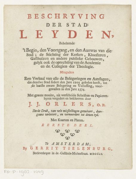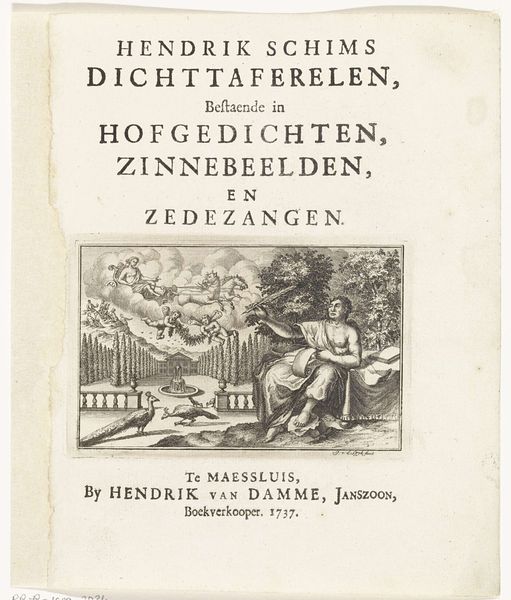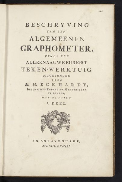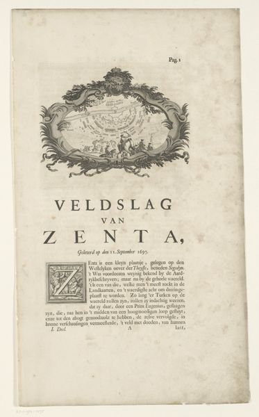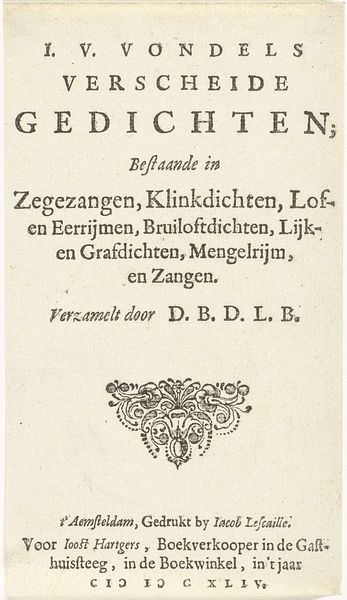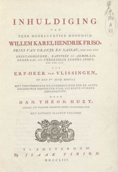
Titelpagina voor: Vervolg van aangenaame gezichten in de vermakelyke landsdouwen van Haarlem, nieuwlings naar 't leven getekend door de beroemde konstenaars H. Spilman en C.V. Noorde, 1762 1762 - 1763
0:00
0:00
januitgeverbosch
Rijksmuseum
graphic-art, print, typography, engraving
#
graphic-art
#
aged paper
#
homemade paper
#
script typography
#
dutch-golden-age
# print
#
sketch book
#
hand drawn type
#
landscape
#
personal sketchbook
#
typography
#
hand-drawn typeface
#
fading type
#
sketchbook drawing
#
sketchbook art
#
engraving
Dimensions: height 425 mm, width 268 mm
Copyright: Rijks Museum: Open Domain
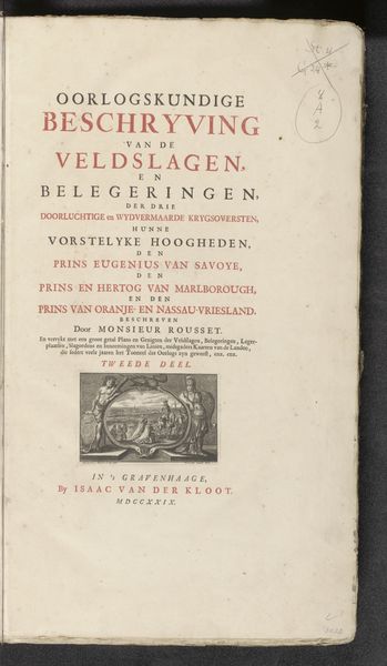
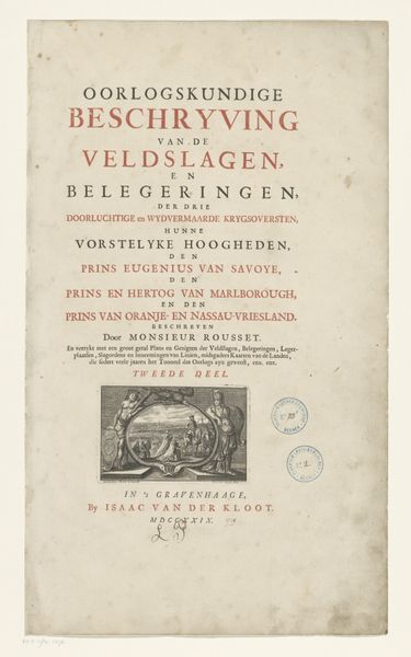
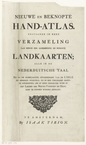
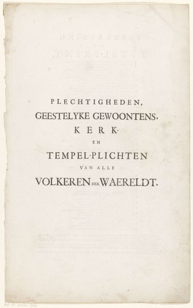
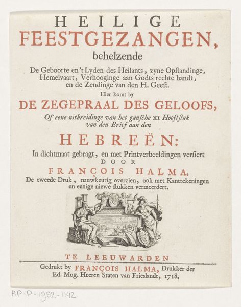
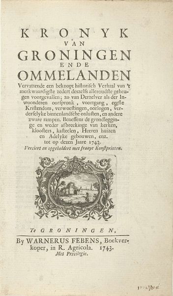
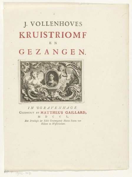
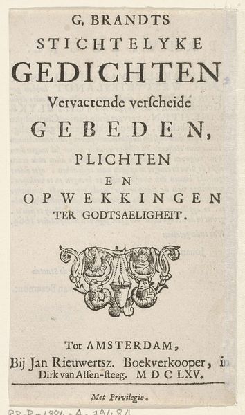
Editor: This is the title page for "Vervolg van aangenaame gezichten in de vermakelyke landsdouwen van Haarlem," created around 1762-1763, a print by Jan Bosch, featuring engraving and typography. I find the aged paper quite beautiful; it gives it such a sense of history. What compositional elements stand out to you the most? Curator: I am drawn to the typographic arrangement. Observe the considered hierarchy, the way the font sizes and spacing guide the viewer's eye. Consider the relationship between the textual elements and the small landscape vignette positioned above the publisher’s imprint. How does this interplay contribute to the overall aesthetic? Editor: The vignette almost seems like a miniature version of what the book promises - scenes of Haarlem. Do you think the specific choice of typeface influences the reading experience? Curator: Absolutely. The typeface, seemingly a hand-drawn typeface, possesses a certain elegance and perhaps communicates a sense of established tradition and refined taste which the publisher aimed to align with their brand and artistic goals. Look at how each letter has been meticulously rendered and arranged with careful attention to negative space, promoting clarity and balance to underscore visual and conceptual connections, as we read from top to bottom. Editor: That's a keen observation. The spacing and arrangement contribute to the visual harmony. I hadn't thought of it in terms of established tradition. Curator: It’s all about discerning the internal relationships between form, material and visual signifiers which produce art's unique communicative power. Editor: So interesting! Thank you for highlighting the typographic elements. I’ll definitely look at title pages differently now. Curator: A rewarding application of formalism! It highlights the aesthetic unity inherent in artistic choices and arrangement.
Comments
No comments
Be the first to comment and join the conversation on the ultimate creative platform.
