About this artwork
Victor Vasarely made this painting, Cassiopee, with a tightly controlled grid of colour and form. It’s got that very specific flavour of the mid-century. The palette is built from square grounds of orange, red, and pink, each hosting a blue disc taking a bite out of one side. Looking at it, I’m immediately drawn to the material. The colours are quite flat, which speaks to a certain kind of efficiency, but the surfaces of the squares aren’t perfectly smooth. You can see the history of the paint being laid down, a kind of layering or building up of colour. The blue discs are particularly interesting – the way the light catches them suggests a slight impasto, like Vasarely was really trying to make them pop off the canvas. It reminds me of Bridget Riley’s work. There’s a similar interest in how simple geometric forms can create complex optical effects. But where Riley often goes for a kind of dizzying instability, Vasarely feels more grounded. The grid provides a sense of order. Like any good art, it leaves you with more questions than answers.
Artwork details
- Medium
- acrylic-paint
- Copyright
- Modern Artists: Artvee
Tags
Comments
Share your thoughts
About this artwork
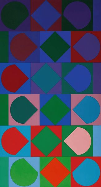
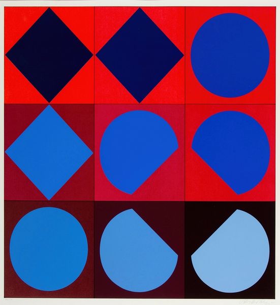
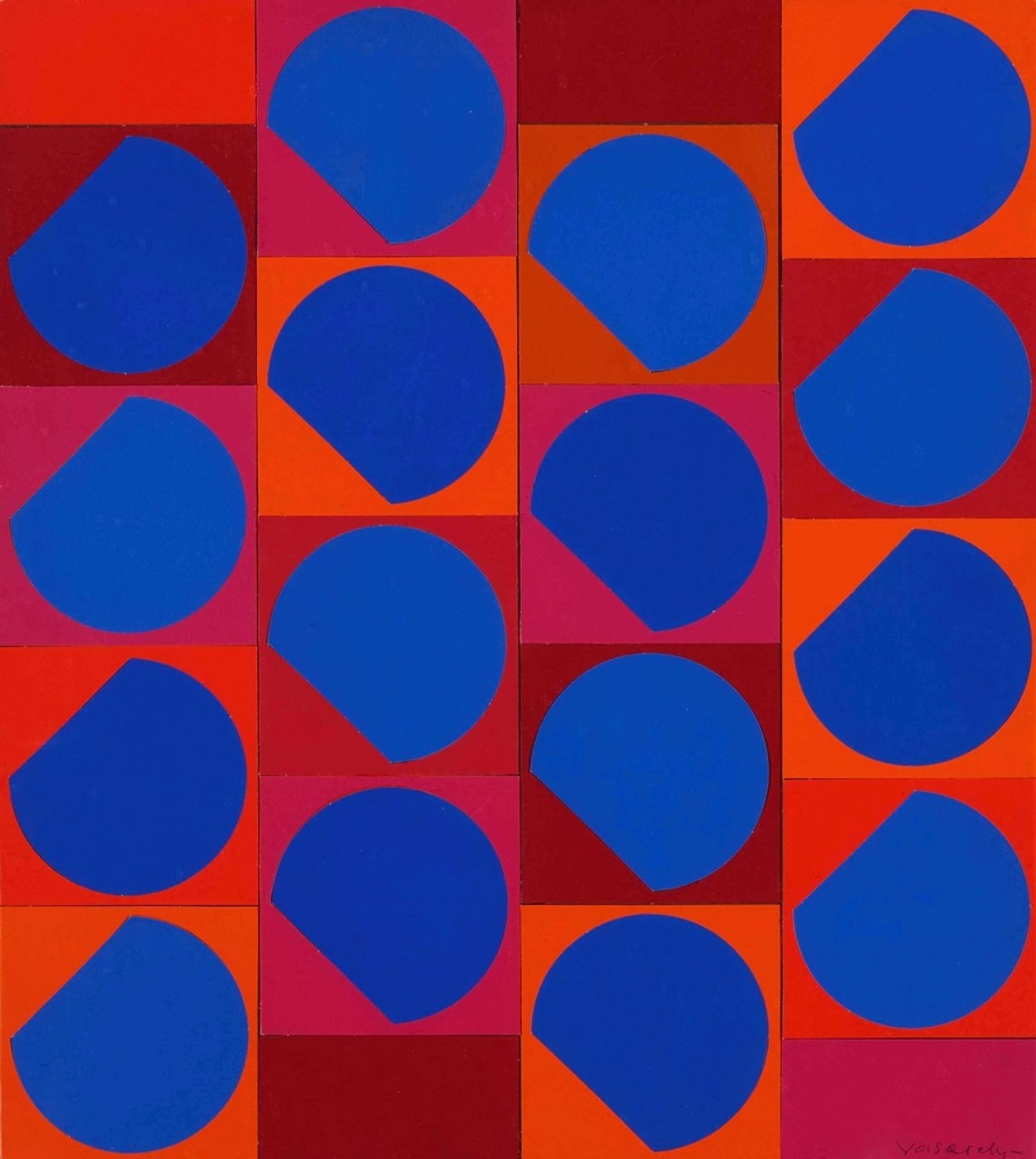
Victor Vasarely made this painting, Cassiopee, with a tightly controlled grid of colour and form. It’s got that very specific flavour of the mid-century. The palette is built from square grounds of orange, red, and pink, each hosting a blue disc taking a bite out of one side. Looking at it, I’m immediately drawn to the material. The colours are quite flat, which speaks to a certain kind of efficiency, but the surfaces of the squares aren’t perfectly smooth. You can see the history of the paint being laid down, a kind of layering or building up of colour. The blue discs are particularly interesting – the way the light catches them suggests a slight impasto, like Vasarely was really trying to make them pop off the canvas. It reminds me of Bridget Riley’s work. There’s a similar interest in how simple geometric forms can create complex optical effects. But where Riley often goes for a kind of dizzying instability, Vasarely feels more grounded. The grid provides a sense of order. Like any good art, it leaves you with more questions than answers.
Comments
Share your thoughts