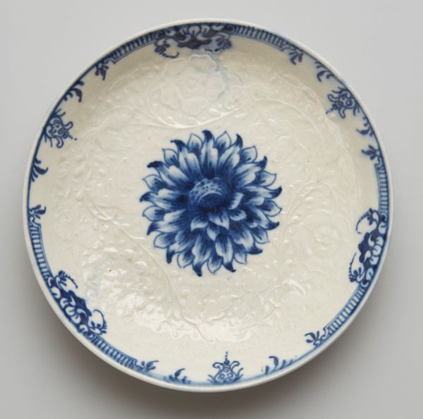
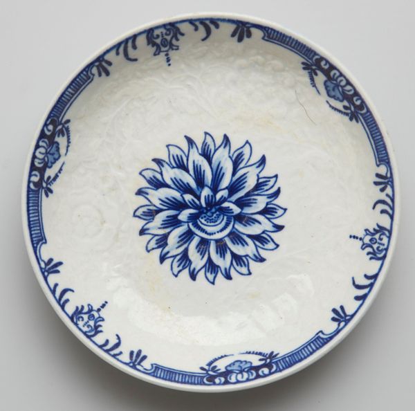
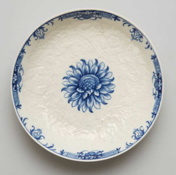
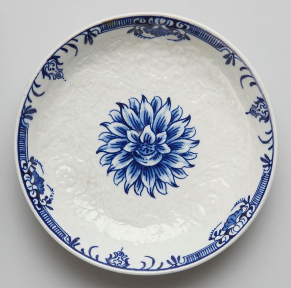
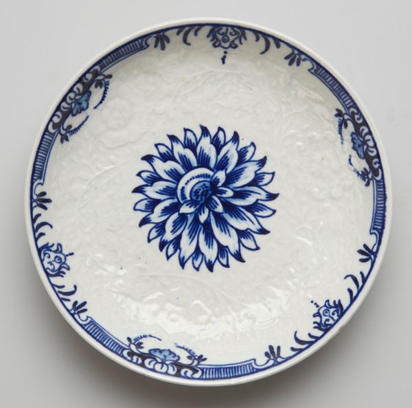
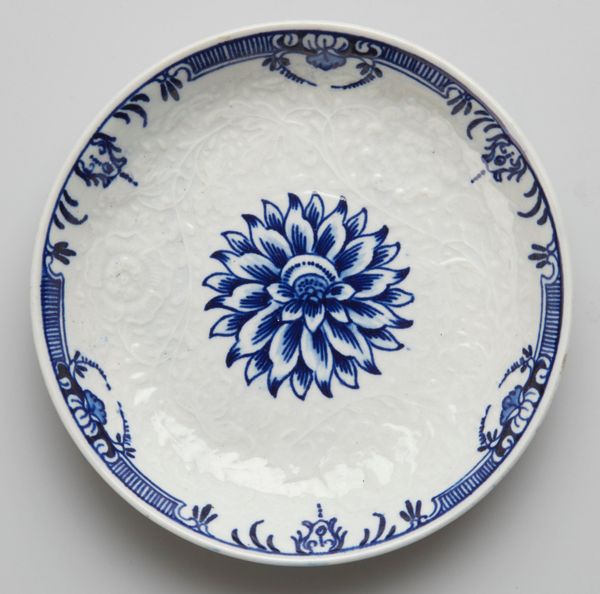
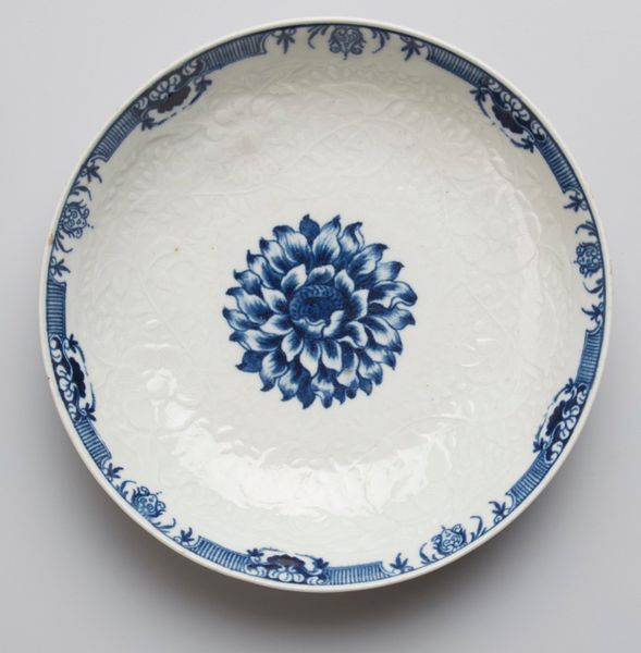
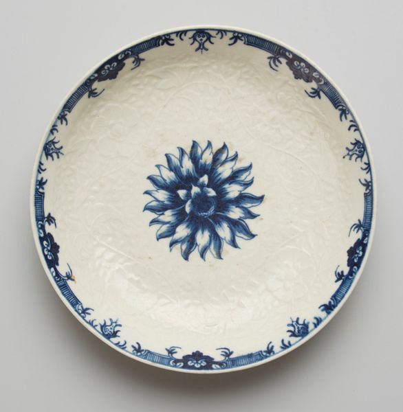
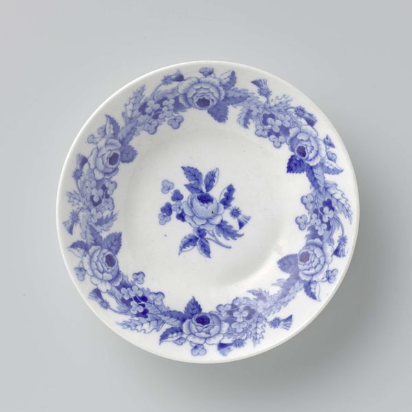
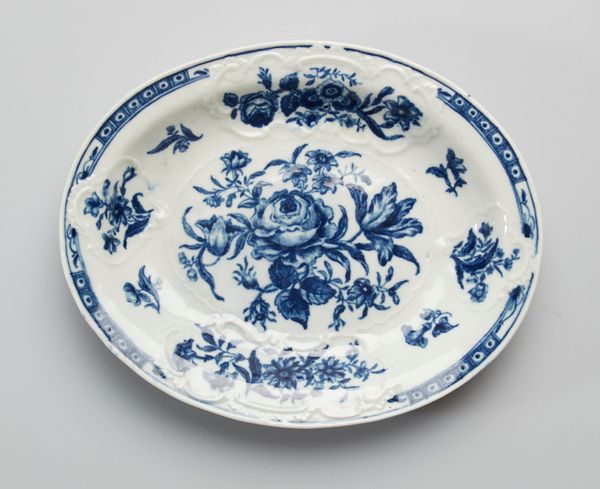
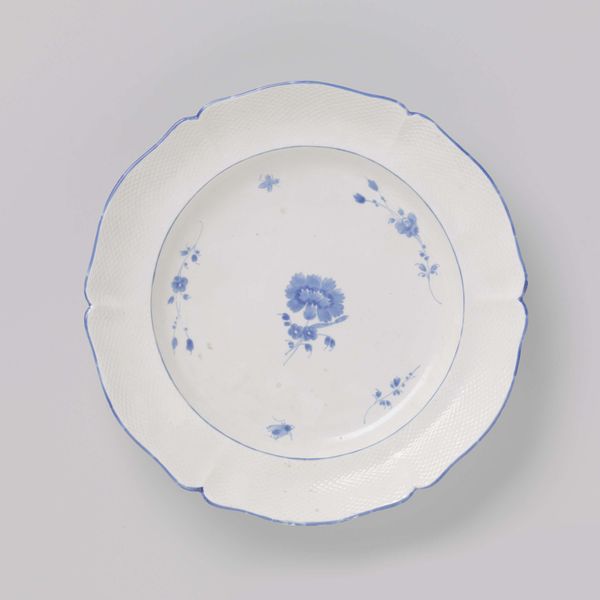
Saucer c. 18th century
0:00
0:00
ceramic, porcelain
#
pottery
#
asian-art
#
ceramic
#
porcelain
#
ceramic
#
decorative-art
Copyright: Public Domain
Curator: At first glance, there’s a deceptive simplicity to this piece. "Saucer," crafted around the 18th century by the Worcester Porcelain Works, uses a fairly restrained palette of blue on white. It’s currently residing here at the Minneapolis Institute of Art. Editor: I find the use of blue profoundly striking. Against that stark white, it gives the central flower such arresting energy—a concentrated bloom ready to unfurl its petals. Almost meditative. Curator: That concentrated quality feels very intentional. Blue-and-white porcelain ware, originating in China, had a profound impact on European ceramics. Worcester, like many others, adapted this style. The blue would’ve had a specific weight, representing a desired global sophistication. Editor: Absolutely. And that flower, rendered so precisely, doesn’t appear quite like a European variety. Is it referencing an East Asian bloom perhaps? Is this a deliberate play on the exoticized other? Curator: Likely, yes. The peony or chrysanthemum held significant cultural symbolism. But note how the makers incorporated subtle Western design elements, creating something uniquely Anglo-Chinese in style. They took the readily-accessible cultural memory and created their own symbolic structure within the history of functional objects for the home. Editor: It's an act of cultural translation, certainly. More broadly, one could read this “Saucer” as emblematic of the 18th century’s fascination with the "Orient", reflecting Europe's developing global consciousness. Everyday items weren’t exempt from participating in that phenomenon. Curator: Exactly! Everyday items became stages for this conscious re-shaping of identity and culture, bringing foreign artistic principles into the domestic space. The porcelain itself feels so very tactile. There's a history of creation and the slow building of global connections layered into this dish. Editor: And I still circle back to that one central flower; to me, it symbolizes resilience and quiet fortitude. Curator: For me, this highlights the ability of material culture to communicate far more than functionality, showing it carries layers of complex histories within the design.
Comments
No comments
Be the first to comment and join the conversation on the ultimate creative platform.
More like this