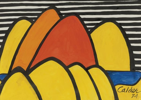
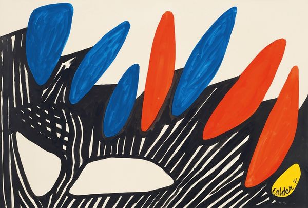
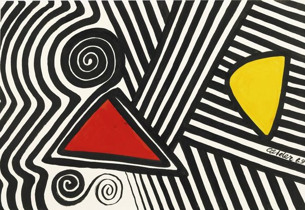
acrylic-paint
#
caricature
#
pop art
#
colour-field-painting
#
acrylic-paint
#
abstract
#
geometric
#
pop-art
#
line
#
modernism
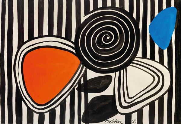
Copyright: Modern Artists: Artvee
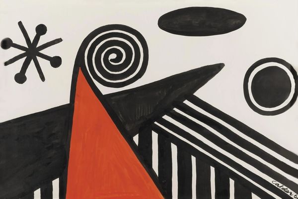
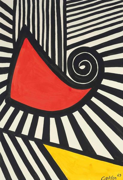
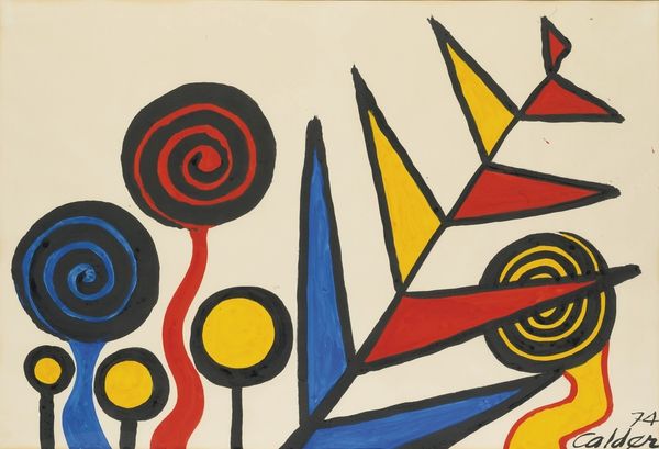
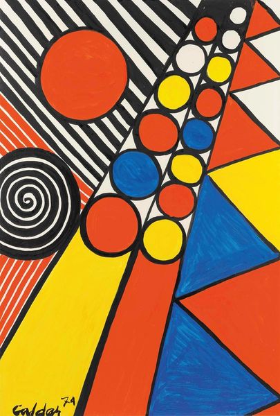
Editor: So, we’re looking at Alexander Calder’s "Whirl on Red," from 1969, an acrylic on canvas piece. It has such a playful and almost cartoonish feel, and the colors are incredibly vibrant. What do you see when you look at it? Curator: What immediately strikes me is the art historical context. This work arrives during a period of significant social and political upheaval. While Calder is celebrated for his whimsical mobiles, this two-dimensional work presents a simplified, almost graphic language, which aligns with the rise of Pop Art and the embrace of accessible imagery. Editor: Interesting! So you think it’s reacting to the political environment? Curator: Potentially. But also, it speaks to how artistic value and public perception are shaped by institutions. Calder was already an established figure. How did his established brand and public recognition influence the reception of this, comparatively flat, work? Consider how museums and galleries curate these types of pieces - what stories are they telling? Editor: That’s a really great point. It makes you wonder if his established reputation gave this piece a boost, or if it was perhaps initially seen as a departure from his ‘real’ work? Curator: Precisely. And beyond Calder’s status, consider the politics of imagery itself. This work almost flirts with caricature. It certainly isn't interested in traditional representation, but it's definitely concerned with capturing an attitude. Would you agree? Editor: Yes, it’s bold, definitely not subtle! I’ve learned that even what seems like playful abstraction can be deeply connected to its time and to art’s place in society. Curator: Indeed! And how our understanding is so influenced by what society chooses to celebrate and display.
Comments
No comments
Be the first to comment and join the conversation on the ultimate creative platform.
More like this