Curatorial notes
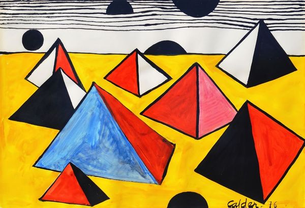
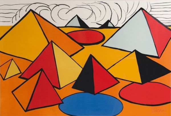
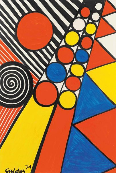
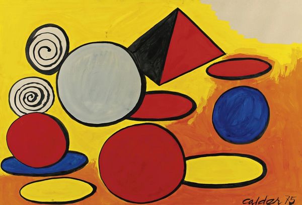
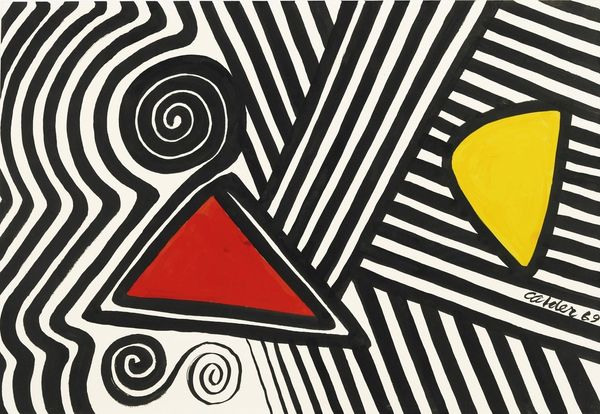
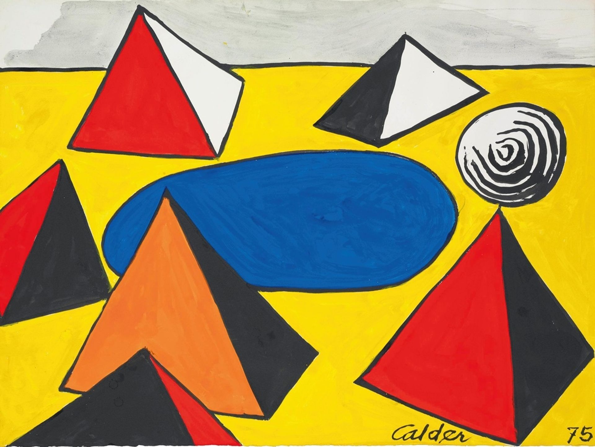
Editor: Alexander Calder's "Tantra," created in 1975 with acrylic paint, strikes me as deceptively simple. There’s a real energy in its contrasting colours and shapes, but I’m unsure what to make of it. What do you see in this piece, approaching it from a formal perspective? Curator: Focusing purely on its formal qualities, the arrangement presents a dynamic interplay of geometric shapes against a vibrant yellow ground. The colour relationships—the stark reds, blues, and oranges juxtaposed with black and white—create visual tension. What strikes you about the orientation of the triangular forms? Editor: I see what you mean. The triangles feel like they're floating rather than resting. Some of the shapes overlap or abut others, making me think of visual rhymes across the canvas. Curator: Precisely. Note how Calder employs line and colour to both define and disrupt spatial relationships. There's a flattening of perspective here, which draws our attention to the surface of the painting, emphasizing its objecthood. How does the absence of traditional depth cues affect your experience of the work? Editor: It almost becomes more about the relationship between colours than the subject, if there even *is* one! Now that you point that out, the flatness almost demands I confront the physicality of paint on canvas rather than looking for a scene or a narrative. Curator: Indeed. Through this distilled visual language, Calder prompts us to engage with the very elements that constitute a painting. A formal approach reminds us to consider how material choices impact meaning. Editor: That's fascinating. I’ll definitely pay more attention to that tension between surface and depth in future works!