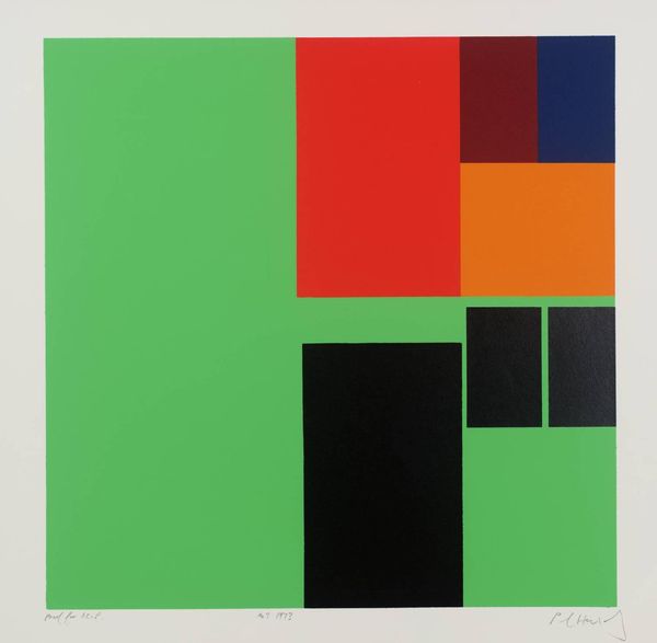
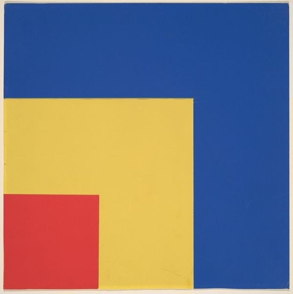
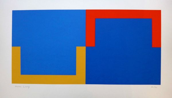
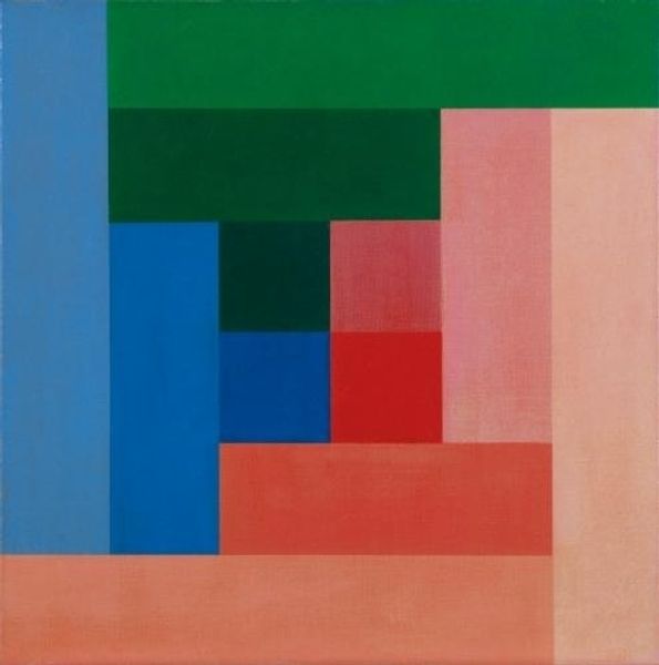
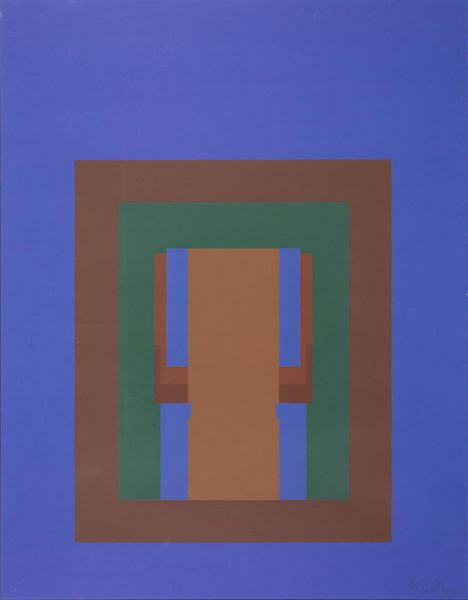
acrylic-paint
#
minimalism
#
colour-field-painting
#
acrylic-paint
#
geometric
#
geometric-abstraction
#
abstraction
#
modernism
#
hard-edge-painting
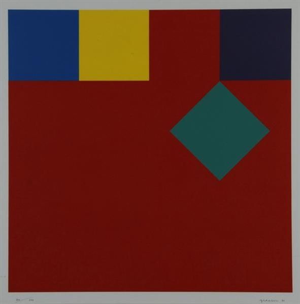
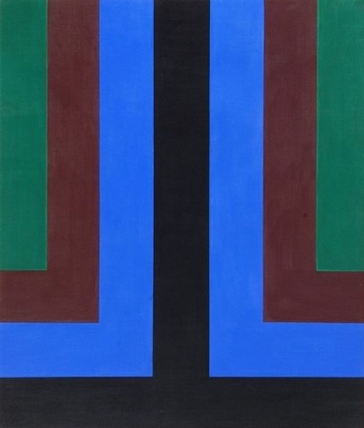
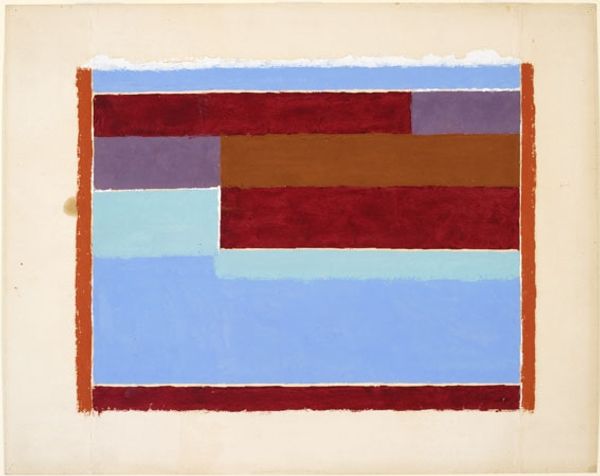
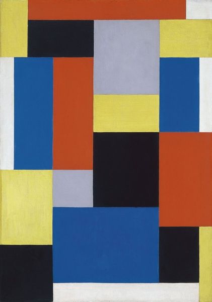
Copyright: Camille Graeser,Fair Use
Curator: Right, let's delve into this piece. What we have here is "Permutation I," created by Camille Graeser in 1969. It's an acrylic on canvas, firmly rooted in geometric abstraction. Editor: Immediately, it strikes me as an exercise in balance, almost like a deconstructed Mondrian. There's a strong horizontal division with the color blocks playing against the large, muted grey space. Curator: Precisely! Graeser, aligned with concrete art principles, explored the objective arrangement of color and form. Look closely at the acrylic application. It’s smooth, precise – likely achieved through meticulous layering and masking. What does this tell us about the artist’s process, the labor involved? This wasn’t about spontaneous expression; it was about controlled execution. Editor: The flatness is striking, though, isn’t it? It negates any illusion of depth. It's definitely in conversation with the Hard-Edge Painting movement, and also the color field, though it still seems uniquely precise. It evokes a kind of post-war order, almost clinical. One might even see it as reflecting a sense of control in a society rebuilding itself, re-ordering priorities, don't you think? Curator: The material’s inherent qualities become the message: Acrylic allowing these pristine blocks of pure pigment, untouched by expressive brushwork. He had specific producers he worked with for particular colors, according to archived letters, that really exemplifies how every step in material usage and production had thought behind it. Editor: The limited palette – blue, red, teal, grey – is also interesting in terms of visual language. The museum selected this image for permanent collections precisely due to its adherence to minimalist structures and it becomes something almost architectural with its own logic or plan that viewers follow as much as contemplate it. It speaks to a trust in rationality and ordered thought that became popular post WWII Curator: Ultimately, it is an amazing testament to how, through material choices and process-driven methodology, Graeser crafted this work. Editor: Agreed. Its power rests not just in what is represented, but in its cultural timestamp, this yearning for order amidst the flux of the late 60s. A cool historical puzzle that mirrors the mindset of those who both viewed and created it.
Comments
No comments
Be the first to comment and join the conversation on the ultimate creative platform.
More like this