painting, acrylic-paint
#
op-art
#
painting
#
pattern
#
op art
#
colour-field-painting
#
acrylic-paint
#
geometric pattern
#
abstract pattern
#
geometric
#
abstraction
#
modernism
#
hard-edge-painting
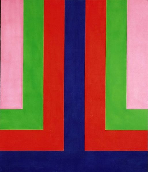
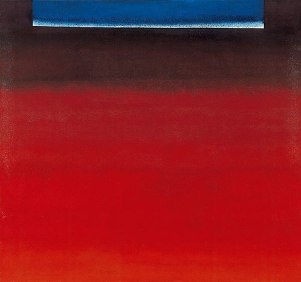
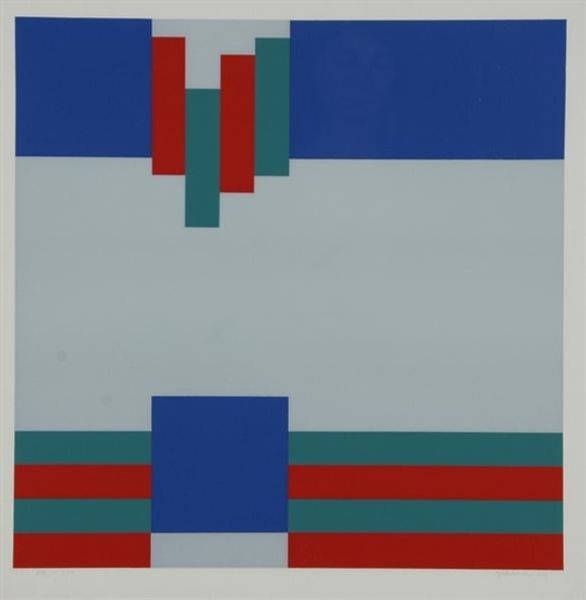
Copyright: Howard Mehring,Fair Use
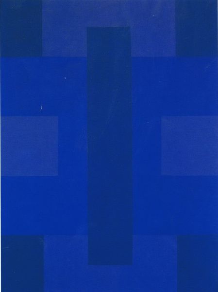
Curator: Stepping into the gallery now, we encounter Howard Mehring's "Blue Note," crafted in 1964 using acrylic paint. Editor: At first glance, it presents itself with an austere yet strangely hypnotic visuality, reminiscent of minimalist architecture, maybe the framing of a doorway... Or, I suppose, a geometric keyhole. The color balance—bold blues, reds, greens, and blacks—provides a striking impact. Curator: Mehring, associated with Colour Field Painting and Hard-Edge Painting, leverages acrylics to create clean, clearly delineated areas of solid colors. Here we observe the dynamic tension of pattern: how is rhythm formed by means of symmetry, how a grid appears by use of depth. These are pictorial devices central to modernist aesthetics. Editor: I agree. I see this piece, produced in 1964, as engaging with prevailing notions about how the experience of public art had to evolve to accommodate a more sophisticated viewing public in postwar America. These very works served the aspirational architectural statements of government or educational buildings in newly created cityscapes, from Lincoln Center to the expanding university campuses. Curator: Its op-art qualities draw the eye into an interaction of positive and negative space, a deliberate perceptual play. It emphasizes flat surfaces rather than illusionistic depth, highlighting the painting’s materiality. Notice how the geometric structures achieve rhythm without any suggestion of atmospheric or gestural effects. Editor: True. Viewing it today, it reminds me how artists of Mehring’s generation reshaped public spaces. It speaks to the ambitions of its era and raises questions of urban and national identities of the time. Curator: Yes, its seemingly straightforward composition is a calculated exercise in formal relations, demonstrating a specific kind of modernist visual language. Editor: Its historical context is really more expansive than might immediately be perceived, and looking closely yields surprising historical resonances. Curator: Indeed, reflecting on "Blue Note," it is in our analysis of the picture’s structure and the deployment of color that we grasp the intentions embedded within its visual rhetoric. Editor: Understanding the painting and its time, we begin to see that it speaks silently to ambitions about art's role in shaping public discourse.
Comments
No comments
Be the first to comment and join the conversation on the ultimate creative platform.
More like this