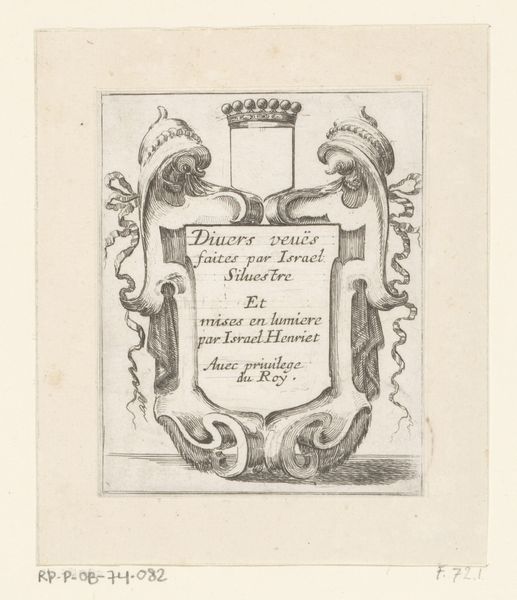
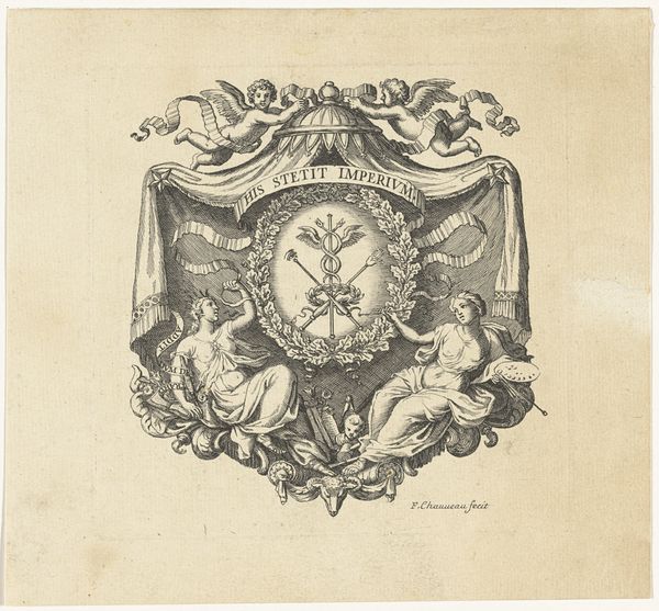
Kaart van het Hoogheemraadschap van de Krimpenerwaard (deel wapenrand) 1683 - 1741
0:00
0:00
drawing, graphic-art, print, ink, engraving
#
drawing
#
graphic-art
#
baroque
#
pen drawing
# print
#
old engraving style
#
ink
#
cityscape
#
engraving
Dimensions: height 445 mm, width 373 mm
Copyright: Rijks Museum: Open Domain
Editor: Here we have “Kaart van het Hoogheemraadschap van de Krimpenerwaard (deel wapenrand)” – a section of a map by David Coster, dating somewhere between 1683 and 1741. It seems to be an engraving or etching, featuring heraldic lions and what I assume is a coat of arms. It strikes me as a very formal, even rigid composition, although the lines are quite elegant. What catches your eye in this piece? Curator: Formally, I find the symmetrical arrangement compelling. Notice the two heraldic lions, mirror images of each other, flanking the coat of arms. This symmetry creates a visual anchor. And consider how the ornate cartouche at the base mirrors the crown at the top, drawing the eye in a continuous loop. The textures are also critical – the smoothness of the shield contrasted with the detailed fur of the lions, achieved through masterful engraving. Does that structured approach resonate with you? Editor: It does, now that you point it out. I was so focused on the content, I overlooked the deliberate arrangement. It is balanced in a way that feels almost mathematical. Curator: Precisely! The artist's choices about line, texture, and form aren't arbitrary. How would you say the composition, its reliance on symmetry, affects the symbolic value? Editor: Hmm, maybe the symmetry reinforces a sense of order, power, and stability. The formal arrangement makes it feel more imposing. I like that I have started considering more the intrinsic formal elements to look for meaning. Curator: Excellent! Recognizing the interplay of form and meaning opens a rich avenue for appreciation. Thank you.
Comments
No comments
Be the first to comment and join the conversation on the ultimate creative platform.
More like this